


![]() Kansas Jayhawks Logo PNG
Kansas Jayhawks Logo PNG
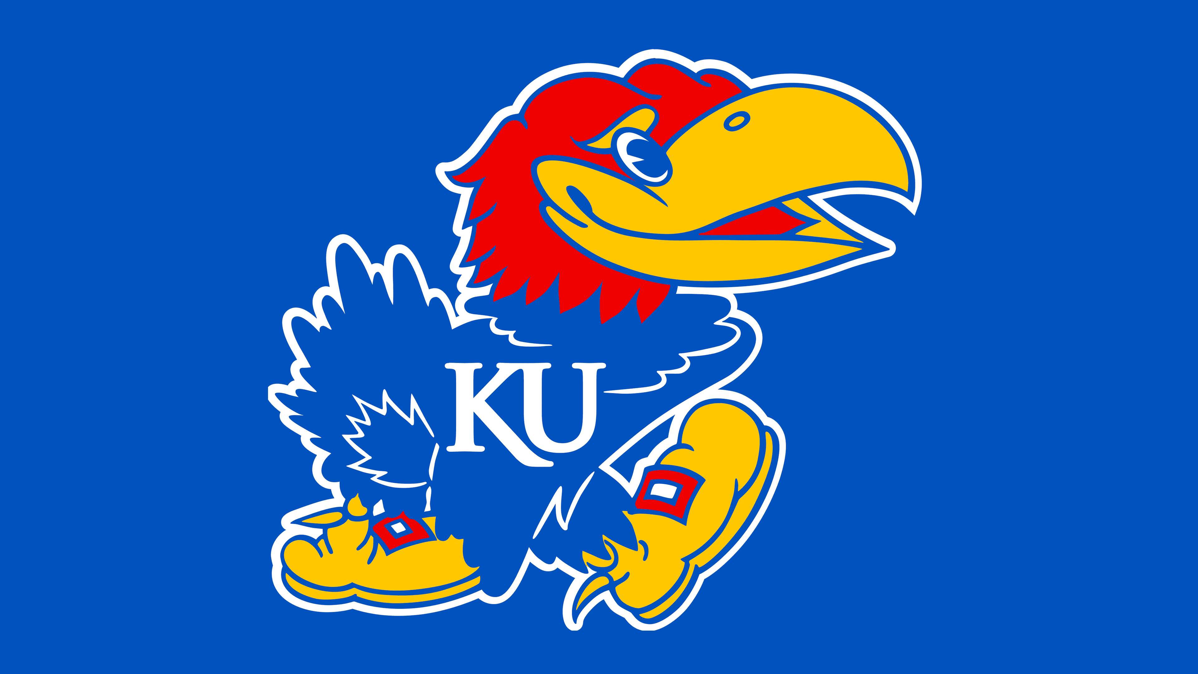
The Kansas Jayhawks logo indicates a readiness to compete for top places in sports. It intimidates opponents, prepares the team for serious challenges, commands respect, and drives success. The simple yet vivid image serves as a mascot for the teams, emphasizing their connection to the locale where the university is situated.
Meaning and History
![]()
The original design of the Kansas Jayhawks logo didn’t emerge immediately: it was drawn in 1912 by cartoonist Henry Maloy, a student working for the university newspaper. His style significantly influenced the logo: it was cartoonish, lacking details but full of character. Besides the anthropomorphic bird, the emblem featured the intertwined abbreviation “KU” with a daisy at the bottom, as the flower was then considered a symbol of Kansas. The bird is a hybrid of two birds, including the noisy blue jay and the cunning sparrow hawk.
The first notable change to the logo dates back to 1929, when the bird gained distinct wings, formidable spurs, and an uncompromising character. The iconic image was radically modified again in 1946 to convey the university’s spirit. The typography was refined by Jim Wilcox in 1996. He introduced curved lines to the letters, making them more dynamic and imbuing them with symbolic meaning: the elongated leg of the “K” represents the hill at the main campus in Lawrence. The bird’s footwear was a gift from its first creator: Henry Maloy drew the boots as a threat to opponents. His idea was for the mythical creature to kick competitors in the face.
What is Kansas Jayhawks?
The Kansas Jayhawks refer to the sports teams belonging to the University of Kansas in Lawrence. They are formed from students who participate in the intercollegiate program and are members of the NCAA Division I and the Big 12 Conference. Overall, the department comprises 16 teams: 8 women’s and 6 men’s. Their name derives from the American Civil War militia and is historically associated with local settlers. The mascot is a bird that combines a sparrow hawk and a blue jay.
1912 – 1919
![]()
The logo features a caricature of a semi-anthropomorphic bird. Its upper part looks normal, but the lower part does not. It has long human legs in boots. To make the footwear more prominent in the drawing, Henry Maloy colored it red. The artist made the bird’s beak yellow and its plumage blue with white unpainted areas. These appeared due to the drawing style: the body, wings, and tail are applied with chaotic lines that do not connect in some places, leaving these white spots.
1920 – 1922
![]()
In 1920, the Jayhawk image became more realistic. A traditional-looking bird sits on the upper stroke of the “K” in the “KU” monogram. It is still colored blue and yellow, but it no longer wears boots. The red moved to the abbreviation. The plumage of the Jayhawk-sparrow hawk symbiosis is distinct, highlighted by thin white strokes.
1923 – 1928
![]()
Two sophomores (Jimmy O’Bryon and George Hollingbery) proposed a new version of the Kansas Jayhawks logo that again adopts a cartoonish style. The structure and color scheme remained the same: the picture depicts the Jayhawk, a mysterious creature combined with two birds. It has a blue body, a red head, a yellow beak, and sports shoes on its feet. The bird is turned to the left and drawn in profile. Unlike the inscription, enhanced with contrasting highlights, its wings and tail are not emphasized.
1929 – 1940
![]()
Forrest O. Calvin depicted a somber bird with a menacing look, achieved by rendering the eye white without a dark pupil. The artist removed almost all contrasting strokes, retaining basic colors: blue, red, and yellow. Their combination was limited to the legs (resembling socks), the head (around the eye area), and the beak (a single stroke at the end). The bird developed powerful spurs to further intimidate opponents in the sports arena. The “KU” monogram is placed horizontally and rendered in bold font.
1941 – 1945
![]()
The author of this logo, Gene “Yogi” Williams, opened the bird’s beak and eyes, giving it a sporty look. Fans nicknamed it Angry Jayhawk for its combative mood, muscularity, decisiveness, and readiness to meet even the fiercest opponent. This version laid the foundation for the familiar emblem known today. Moreover, the designer significantly altered the typography: he changed the inscription from red to white to make it stand out clearly against the blue background.
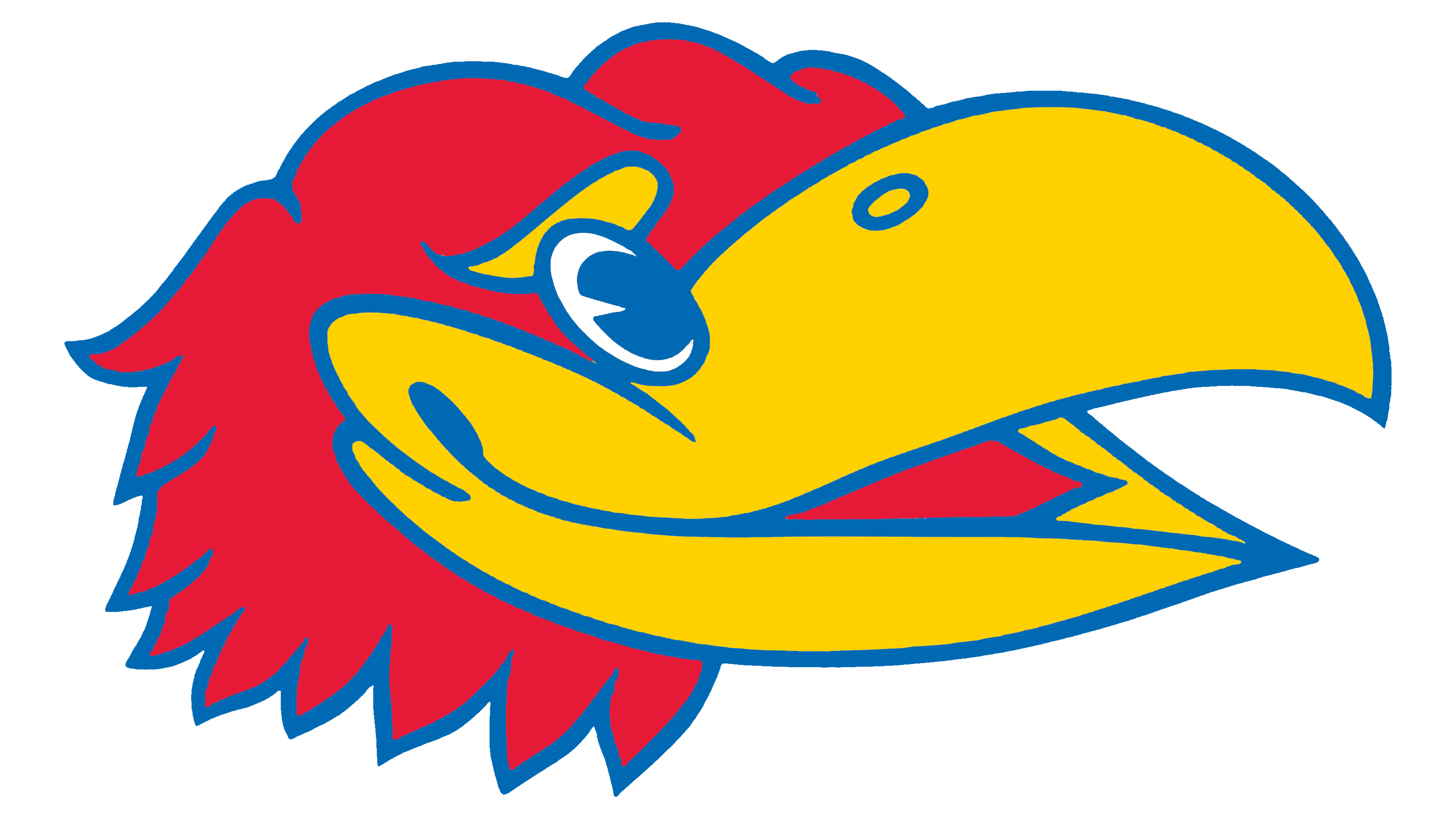
1946 – 2005
![]()
The university’s administration considered the previous Kansas Jayhawks logo excessively aggressive and held a competition. Student Harold D. Sandy won, turning the bird to the right, adding friendliness to its gaze, and drawing a smile. For his victory, he received $50. The university registered the copyright for the new emblem in 1947. Jim Wilcox altered the font in 1996, transitioning it from a playful design to a classic one.
2005 – today
![]()
The emblem gained expressiveness through enhanced shades. Each color was significantly refined to the desired brightness, eliminating dullness and adding depth. The font was also modernized: it is now linked to authenticity, as the elongated leg of the “K” represents the hill at the main campus in Lawrence and conveys inner movement. Otherwise, the logo remained the same.
Font and Colors
In the latest Kansas Jayhawks emblem, the abbreviation on the bird’s body is set in the Trajan font, a soft serif with thin serifs. In earlier logos, a grotesque font predominates, with all letters made in a geometric style.
Blue and crimson were officially approved in the spring of 1896. Yellow was added later and became complementary. It perfectly balances the bright palette, adding liveliness and realism. Red here signifies the peak of emotion as it flares up in the stadium. Blue conveys loyalty. Yellow symbolizes superiority.