


![]() University of Louisville Logo PNG
University of Louisville Logo PNG
The University of Louisville’s logo is part of the institution’s overall strategy to attract students and sponsors. The emblem reflects the university’s values and helps promote it as a recognizable and attractive brand in education.
The University of Louisville traces its origins to April 3, 1798, when eight Louisville residents announced plans for Jefferson Seminary. Kentucky lawmakers had recently chartered the academy and sold 6,000 acres to fund it. Money problems delayed the opening until fall 1813, when classes began in rented downtown rooms under Edward Mann Butler. The seminary closed in 1829 after public criticism and competition from new schools.
In 1837, Louisville created the Louisville Medical Institute under Charles Caldwell, a former leader at Transylvania University. In 1846, Kentucky combined the medical institute, a collegiate institute, and a new law school into the University of Louisville. For much of the nineteenth century, the medical school was its strongest division, later linked to early ambulance service, emergency care, blood banking, an artificial heart transplant, and a successful hand transplant.
In 1931, during the era of segregation, the university opened Louisville Municipal College for Black students on the former Simmons University campus. Full desegregation came in the 1950 and 1951 academic year. In 1970, control moved from the city to the state of Kentucky.
Athletics became a major part of the university’s identity. Denny Crum took over basketball in 1971 and won national titles in 1980 against UCLA and in 1986 against Duke. Rick Pitino arrived in 2001 after coaching Kentucky, the New York Knicks, and the Boston Celtics. In 2013, Louisville had its “Year of the Cardinal,” though the men’s basketball title was later vacated by the NCAA in 2018. In 2016, Lamar Jackson won the Heisman Trophy, while the rivalry with Kentucky’s Wildcats remained one of the school’s defining sports stories.
Meaning and History
![]()
The contemporary identity of the University of Louisville reflects its history. The mascot and official university colors were adopted in 1913. The wife of John L. Patterson, the Dean of Liberal Arts at the time, suggested making the Northern Cardinal, the state bird of seven US states, the primary symbol of UofL. The combination of red and black was chosen due to the bird’s plumage.
The current university logo features the head of a red cardinal. The history of this graphic symbol dates back to the 1960s, when artists depicted the sports mascot as an anthropomorphic bird with a predatory grimace: a toothy beak expressing aggression. In 1983, UofL introduced an identification program that included a word mark developed by Stewart Winner Inc. In 2008, a full academic rebranding took place. The institution adopted a new visual symbol featuring the bird’s head, based on the sport’s 1998 emblem. The SME company created this design.
What is the University of Louisville?
The University of Louisville is an educational institution that joined the state university system in 1970. It was established in 1798 in Kentucky and is one of the oldest universities in the southern United States. UofL educates students and conducts scientific research across various fields, including biomedicine, computer science, and the social and natural sciences.
before 2008
![]()
2008 – today
![]()
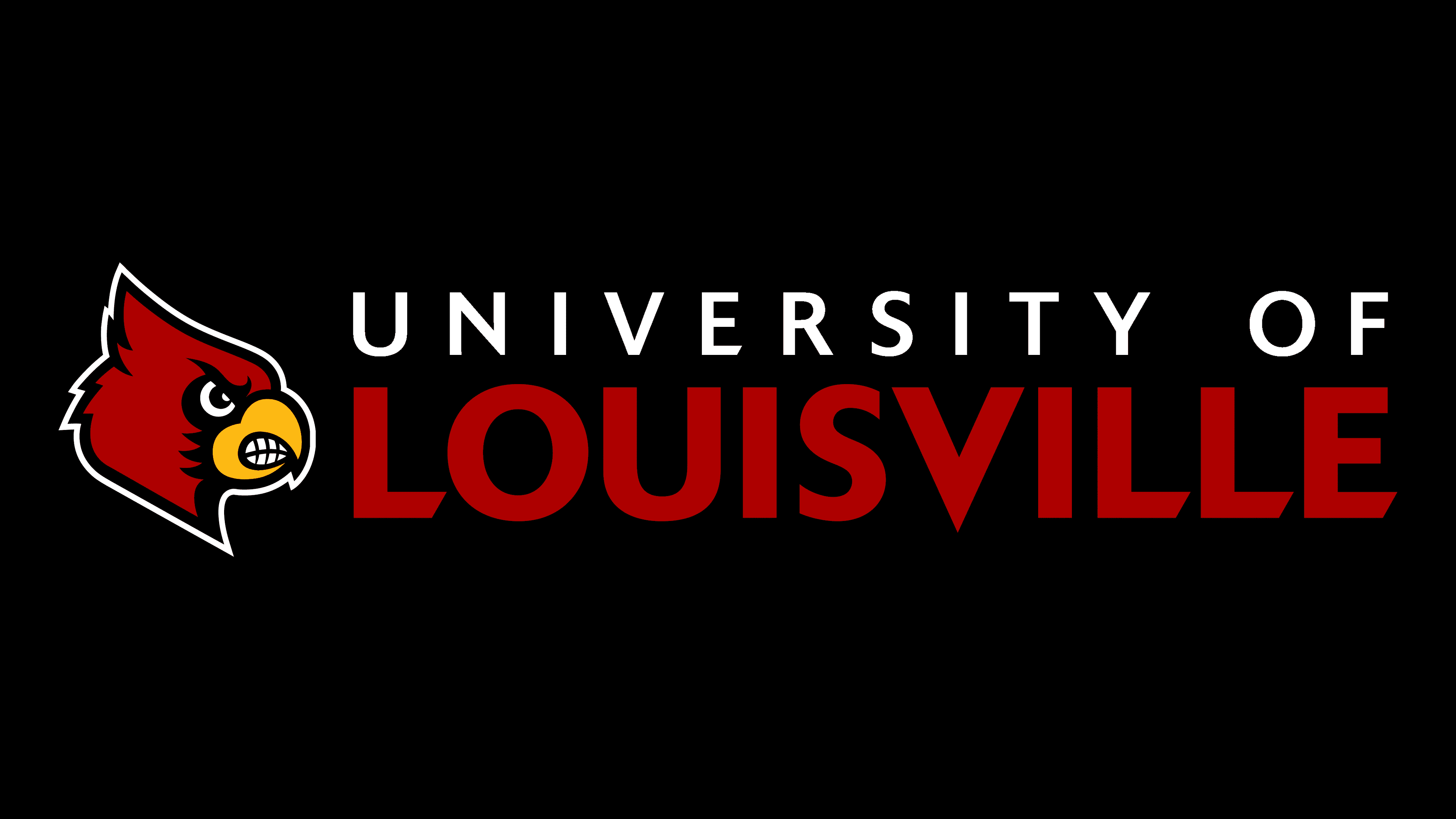
The official logo of the University of Louisville is in the institution’s traditional colors: red, black, and white. It consists of text and a drawing located alongside. Artists depicted the head of a red cardinal, the university’s main mascot. The animal looks to the right, frowning angrily and clenching its teeth tightly. Designers added such an atypical feature to the bird: teeth, to show maximum aggression. This emblem was initially a sports one and was popular among fans. The cardinal embodies strength, energy, and confidence. Moreover, it’s a symbol of loyalty and commitment, aligning with the university’s values.
The name of the educational institution is located to the side, divided into two lines: black and red. The bottom inscription is almost twice as large as the top one. But they match in length because the designers adjusted the width of the letter gaps. The same bold, sans-serif font, Delta Jaeger, is used in both cases. Only the “V” in the word “LOUISVILLE” at the bottom has a long, sharp angle.
The Seal
![]()
While the university logo is part of the overall branding strategy and can be used for marketing purposes, only the Office of the President has the right to manage the seal. It is applied to official messages and documents. Its central image is Minerva, ancient Roman mythology’s goddess of art, science, and wisdom. This is the oldest symbol of UofL, as an early version of the seal appeared in the 1830s. It contained concentric circles, a strict black inscription, and a portrait of a woman looking to the side. The modern version differs with a more stylish font, bright red color, and an interesting drawing design.
The use of the Minerva image is explained by the university’s history, which dates back to 1798. When it was transformed and received its current name (in the first half of the 19th century), allegorical images that emphasized the importance of education and science were often found on the seals of educational institutions.
The current version was developed in the 1950s by the professional American artist Victor Karl Hammer. In 1992, it was slightly modified by Professor Steven Skaggs. Now the seal contains the head of Minerva in a traditional helmet. The goddess has a classic Greek profile, considered the standard of beauty in the ancient world: a straight nose, a heavy chin without a dimple, large lips, and deep-set eyes. Wavy hair is detailed, as are the patterns on the headdress. The stylized portrait is placed in a ring of text: “UNIVERSITY OF LOUISVILLE 1798”.
Font and Colors

The inscription on the official logo is rendered in a modified version of the Delta Jaeger font, created in 1976 by typographer Gustav Jaeger. Its characteristic feature is the cuts at the ends of some letters, creating a dynamic effect. Meanwhile, the word “LOUISVILLE” has a modified “V” with a sharp bottom. A unique set of glyphs was developed for the UofL seal. They differ in irregular shape, serifs, and curvatures.
The visual symbols of the University of Louisville are presented in its official colors: red (shade PMS 1797C) and black. White is used as the background. The combination of red and black was chosen because it matched the natural color of cardinal feathers.