 University of Mississippi Logo PNG
The logo of The University of Mississippi emphasizes professionalism and stability. Teaching at the university began several centuries ago. Therefore, the institution has tremendous experience and provides training at the highest level.
University of Mississippi: Brand overview
| Founded: | 1844 |
| Headquarters: | University, Mississippi, U.S. |
| Website: | olemiss.edu |
Meaning and History

The university received official registration in the winter of 1844 from the Mississippi Legislature. He was granted isolated lands in Oxford in order to facilitate educational and research work. In 1985, the people of Lafayette County gave him areas to the west of the city to construct the campus. The following year, the future university began the construction of two dormitories, an academy, and an administrative building, under the guidance of architect William Nichols. In the autumn of 1848, the university opened its doors to the first enrollment of eighty students.
The second launch of the educational institution took place in 1865 after the Civil War, as in a difficult period for the country, it was a hospital and barely escaped destruction. For veterans, the university has reduced costs and admission standards, allowing students to live off-campus. In 1882, he began to co-educate boys and girls, which had not happened before. But at the same time, students were forbidden to live in a hostel and study at the Faculty of Law.
In 1885, the University of Mississippi hired a woman teacher, Sarah McGehee Isom, for the first time in the southeastern region of the United States. Currently (data for the 2020-2021 academic year), 500 women teach at the university, which occupies almost half of the faculty. And it is also predominantly women who study in it: 57 percent of students are girls. The educational institution also conducts active research activities, being one of the scientific flagships of the country. Its emblem is well known to residents of the United States and other countries since foreigners often come to the university. Among its alumni are many celebrities, including writer William Cuthbert Faulkner.
The university emblem has a complex structure with text and graphic parts. The icon is located to the left of the inscription and is a vertical oval with a double border around the edge. In the center, on a red background, there is a colonnade of six pillars. The facade is decorated with steps and a triangular roof. Below (under the stairs), the year of establishing the higher educational institution is indicated. The color scheme is white and red. All elements are drawn first, and the second is the background.
On the right side is the full name of the university. It occupies two lines: the top – “The University of,” the bottom – “Mississippi.” For them, a combined font with serifs is used. The preposition “of” has a different style – it is italic, unlike the rest of the inscriptions. The letters are predominantly uppercase, bold, with large serifs. An originally figured notch complements “M” with rounding in the upper part of the right leg.
Seal
The seal of this institution of higher education is round and focused on the advancement of knowledge. It has no historical values, architectural sights, or local roots – the main emphasis is on education. To do this, the center of the logo is the sun – an eternal source of light. And light, as you know, is an allegory of knowledge. The luminary has many short and sharp rays of different lengths. In the middle of the white space is an eye from which a gaze emanates. These two elements are placed on a red background and separated by a thin line.
This is followed by a wide strip with the inscription “University of Mississippi” and the designation of the year of its appearance – “1844”. The text is expanded in a ring and occupies the entire circle. Along the edge of the print is a white and blue frame with ragged strokes directed inwards. They also form a kind of sunbeams.
Ole Miss Rebels Logo
The sports department of the University of Mississippi is called the Ole Miss Rebels and consists of 18 men’s and women’s teams. Its base was laid in 1893 with the advent of football players. The number of disciplines has increased a lot and includes golf, tennis, baseball, basketball, cross-country running, athletics, and other sports. The club competes within the NCAA and SEC. Until 1936, he was Mississippi Flood and then received the current name – Rebels.
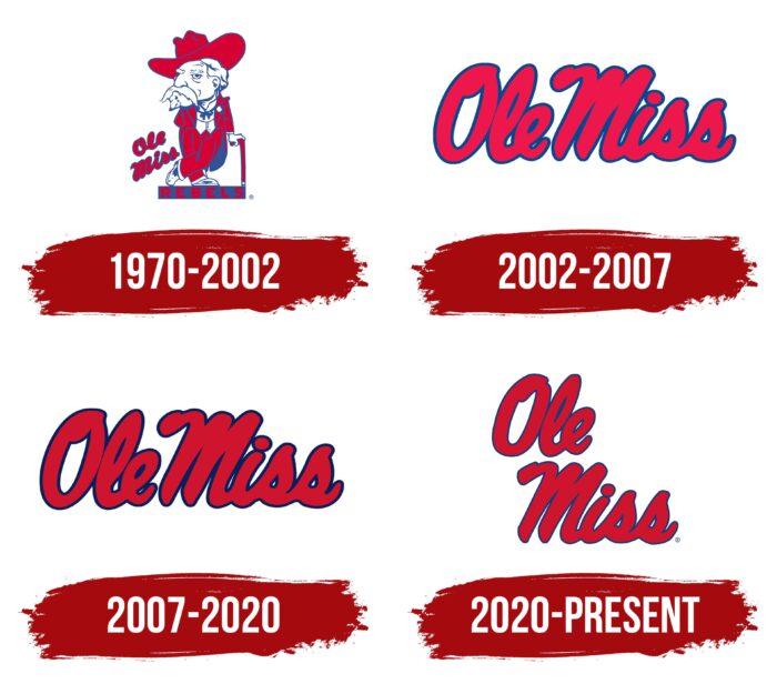
1970 – 2002
The emblem shows an elegant aged gentleman with a mustache, beard, and a huge hat. He leans on a cane with his left hand and holds his right hand behind his back. The man is wearing a dress coat, a ribbon tied in a bow, a jacket, and boots. The leg is wound behind the leg, which emphasizes his confidence and composure. The older man’s head is disproportionately large, turned half-face. The look is haughty. The hat and suit are dyed red. The gentleman is standing on a rectangular platform with the word “Rebels,” to his left is the phrase “Ole Miss,” written in a script that mimics handwriting. The drawing is made with thin blue contour lines.
2002 – 2007
The designers used only the inscription from the previous version for the logo. They unfolded it, stretched it into one line, and placed it horizontally. The font is cursive, connected, bold, and cursive. The phrase consists of lowercase letters, but the first characters in words are much higher than the rest.
2007 – 2020
The undertaken redesign touched only the color. The rest of the elements remained unchanged. As a result, the red got a shade of cardinal, which, due to the dark blue edging, is perceived as burgundy.
2020 – today
The current emblem retains both the shape and color of the letters, but the thickness of the dark blue outline has been reduced, so it is now thread-like. Thanks to this, the inter-letter gaps became visible. In addition, the words are separated and arranged in two lines, one above the other.
Font and Colors
The evolution of the sports logo is associated with the change of team names. The academic press, on the contrary, is stable and has not undergone any adjustments. It personifies education, science, internal development, and not the university’s history. The university emblem is the most multi-component and consists not only of text but also of graphics. A corporate palette unites all three attributes of the identity of the University of Mississippi.
The university management settled on three types of typefaces: sans serifs with thickened ends (for the inscription on the press), with classic serifs (for text on the general emblem), and italic version (for the sport’s emblem).
The official palette is stable and includes two colors: Cardinal red (#CE1126) and Navy blue (#14213D). An additional gray (#747679) is also used in some cases.
University of Mississippi color codes
| Fire Engine Red | Hex color: | #ce1126 |
|---|---|---|
| RGB: | 206 17 38 | |
| CMYK: | 0 92 82 19 | |
| Pantone: | PMS 185 C |
| Space Cadet | Hex color: | #14213D |
|---|---|---|
| RGB: | 20 33 61 | |
| CMYK: | 67 46 0 76 | |
| Pantone: | PMS 282 C |
| Teal | Hex color: | #747679 |
|---|---|---|
| RGB: | 116 118 121 | |
| CMYK: | 4 3 0 53 | |
| Pantone: | PMS Cool Gray 9 C |


