 University of Washington Logo PNG
The elite of the institution conveys the logo of the University of Washington. One letter is enough to make it clear that this is the most famous and worthy university. Students from the upper strata of society study here and receive the best education.
University of Washington: Brand overview
| Founded: | November 4, 1861 |
| Headquarters: | Seattle, Washington, United States |
| Website: | washington.edu |
Meaning and History
In 1845, Governor Isaac Stevens proposed building an educational institution in Washington Territory. Some members of the administration took up the idea. The approval came from a strong financial motivation: they wanted to raise the state’s prestige and get an influx of finances to the city of Seattle. After lengthy settlements and construction, the college was opened. At the time, it was called the Territorial University of Washington.
The large letter “W” marks the first character from the names of the state and the university. It is bold, flat, complete with geometric serifs that look like horizontal rectangles. And each left line of the double sign is wide, while the right line is narrow. Such graphics are visually confusing because the sign reads like two adjacent “V’s.” The letter occupies the center of the top line, and below it is the university’s full name, typed in a high, thin font. The exception is the conjunction “of”: it is lowercase and italicized. Interestingly, the serifs in this inscription are very original, as they resemble nail hats.
Seal
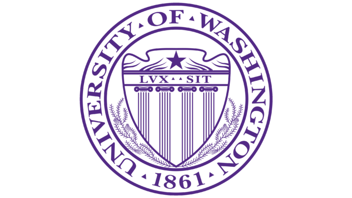
The university seal has a classic shape:
- A rondel
- A traditional circle with a well-defined center
- Several concentric rings of different widths
In the center is a pentagonal shield that resembles a massive arrowhead pointing down. On it are four tall columns and a dark purple star surrounded by thin grass stems. Both elements are separated by a horizontal stripe with the university’s motto. It bears the phrase “LUX SIT” written in Latin.
The sharp end of the shield comes in contact with the branches of a coniferous tree diverging in two directions. It is followed by a wide, light space with the name of the institution of higher learning and the year of its appearance. The text is in uppercase type with thin and short serifs. Between the words, you can see small triangles turned upward.
Washington Huskies Logo
Twenty-two teams represent the University of Washington athletic department. Soccer players, skiers, basketball players, rowers, volleyball players, softball players, and other athletes are the most successful. They have won numerous championships and gold medals as they compete in the NCAA and Pac-12, and in the Olympics. From 1907 to 1917, UW soccer teams did not lose a single game in 64 consecutive games.
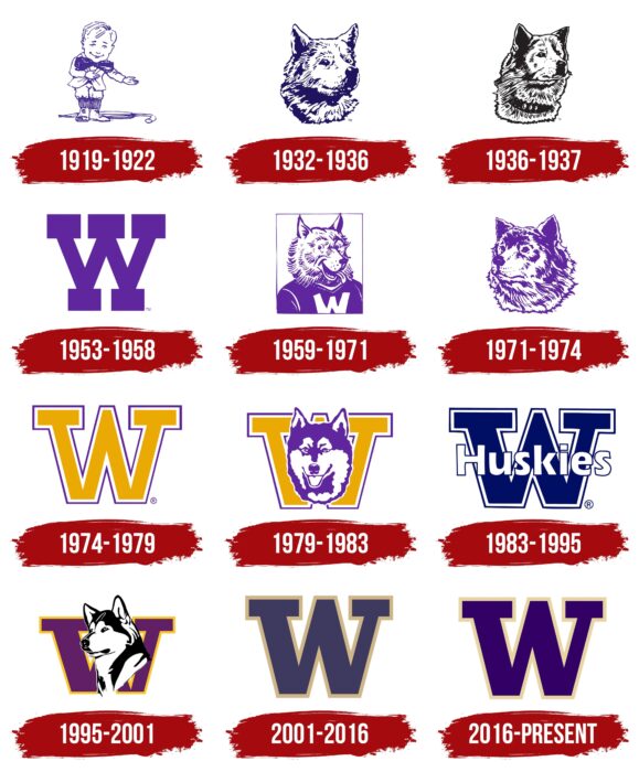
1919 – 1922
The athletic department’s debut logo consists of an image of a Sun Dodger and is related to the allusion to the rainy weather that most often prevails in Seattle. This is evidenced by the large umbrella thrown at the main character’s feet. The tiny little man is chosen as a mocking allusion to the region’s perpetual slush, so a snide smile wanders across his face. The figure is abstract but depicted realistically with outline lines. Sun Dodger has a large head and a disproportionately small body. The large purple bow tie is highlighted. In 1922, the student body thought the name and emblem were unrepresentative of the state, so they re-vote and chose the Huskies.
1932 – 1936
The logo depicts a dog presumably of the Husky breed, as it was at the time. The head is made in the style of chaotic strokes, from which the desired image is formed. The gaze of the university mascot is focused. Although the animal looks ahead, it seems that it wants to capture the attention of all its surroundings. The protruding ears indicate that the dog does monitor the situation, so it listens to what is going on around it.
1936 – 1937
The artists made the image cleaner by removing unnecessary strokes. They also painted the husky’s neck and “hung” a collar with awards on it. Black is used instead of purple.
1953 – 1958
This is a landmark period, as the athletic department first had a letter symbol. The “W” is large, solid, with smooth lines and serifs. They have the same shape and look like bricks. This impression is created because the serifs are not two but five: three at the top and two at the bottom, forming a platform for the letter. The designers brought back the purple color but made it lighter, almost like on the debut emblem.
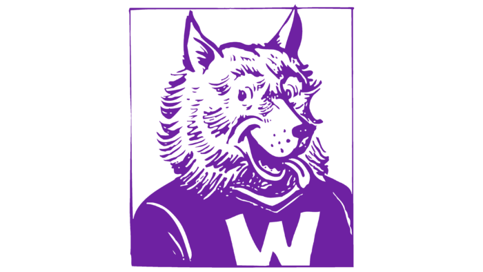
1959 – 1971
The Husky is presented in the style of a humorous caricature. The anthropomorphic animal smiles, sticking its long tongue out of its mouth, and looks to the left, although its head is turned to the right. The dog is wearing a dark purple sweater with a white “W” in the center.
1971 – 1974
After the redesign, the logo features a slightly modified version of the 1936-1937 Husky. The only thing that seriously differentiates these versions is the positioning of the head. After the adjustment, the dog looks to the left.
1974 – 1979
Again, the emblem is textual: it features a large gold-colored “W” with the lower protrusions cut off. The entire perimeter of the letter is bordered with a purple band placed on some separation. Only two of the five serifs remain.
1979 – 1983
In this version, the first letter from the name of the university and state is combined with a husky head. The dog is depicted in a different image, with a light-colored muzzle.
1983 – 1995
The athletic department adopted a new emblem in which the Huskies name is written in grotesque white script against a large “W” painted in dark purple. The letter’s structure has changed: due to the difference in serif length, it is not as proportional as before.
1995 – 2001
The color and size of the “W” have changed: the latter is smaller and repainted in lilac with a yellow edge. In its background is a black and white dog pointing to the left side. The Husky is drawn neatly, without a cluster of small disproportionate strokes.
2001 – 2016
The university has once again approved a logo without a graphic image. It featured only a text mark in a blue-purple hue and circled with a gold stripe.
2016 – today
The modern version of the visual identity consists of the former letter “W,” but now in purple, with a thin gold border.
University of Washington: Interesting Facts
The University of Washington (UW) in Seattle is renowned for its long history, academic achievements, and research contributions.
- Early Beginnings: Founded in 1861, UW is one of the oldest universities on the West Coast. It has branches in Tacoma and Bothell, expanding its reach nationwide.
- Cherry Blossoms: A highlight on campus is the Quad’s Yoshino cherry trees, which bloom beautifully in spring, drawing crowds for the stunning scenery.
- Research Leader: Recognized for its research efforts, UW ranks high among public universities for its research spending, making strides in medicine, oceanography, and environmental sciences.
- Nobel Laureates: Among its faculty and alumni are Nobel Prize winners, such as Linda B. Buck, who won in Physiology or Medicine in 2004 for discovering how we smell.
- Going Green: UW is dedicated to sustainability and is noted for its green buildings, recycling programs, and efforts to reduce carbon emissions.
- Husky Stadium: Known for being one of the loudest football stadiums, it also has a tradition of “sailgating,” where fans can tailgate on boats on Lake Washington.
- Community Engagement: UW emphasizes public service, with many students and alumni volunteering locally and worldwide, earning it recognition for its commitment to community service.
- Top Programs: The university offers top-ranked programs, especially noted for its medical school, College of Engineering, and School of Oceanography.
- Tech Partnerships: UW has strong connections with tech giants like Microsoft and Amazon, which provide students with internships and job opportunities and foster collaborative research.
- W Gates Hall: The law school building is named after William H. Gates Sr., celebrating the contributions of the Gates family to the university, including those by Microsoft co-founder Bill Gates.
With a beautiful campus and a dynamic academic environment, the University of Washington is a key center for education and innovation in the Pacific Northwest and beyond.
Font and Colors
The main factor that unites the academic seal, the university-wide logo, and the athletic sign is the corporate palette. Each features the original purple hue.
The University of Washington uses two types of Open Sans typeface, Regular and Bold. Preference is given to the serif versions. The official color scheme of the university is a combination of magenta and dark gold, which is also represented on the emblem.
University of Washington color codes
| Persian Indigo | Hex color: | #390068 |
|---|---|---|
| RGB: | 27 0 104 | |
| CMYK: | 45 100 0 59 | |
| Pantone: | PMS 2607 C |
| Sunset | Hex color: | #f0d4a1 |
|---|---|---|
| RGB: | 240 212 161 | |
| CMYK: | 0 12 33 6 | |
| Pantone: | PMS 155 C |

