


![]() USAL Logo PNG
USAL Logo PNG
Deep historical roots are evident in the university’s emblem. The USAL logo represents the institution as a repository of extensive knowledge about the country’s past and present, which is passed on to students through its educational programs.
The University of Salamanca was founded in 1218 by Alfonso IX of León, who gathered scholars in a city positioned on major trade and pilgrimage routes. Early teaching focused on grammar, logic, theology, and law.
In 1254, Alfonso X granted privileges that secured funding and autonomy. In 1255, Pope Alexander IV recognized Salamanca as a Studium Generale, thereby validating its degrees across Europe. By the late 13th century, it ranked among the leading institutions alongside Bologna, Paris, and Oxford, a status noted by Pope John XXII in 1316.
The 15th and 16th centuries marked the peak of influence. Under Ferdinand of Aragon and Isabella of Castile, the university expanded and built its plateresque façade, which became its enduring symbol. In 1492, Antonio de Nebrija published the first grammar of the Castilian language in Salamanca, shaping linguistic standardization during Spain’s imperial expansion.
Between 1526 and 1546, Francisco de Vitoria developed ideas on international law and the rights of peoples that later influenced modern legal thought. The Enlightenment and the 19th century brought disruption. The Inquisition restricted academic life, and the Napoleonic wars damaged buildings. The 1845 Pidal reforms centralized university control but preserved Salamanca’s status.
From 1900 to 1914, Miguel de Unamuno served as rector, turning the university into a center of intellectual debate. In 1936, during the Spanish Civil War, his public speech led to his removal. Under Francisco Franco, the institution operated under ideological limits, though it retained academic activity. After 1975, with Spain’s transition to democracy, Salamanca re-established its international academic role.
Meaning and History
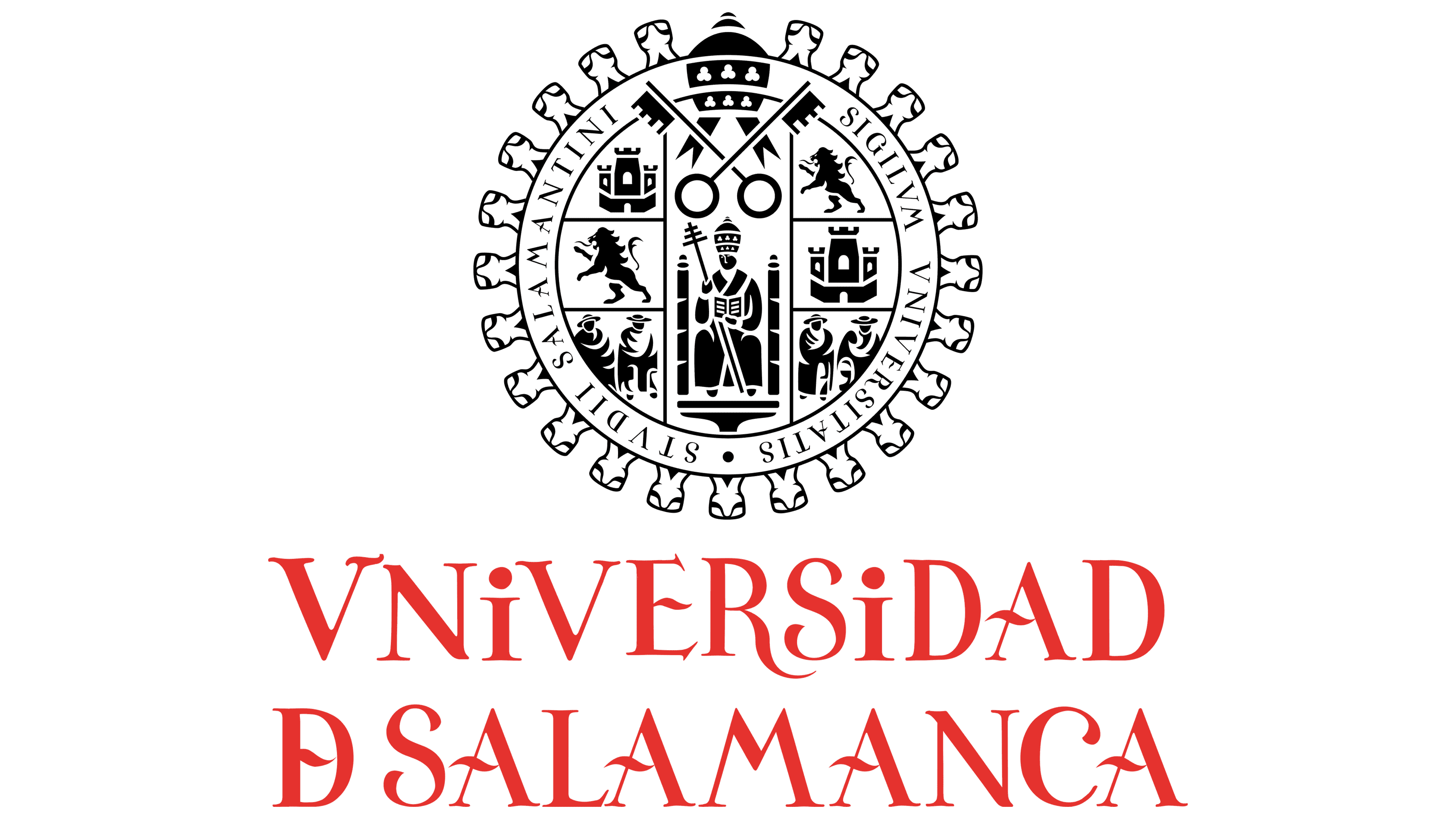
Ranked among the oldest universities globally, USAL is distinguished by an emblem featuring its name in a distinctive typeface and a round shield. An authentic logo is the university’s name, presented in two tiers: the first, “Universidad”; the second, “D Salamanca.” Both words are printed individually in red.
Compositionally, they are conceived so that the initial letter meaning “U” is interpreted as the Roman number “V.” Another striking feature is the presence of two miniature lowercase “i” s among the uppercase letters. They effectively stand out from the rest, adding originality to the emblem.
What is USAL?
USAL is the abbreviated name for the University of Salamanca in Spain. The university is located in the Castile and León commune, where King Alfonso IX founded it. It is considered one of the world’s oldest, having been established in 1218. The name of King Solomon inspires the name.
The next nuance is an elongated wavy crossbar for all the “A” symbols. Such a graphic technique is played very interestingly because, in a nutshell, there are several of these letters. The “D” has a similar element.
In 2018, for the university’s 800th anniversary, a festive sign was developed and used for a limited time, only in the anniversary year. It was named “USAL 800 Year Seal” and is used on special occasions. Reflects the connection between the university’s traditions and the future. Its author is Miquel Barcelo.
The logo depicts the abbreviation “USAL” as two dragons, emphasizing the university’s connection to antiquity. Below them are the inscriptions “800 anos” and, even lower, “1218-2018”. Moreover, this sign exists in several versions.
Font and Colors

The logo is based on ancient symbols around the knight’s shield, set against the battlements of an ancient fortress. It is divided into several parts: a central section depicting the king sitting on a throne, and six sides (right and left) depicting lions, subjects, and castles. Above them are two crossed keys and a crown, as a direct confirmation of the monarchy’s connection. Around the graphic elements is the phrase “SIGILVM VNIVERSITATIS STVDII SALAMANTINI” in uppercase.
For the inscription, the designers used two fonts: Gloss Drop and the corporate Helvetic Neue. They also wrote the university’s motto in Spanish, “Deciamos ayer y diremos mañana,” which is present in some versions.
The modern color of the graphic sign is silver-gray, but it was once copper-brown. In addition to them, the corporate palette includes yellow, blue, orange (in early versions), and red (which appeared later).