 University of South Florida Logo PNG
The University considers learning as an integral part of life and development. Education provides a foundation for future careers and allows you to benefit your homeland. The USF logo shows the importance of persistence and perseverance along the way.
USF (University of South Florida): Brand overview
USF is an acronym for the University of South Florida, Florida’s leading R1 research and educational institution. It is the eleventh-largest institution of higher education in the United States. The university has 14 colleges where students earn more than 200 degrees at four levels of study – bachelor’s, master’s, specialist, and doctoral. USF is characterized by high research activity: faculty, alumni, and students hold a total of about 2,400 patents. The university is also home to the National Academy of Inventors, the Florida Inventors Hall of Fame, and athletic teams. Their representatives participate in the American Athletic Conference and compete in NCAA Division I. The university is located in Tampa, with branch campuses in St. Petersburg and Sarasota. The year of its opening is 1956.
The University of South Florida was the first university built in the 20th century. Its ancestor is considered Samuel Gibbons, a politician who represented the interests of the state in the U.S. Congress. He succeeded in getting a modern university to appear on the site of the former Henderson Airfield, which was in operation during World War II. Although it was founded in 1956, it was officially named later, and classes did not begin until 1960. The first graduation took place in 1963. Now, this institution is recognized as the most prestigious in the system of public universities in the south of the country, so its affiliation is recognized in all corners of the world.
Meaning and History
The university-wide emblem is associated with the image of a golden Brahman, later renamed a bull. It was chosen as a mascot by the students who voted for it in 1962. Since then, he has accompanied most of the university’s official paraphernalia, including the emblem. The bull’s head with steep horns is harmoniously stylized as the first letter of the USF name. The front of the insignia has several transitions, diagonal lines, and cuts that resemble the muzzle of a hoofed animal. The horns point upward. They are rounded and broadened at the base but taper closer to the top. The symbol is outlined with a thin strip of golden color.
On the right side is the phrase “University of South Florida.” It is divided into two lines and aligned on the left side. At the top is “University of,” and at the bottom is “South Florida.” The main emphasis is on the second line: large, bold type is used there, while the letters in the first line are small and thin.
The USF seal has a round shape and a classic structure. It consists of two main components: the center and the border. The center, highlighted by a golden-beige ring, depicts a transparent globe. On it is the North American continent, and on top of it is a wide grid of parallels and meridians. This object is located on the right side. On the left is a makeshift sun. It has a round center surrounded by a white crown. From it, in different directions diverge large rays. They are long and prickly. This image emphasizes the hot climate of the region where the university is located.
The educational significance of USF is evidenced by the lamp at the bottom, from which a flame bursts. It takes center stage between two ribbons with the inscriptions “TRUTH” and “Wisdom.” All surrounds a wide, light-colored ribbon with the name of the university and the year of its establishment. The inscription is in thin capital letters with tiny serifs.
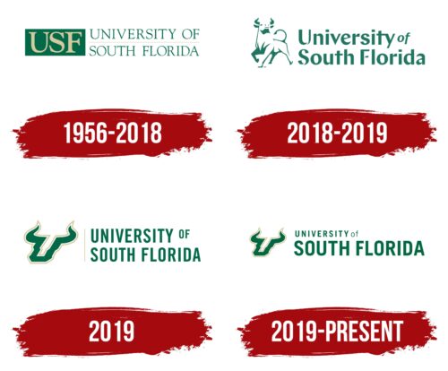
1956 – 2018
The old academic logo of the University of South Florida consisted of two parts. About a third of the space was taken up by the abbreviation “USF” in a dark green vertical rectangle. The letters themselves were golden and dynamic due to the contrasting font, which had large and small strokes of different thicknesses.
To the right was a word mark – the inscription “UNIVERSITY OF SOUTH FLORIDA,” divided into two lines. This phrase was typed in uppercase glyphs with narrow and long serifs. For the full name of the university, the designers used the same dark green color as for the quadrangle, and between the two levels, they drew a long horizontal line in gold color.
2018 – 2019
The new logo debuted in September 2018 to great response from USF students and alumni. The public did not like the lime green bull, which was depicted in a minimalist style using a negative space effect and was very reminiscent of the Merrill Lynch logo. The name of the educational institution was written on the right, for which the designers chose a non-standard font. The name of the university consisted of asymmetrical sans-serif letters. The capital letters “U,” “S,” and “F” with empty spaces, as well as the italicized preposition “of,” stood out the most.
It is known that at first, it was planned to use the iconic symbol of Bull U sports teams for the logo of the University of South Florida. But then the concept changed, and it was decided to create a new drawing from scratch. The animal’s pose was inspired by sculptures located on various campuses. The regal pose is from the bull from Tampa, the curled tail is from USF Sarasota-Manatee, and the upturned head is from USF St. Paul. The university had already changed its logo once before in March 2019, costing nearly $8,000. The redesign process took five months, but in the end, it turned out that the unloved bull remained, and only the shape of the tail and the location of the hind leg changed.
2019
On May 6, 2019, it became known that the University of South Florida was ready to return to its classic green-and-gold color palette and abandon the logo unloved by students and alumni. Instead, it was decided to use the Bull U emblem made famous by USF sports teams. In the original version, the horned letter “U,” stylized as a bull’s head, was located in the left part, and the name of the institution occupied the right part. The letters in all words, with the exception of the diminutive preposition “OF,” were the same size. They were bold and elongated vertically. A gold-colored demarcation line ran between the text and the emblem.
2019 – today
Not a few months passed before the designers released the logo again. In the new version, the inscription appeared with a more varied font. The largest is now the phrase “SOUTH FLORIDA” in the second line. The word “UNIVERSITY” is half the size, and the preposition “of” is almost invisible as it is written in small and thin lowercase letters. Separating vertical stripe in this version of the emblem is absent.
USF (University of South Florida): Interesting Facts
The University of South Florida (USF), based in Tampa with additional campuses in St. Petersburg and Sarasota-Manatee, was founded in 1956. It’s known for its academic research, innovation, and education.
- Growth: Starting with a focus on South Florida’s students, USF has become the state’s fourth-largest public university by enrollment.
- Research: USF is a top-tier research university that excels in health sciences, engineering, marine science, and sustainability.
- Mascot: Their sports team, the Bulls, symbolizes the university’s spirit and competes in NCAA Division I.
- Campus: The Tampa campus is known for its modern architecture and the USF Health complex, which contribute to healthcare research and education.
- Patents: USF stands out globally for its innovations and the number of U.S. patents it has received, highlighting its role in fostering new ideas.
- Sustainability: The university is committed to reducing its environmental impact and is recognized for its energy-efficient buildings and green initiatives.
- Global Engagement: The university promotes global engagement through its USF World program and offers numerous study-abroad opportunities.
- Preeminence: In 2018, USF was designated as a “Preeminent” state research university, a mark of its excellence in research, student success, and faculty achievements.
- Moffitt Cancer Center: This top-notch cancer research and treatment center on the Tampa campus collaborates with USF, providing valuable opportunities in oncology.
- Alumni: USF’s alumni have significantly impacted various fields, including astronauts, politicians, CEOs, and professional athletes.
USF’s dedication to innovation, research, and nurturing student success has made it a significant force in higher education. It pushes knowledge forward and contributes to the community and beyond.
Font and Colors
The primary basis for all USF visual identification marks is a Florida breed of bull called the Golden Braman. The bull was specifically chosen because animal husbandry is a major economic driver in the region. The first vote for the mascot was in 1962; the next vote was in 1980, when everyone realized the mistake in the name that made the teams look bad.
The USF seal uses the Univers family font, otherwise Garamond. A custom font is also present. The official colors of the university are green and gold. They are used in all versions of the university’s identity.
USF (University of South Florida) color codes
| Bottle Green | Hex color: | #006747 |
|---|---|---|
| RGB: | 0 103 71 | |
| CMYK: | 100 0 31 60 | |
| Pantone: | PMS 3415 C |
| Lion | Hex color: | #cfc493 |
|---|---|---|
| RGB: | 207 196 147 | |
| CMYK: | 0 5 29 19 | |
| Pantone: | PMS 4535 C |


