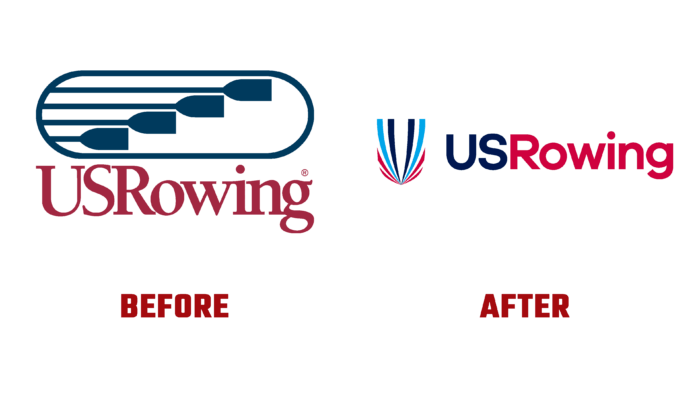
In 1982, a non-profit, membership-based organization, USRowing, was formed to select, train, and manage US rowing teams. As a national governing organization, it effectively works with teams representing the country in various international competitions, world championships, and the Olympic Games. The brand has successfully promoted sports for over 40 years, providing membership, reaching juniors and students, masters, and fans of outdoor activities, fitness, and competitive games. The previously created image is already obsolete and requires changes by the requirements of the time and the need to reflect the changes that have occurred over the years of existence and demonstrate new goals and prospects for further development. Today, the brand has taken on a new modern identity, characterized by flexibility and no restrictions in use, thanks to the use of modern technologies in design and media.
The new identity demonstrates a transitional moment in the organization’s history, providing a complete reflection of the ongoing changes. The new visual representation of the brand to its audience creates the desired impression of the structure of its hospitality, attracting more attention from athletes and amateurs. USRowing offers itself as a leader and banner for the entire American rowing community, committed to a common cause, with a shared vision of the sport’s future, inclusion, and success. Simultaneously, the visualization maintains the organization’s commitment to its unique and compelling story.
The use of dynamics brings the developed icon to life, showing a boat with rowers confidently splitting the water surface and spreading ripples along its surface. The full-color version of the badge looks especially impressive. The text element used in the logo – the organization’s name- is solid and durable. The main accent is taken by the letter “R,” standing out brightly against the general background. At the same time, the wordmark is also particularly attractive in full color. Athletes’ uniforms clothing bearing the emblem are very beneficial, providing a variety of new interpretations of the emblem when worn. For example, the stretchy logo slightly changes the image on socks, making it even more cute and attractive. The new identity turned out to be spectacular and attractive, reflecting sportiness and modernity in a purely American way.


