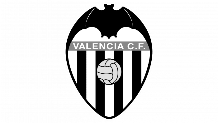
Footballers playing under the Valencia logo have wings. They fly across the field without losing the ball from their “embrace.” They are helped by love for their native land and football. The emblem shows self-confidence and readiness to fight back against anyone who tries to take the championship.
Valencia: Brand overview
| Founded: | 18 March 1919 |
| Founder: | Peter Lim |
| Headquarters: | Valencia, Spain |
| Website: | valenciacf.com |
Meaning and History
The bat, which received the status of the club’s main symbol, was originally depicted on the coat of arms of King James I of Aragon. There are two versions of its origin. According to one of them, she sat on the top of the flag when the king liberated Valencia’s city from the Moorish invaders. According to other assumptions, there were many bats in that area, which served as an inspiration for the authors of the royal coat of arms.
As a result, this animal became part of the state symbols, and from there, it migrated to the Valencia football club’s emblem. Moreover, the first logo came complete with a red and yellow striped diamond and a gold crown, taken from the city’s heraldic shield. They complemented the black letters “C,” “V,” and a large light brown soccer ball.
What is Valencia?
Valencia – a shortened name for Valencia Club de Fútbol. This is a professional soccer team from Spain that participates in La Liga. It was established in 1919. The club has achieved considerable success domestically. Internationally, it has won the UEFA Intertoto Cup, UEFA Cup Winners’ Cup, and UEFA Cup once each, and the UEFA Super Cup and Inter-Cities Fairs Cup twice each.
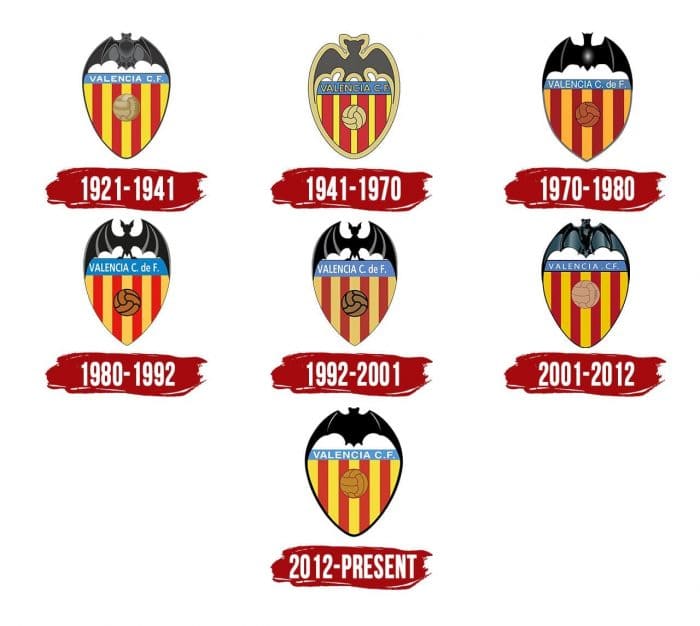
1921 – 1941
This emblem is based on a previous version that appeared in the first year of the club’s existence. Above is a gray-black bat (before that, it was completely black), and below is a triangular coat of arms. Directly below the animal is a blue rectangle with the words “Valencia C.F.” On the logo of 1919-1920. the quadrangle was purple and contained the letters “V. C. F.” (from Valencia Football Club).
The shield’s inside is lined with the same stripes as the rhombus was decorated on the city coat of arms. There are only nine of them: five yellow and four red. In the center, there is a soccer ball, the design of which has hardly changed. At the Valencia club in 1921-1941. there was one unpopular logo that looked like a simplified version of the basic graphic. The artists changed the proportions and colors of the elements, but the experiment was unsuccessful.
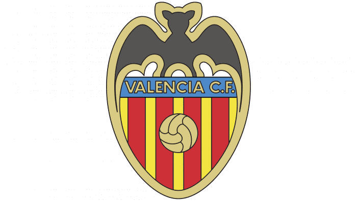
1941 – the 1970s
The logo, adopted in 1941, is very similar to the one created in 1921. They have a lot in common: the same tapered yellow lines on the shield, wide contours, and a minimalistic bat. Only the primary colors differ.
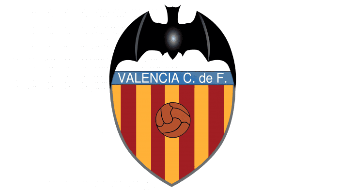
the 1970s – 1980s
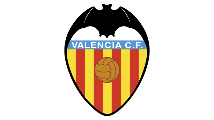
For the first time, the bottom of the shield became pointed. The lettering in the blue rectangle has changed because Valencia Football Club has been renamed Valencia Club de Futbol. The palette has shifted to a darker one, especially noticeable in the brown ball and burgundy vertical lines. The wide light yellow stroke is gone. The designers have also updated the bat, giving it an elegant shape and embellishing the black silhouette with white and gray highlights.
the 1980s – 1992
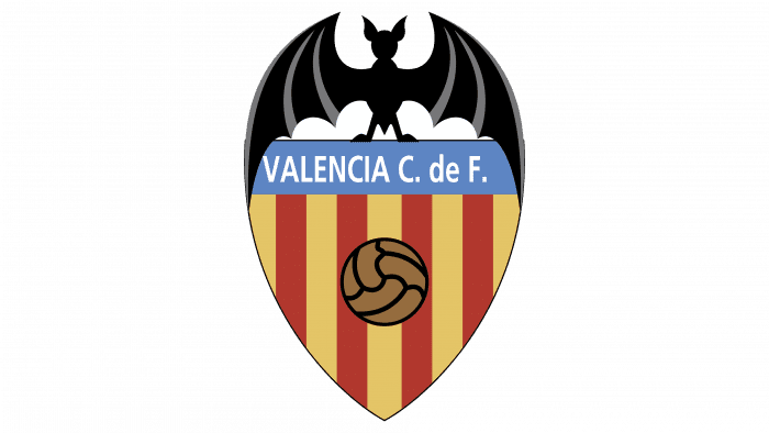
In the new version of the emblem, the bat stands on the shield, touching it with the tips of its wings. She is depicted in a cartoon style, although the artists have done without detail. The coat of arms is slightly stretched downward, due to which the inscription has more space. The colors are expressionless, pale, muted.
1992 – 2001
The light blue rectangle containing the name of the club has turned dark blue. The Valencia owners decided that more global changes would be redundant.
2001 – 2012
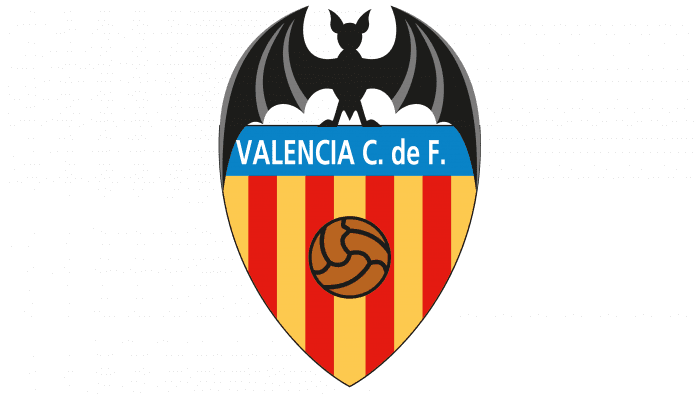
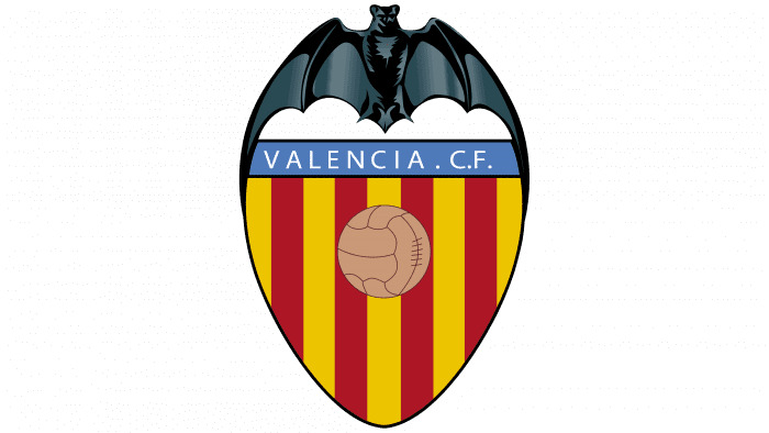
From 2001 to 2012, the team used an improved logo that was structurally similar to previous versions. The bat on it is depicted quite realistically: the artists paid attention to the anatomical details. The shield is enlarged, the colors are brighter.
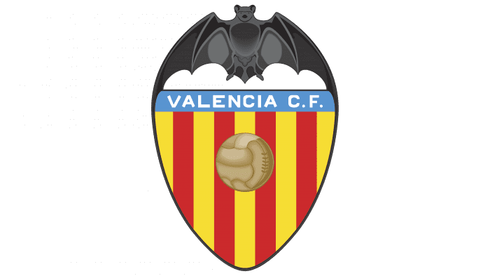
2012 – today
The latest Valencia graphic contains all the same elements: a bat, a soccer ball, the club’s name, and a triangular shield with yellow and red stripes.
Valencia: Interesting Facts
Valencia Club de Fútbol, also known as Valencia CF or just Valencia, is a big deal in Spain’s football world.
- Starting Out: Valencia CF began on March 18, 1919. Soon after, they played their first game against Valencia Gimnástico, which was the start of their long and exciting story.
- Their Stadium: They play at Estadio Mestalla, a very old and famous stadium that opened in 1923. It’s known for being loud and exciting.
- Winning in Spain: Valencia has won the Spanish La Liga several times over the years, showing they’re one of the top teams in Spain.
- Doing Well in Europe: They’ve won big European tournaments like the UEFA and Winners’ Cup. They made it to the UEFA Champions League final two years in a row but came in second both times.
- Copa del Rey: They’ve also won the Copa del Rey, Spain’s big cup tournament, several times, proving they can take on the best teams in Spain.
- Famous Players: Valencia has produced many great players, such as Mario Kempes, David Villa, Gaizka Mendieta, and Santiago Cañizares.
- Symbols: Their symbol is a bat, which is important to the city of Valencia. They’re also associated with oranges because that’s a big thing in their region.
- Training Young Talent: Valencia is known for its great youth academy, the Academia VCF, which has trained many successful players.
- Money Problems: In the 2000s, Valencia had money troubles and had to deal with changes in who owned the club and some debt, but they’ve stayed strong through it all.
- Helping Out: Valencia isn’t just about football. They do a lot of good work in the community, like health, education, and sports projects, to help make the world a better place.
Valencia CF has a special place in football with its big wins, dedicated fans, and famous stadium. They’ve had ups and downs but remain one of the most loved clubs.
Font and Colors
The bat is the main symbol of the region and has been used in local heraldry for several centuries. Therefore, any claims by DC Comics that the Spanish club’s logo looks like an image of a winged superhero named Batman has no real basis.
Red and yellow stripes on the shield can also be interpreted in different ways. On the one hand, they resemble the colors of the ancient Catalan flag of Senyera. But in fact, this pattern was taken from the coat of arms of the city of Valencia.
The name of the club is in simple chopped type. The inscription is unremarkable and is lost against the background of graphic elements. The emblem is really very bright and colorful: the list of colors used includes black (# 000000), yellow-orange (# D18816), red-orange (# AA2D2A), red (# EE3524), yellow (# FFDF1C) and light blue (# 0097D7).
Valencia color codes
| Light Blue | Hex color: | #0097d7 |
|---|---|---|
| RGB: | 0 151 215 | |
| CMYK: | 100 30 0 16 | |
| Pantone: | PMS 801 C |
| Yellow | Hex color: | #ffdf1c |
|---|---|---|
| RGB: | 255 223 28 | |
| CMYK: | 0 13 89 0 | |
| Pantone: | PMS 108 C |
| Red | Hex color: | #ee3524 |
|---|---|---|
| RGB: | 238 53 36 | |
| CMYK: | 0 78 85 7 | |
| Pantone: | PMS Bright Red C |
| Red-Orange | Hex color: | #aa2d2a |
|---|---|---|
| RGB: | 170 45 42 | |
| CMYK: | 0 74 75 33 | |
| Pantone: | PMS 711 C |
| Yellow-Orange | Hex color: | #d18816 |
|---|---|---|
| RGB: | 209 136 22 | |
| CMYK: | 0 35 89 18 | |
| Pantone: | PMS 144 C |
| Black | Hex color: | #000000 |
|---|---|---|
| RGB: | 0 0 0 | |
| CMYK: | 0 0 0 100 | |
| Pantone: | PMS Process Black C |

