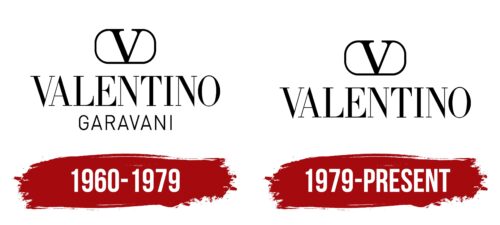
The iconic Valentino logo is as stylish as the clothing it adorns. Refinement, grace, creativity – all are reflected in it, like in a crystal clear mirror of His Majesty High Fashion. Even the sharp lines and angles do not detract from this impression because everything in the emblem is harmoniously balanced.
Valentino: Brand overview
Meaning and History
Italy is one of the world-recognized bastions of fashion. This is facilitated by nature itself, climate, temperament, and refined creativity. It was in such conditions that the Valentino fashion house emerged. It appeared in 1960 and was named after its founder – Valentino Garavani. In the early years, both the name and surname of the designer were used in the logo, but over time, the brand became so recognizable that the surname was no longer needed in the emblem. Fans of his mastery only needed to glance at the label with the expressive “V” to understand the author of the garment.
This victory sign was first shown to the world in 1967 at the show of the “colorless” collection. Until then, it did not exist. Overall, the great designer was a pioneer in using logos on clothing prints and in decorating hardware and accessories: the maestro placed the first letter of his name everywhere and did so unobtrusively.
What is Valentino?
Valentino is an Italian fashion house founded by Valentino Garavani with the support of Giancarlo Giammetti. The fashion company began its work in Rome in 1960, debuting with a personal collection in Florence in 1962. Its most grandiose show at the start of its career took place in 1967. It was called Valentino White: all the clothing was made from white, beige, and cream fabrics, distinguished by incredible spiritual purity, as it lacked the psychedelic patterns fashionable at the time.
1960 – 1979
The first characteristic of the Valentino logo is its monochrome. It was chosen deliberately, as the owner of the fashion brand adhered to the principle of minimalism in color at the beginning of his career. Not surprisingly, his early clothing collection was presented in a “no colors” style. White is the perfect background for black, so the designers made the inscriptions dark. With this combination of colors, regardless of thickness, the glyphs look clear and expressive.
The trade name is divided into two levels, as it includes both the name and surname of the Italian designer. The first line is the largest: the word “Valentino” is in bold font in uppercase. The letters consist of lines of varying thickness, adding elegance. Some have thin serifs, while others end in sharp, needle-like tips. The inscription in the second row is less striking: it is set in a thin sans-serif and centered. Above them flaunts the iconic “V” sign with elongated serifs that form almost a complete oval. It schematically resembles an imperial crown, as the founder of the fashion brand is often called the emperor of fashion.
1979 – today
The former owner’s surname disappeared from the logo, as by that time, the information was no longer relevant. The single word “Valentino” perfectly fulfills the function of representing the brand, as by then, it was well known around the world even without the specification “Garavani.” Otherwise, everything remained in its original form – the monochrome, the pointed letters, the thin serifs, and, of course, the unique element in the form of the victory sign – “V.”
Font and Colors
The text in the Valentino emblem is set in Italian Didot font. Designer Bob Alonso developed it, and it was first published by BA Graphics. Its free alternative is Bodoni FLF by Casady & Greene. Later, a new typeface with serifs, NT Valentino, was created based on the original style.
The palette of the fashion house’s visual identity is distinguished by monochrome, as the designer adored single-color schemes, which is clearly evident in his collections. Black inscriptions on a white background look simple but impressive.


