


![]() Vancouver Whitecaps FC Logo PNG
Vancouver Whitecaps FC Logo PNG
The FC Vancouver Whitecaps logo primarily symbolizes the club’s association with Vancouver, featuring a stylized depiction of snowy mountains against the ocean. The logo’s graphic represents the region’s nature, the club’s history, and its victories and achievements.
Vancouver Whitecaps FC is a Canadian professional club competing in Major League Soccer. The “Whitecaps” name first appeared in 1973 with the NASL team that played until 1984. It was coined by Denny Veitch, the club’s first general manager, after he drove across the Lions Gate Bridge and noticed the white caps on the Pacific Ocean and the snow-capped mountains above. The image tied the team to the region’s landscape and gave it a distinct identity from the outset.
After the original NASL folded, professional soccer in the city continued under a new structure. In 1985, operations began through the West Coast Soccer Society, and in 1986, the team entered competition as the Vancouver 86ers. The name referred to the founding year, the group of 86 initial directors, and the year Vancouver was incorporated in 1886. Many figures connected to the earlier Whitecaps remained involved, including shareholders and technical staff, while Tony Waiters, Les Wilson, and Dave Fryatt secured the rights to operate a franchise under the Vancouver name.
Through the 1990s, the club moved across leagues following the collapse of the CSL, joining the American Professional Soccer League and later competing in the A-League and USL-1. In 2000, after public support and the purchase of naming rights from former NASL director John Laxton by owner David Stadnik, the 86ers reverted to Whitecaps. Greg Kerfoot became the owner in 2002, added “FC” in 2003 to reflect a broader club structure with men’s, women’s, and youth programs, and in 2006, the official name became Vancouver Whitecaps FC. An MLS expansion franchise was awarded in 2009, with league play beginning in 2011 under an ownership group that includes Greg Kerfoot, Steve Nash, Jeff Mallett, and Steve Luczo.
Meaning and History
![]()
From 1974 to 1984, the team competed in the North American Soccer League and had two different logos. The first Whitecaps logo presented the “Whitecaps” as a Canadian soccer club. Essentially, a red and white soccer ball with a Canadian maple leaf in the center and the team’s name on top was the face of the “Whitecaps” until the second logo appeared. In the first version of the Whitecaps logo, the red and white colors were replaced with blue and white. The second face of the club brought a soccer ball to Vancouver, carried by blue-and-white waves. The “Vancouver Eighty-Six” team wore a red-and-yellow crest until it was revived, then returned to blue and white. The Whitecaps are once again revived this time in MLS, where, in 2010, the team will start a new chapter in its history.
What is Vancouver Whitecaps FC?
Vancouver Whitecaps FC is a professional soccer team from Canada, a member of MLS, and a participant in the Western Conference. Founded in 2009, the club began its sports career in 2011 as the league’s seventeenth franchise. The club’s owners are Jeff Mallett (also the chairman of the board of directors), Greg Kerfoot, Steve Luczo, and Steve Nash.
1995 – 2000
![]()
When the team was called the Vancouver Eighty-Sixers, it had several logos. One of them depicted a flying soccer ball intertwined with a red net. Apparently, the artists conveyed an accurate shot of the opponent’s goal. The force with which the ball literally tears the net speaks of the players’ determination and immense will to win.
The emblem represents the Vancouver Eighty-Sixers as an indomitable club, particularly Canadian, with a palette that includes the country’s official colors: red and white. The words from the team’s name are positioned above, to the right, and to the left of the ball, allowing the emblem’s affiliation to be identified.
2001 – 2010
![]()
In the early 2000s, Vancouver Whitecaps FC had another emblem featuring a ball. But it wasn’t flying towards the goal; instead, it floated on the water. Waves carried it, the very “whitecaps” referred to in the team’s nickname. Designers decided not to leave the ball in a space, so they placed it on a drop-shaped shield and added the inscription “WHITECAPS.” The letters vary in size, transitioning from larger to smaller, creating the impression that the word gradually decreases in size.
2011 – today
![]()
On June 8, 2010, it was officially announced that the club would continue to use the “Whitecaps” name in MLS, but with an updated logo for “Vancouver Whitecaps.” The logo has an irregular shape: three diamonds, one overlapping the other two. The team’s full name is positioned opposite the geometric shapes. The font is classic, sans-serif. The word “Whitecaps” appears under “Vancouver,” just as in the original ’70s logo.
The FC “Whitecaps” logo features broad white stripes. They form three angles pointing upwards. The intention is that these represent the snow-capped mountains to the north of Vancouver. The same angles, but pointing downwards, are under the inscription “Vancouver Whitecaps FC.” This is a mirror reflection of the white waves of the Pacific Ocean to the west. The deep blue background (“deep sea”) represents the maritime landscape of the Vancouver area.
The new emblem of the Vancouver Whitecaps embodies the natural landscape and the club’s rich history. The logo uses a light blue (“Whitecaps blue”) that refers to the primary color of the original “Whitecaps” roster, the winners of the 1979 Soccer Bowl. The silver outline pays tribute to the team’s championship victories since 1974.
Font and Colors
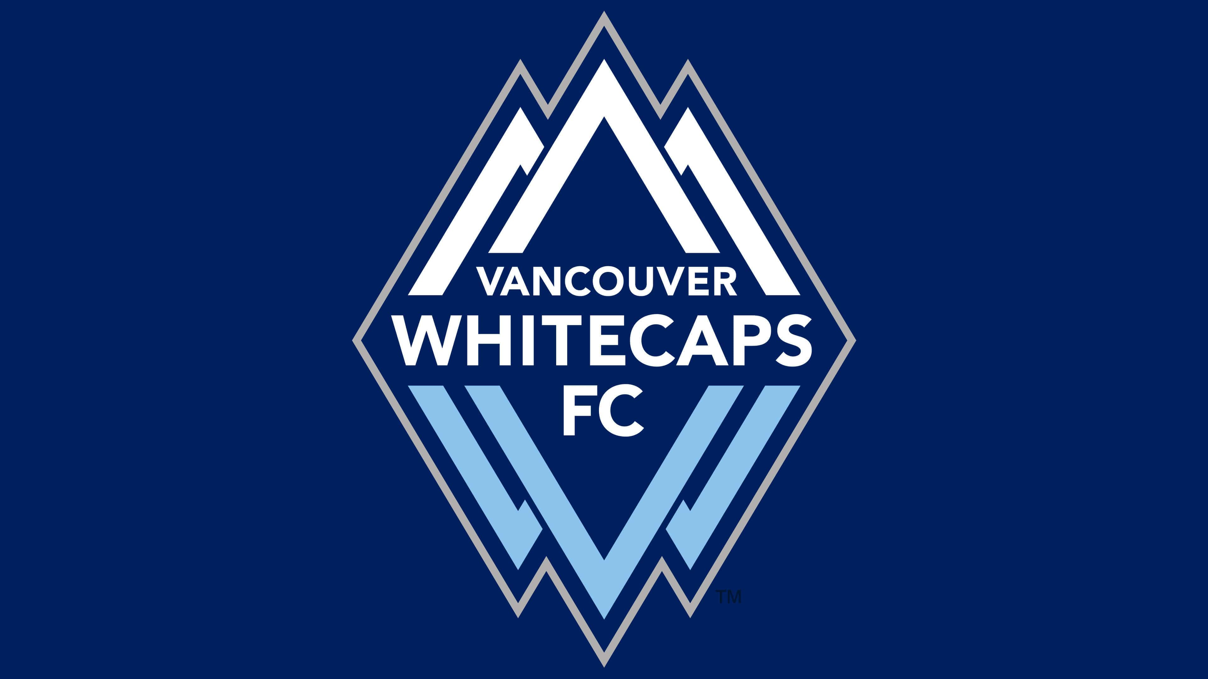
The modern logo depicts the very mountains that inspired the club’s first general manager to coin the original nickname “Whitecaps.” The three white triangles at the top symbolize the sharp mountain peaks. Identical figures, in blue only, are located at the bottom. According to the authors, this is the mirrored reflection of the snow-capped peaks on the water’s surface. And not just any water, but the vast expanses of the Pacific Ocean, which washes the city’s western coast.
The second most important element of the logo is the inscription “VANCOUVER WHITECAPS FC.” The font used is based on Avenir Black or resembles it: they have much in common, including the characteristic placement of strokes and lack of serifs.
The colors correspond to those of the main graphic elements. For instance, Deep Sea Blue (#04265C) is associated with the oceanic landscape, while Whitecaps Blue (#94C2E4) refers to the reflection of mountain peaks in the Pacific Ocean. To complete the picture, they are supplemented by two more colors: white and silver (#84868C).