


![]() Vans Logo PNG
Vans Logo PNG
The Vans logo embodies the spirit of freedom, movement, and creativity that defines the brand’s essence. It strongly connects to street culture, where individuality and style are celebrated. Originally focused on crafting durable and comfortable footwear for skateboarders, Vans has evolved into a symbol of subcultures, inspiring experimentation and self-expression. The emblem unites those who value comfort, style, and the courage to be authentic.
Vans began on March 16, 1966, when Van Doren Rubber Company opened its first store in Anaheim, California, founded by Paul and Jim Van Doren with Gordon Lee and Serge D’Elia. On the first day, 12 pairs were sold, all made on-site.
The early model relied on local production, allowing customers to order shoes in the morning and pick them up the same day. The brand became known for its waffle sole, which improved grip and durability.
In the early 1970s, Vans gained traction among skateboarders in Southern California, shaping its further development. In 1976, the company worked with Tony Alva and Stacy Peralta to create model #95, later known as Era, designed specifically for skateboarding.
By 1977, Vans introduced Old Skool and Sk8-Hi. Old Skool featured the “Jazz Stripe”, which became a recognizable design element across the brand’s products.
In 1982, Vans began international expansion but filed for bankruptcy in 1984 due to financial pressure. After restructuring, it continued operations and was sold in 1988 to McCown De Leeuw & Co.
During the 1990s, Vans supported skateboarding culture and launched the Vans Warped Tour in 1995. In 2004, VF Corporation acquired the brand for $396 million.
From 2010 to 2015, Vans expanded its apparel and collaborations. Between 2016 and 2020, it marked its 50th anniversary and increased partnerships with artists and brands.
Meaning and History
![]()
This brand is widely known among youth and athletes. This is because it was initially oriented towards those who lead an active lifestyle – primarily skateboarders. Even its first logo first appeared on a skateboard, and only then was it depicted on shoes.
What is Vans?
Vans is a company that produces clothing and shoes for skateboarding, but does not associate itself only with this sport. It offers fashionable accessories and wardrobe items for everyone who leads an active lifestyle. The company was founded in 1966 by three friends and was named after one of them: Van Doren Rubber Company. After becoming popular, it was renamed The Van Doren Rubber Company.
1966 – today
![]()
Vans’ debut logo was created by 13-year-old Mark Van Doren, the son of one of the company’s founders. He made a stencil to paint skateboards. James Van Doren immediately noticed this graphic sign and placed it on the heel of the Style 95 sneakers. After that, the company’s owner decided to pursue the production of skateboarding shoes more seriously.
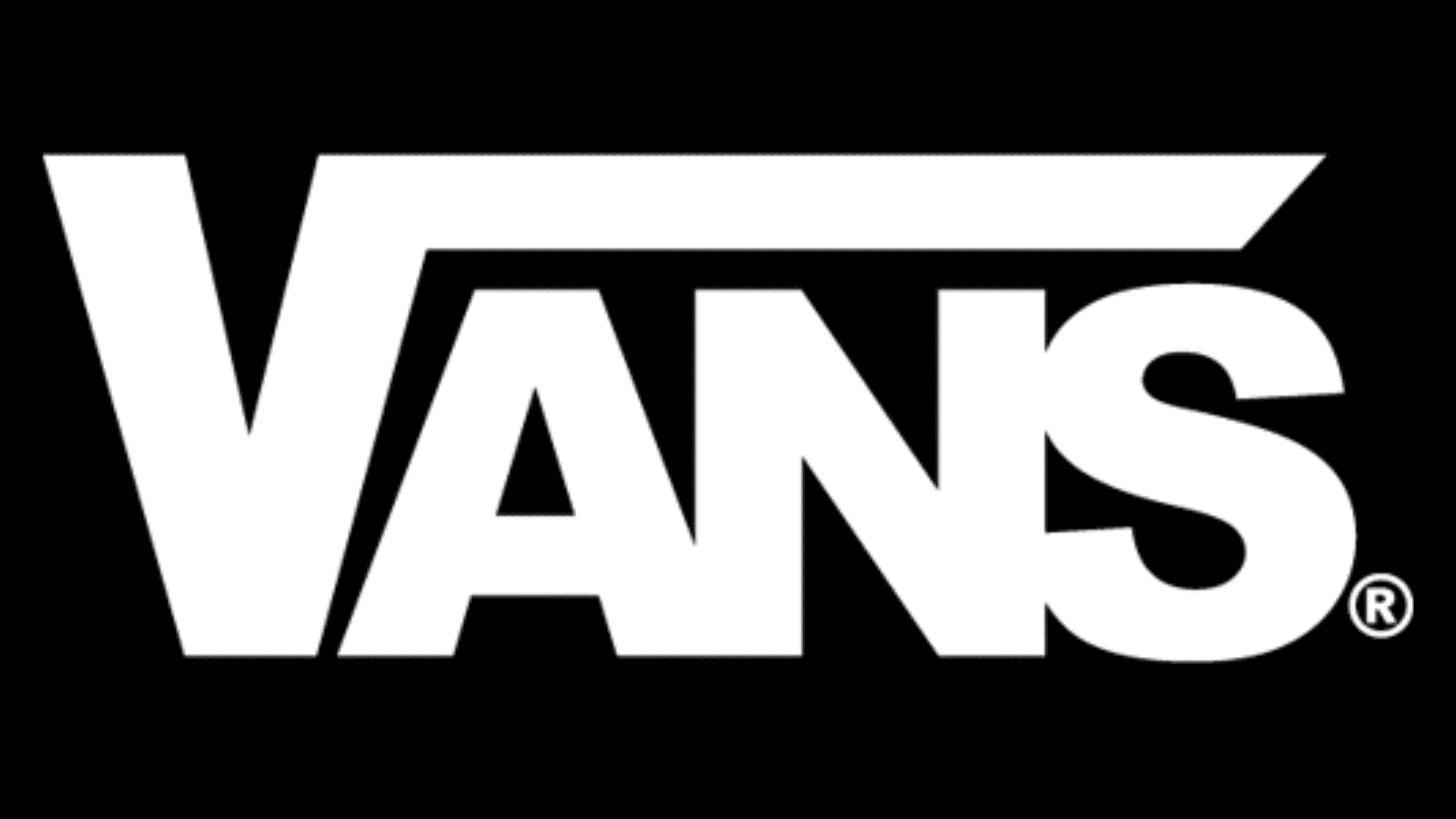
The logo contains the word “Vans,” which looks unusual because of the long horizontal line over the letters “A,” “N,” and “S.” The line starts at the top of the letter “V,” making the letter look like a square root symbol. This important design aspect has become integral to the brand’s visual identity.
2016 – today
![]()
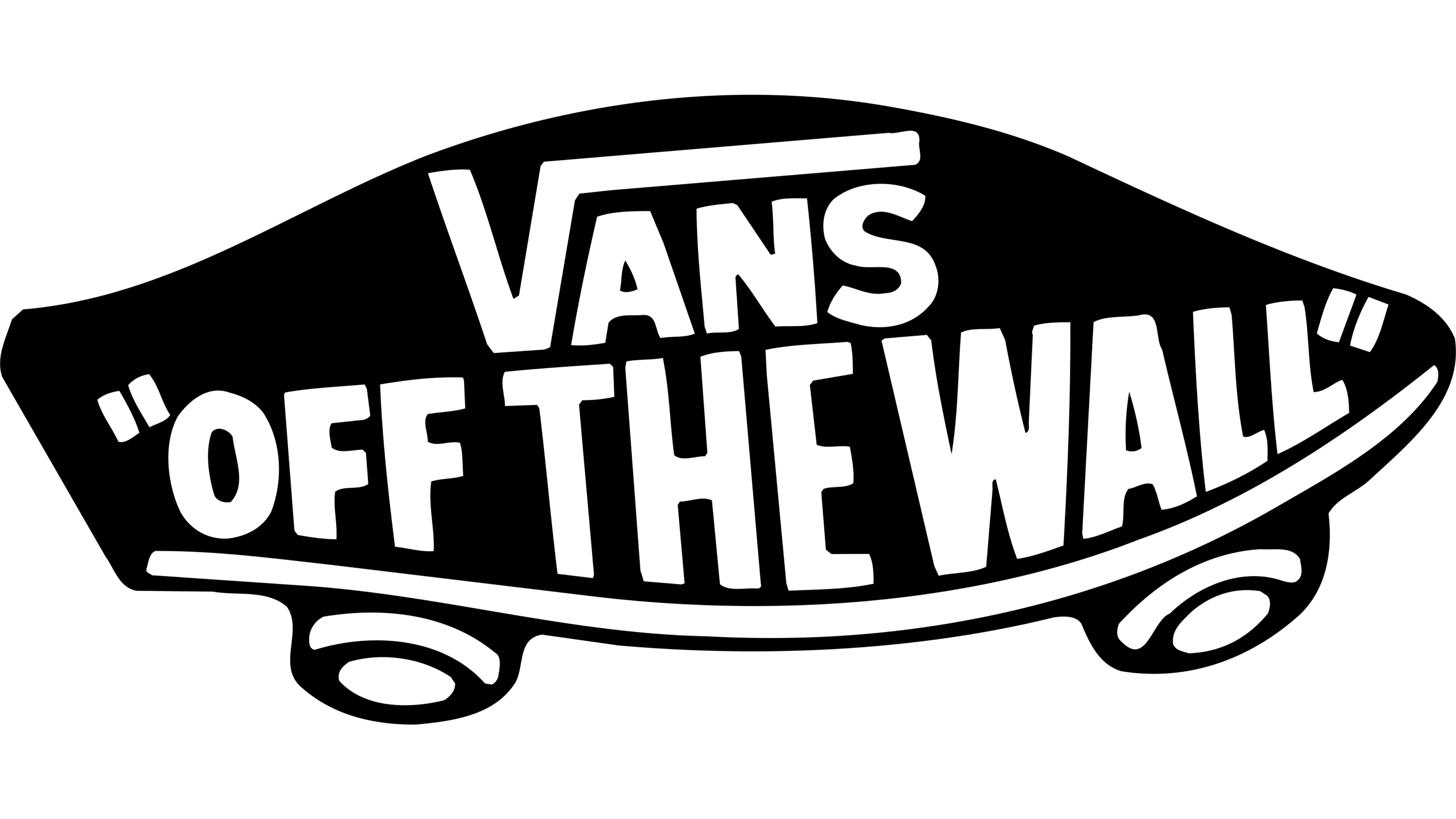
In 2016, developers made the word “Vans” red. The bright color symbolizes joy, energy, and passion. The white background conveys aesthetic purity and sophistication. The black inscription “Off the Wall” beneath it complements the red-and-white palette.
The history of this sign dates back to the mid-1970s. Californian skateboarders Tony Alva and Stacy Peralta told Jeff Ho about riding in an empty pool at Surfboards and Zephyr Productions. Tony boasted that he managed to flip over the wall and fly into the air. At that moment, an admiring Skip Engblom exclaimed, “Dude, you just went off the wall.”
The owners of Vans decided to immortalize the memorable phrase in their logo. At first, it was depicted against a small skateboard resembling a turtle shell. For this picture, it was nicknamed – “turtle.” A little later, to the word “Vans,” stylized by Van Doren even earlier, the phrase “Off the Wall” was added. The combined trademark was used only on skateboarding shoes. Everything else was adorned with the company’s name on the emblem.
In 2016, designers revisited the old design, removing the skateboard and leaving only part of the word. However, if the inscriptions were uneven initially, the font is now strictly standardized: all letters are uppercase and symmetrical. The dashes are uniform in width and length. There are no serifs: most lines end at a right angle.
Emblem “Off the wall”
![]()
The Vans “Off the Wall” logo is an emblem of its era and a representation of the skateboarding spirit that emerged in the 1970s. It encapsulates the energy, freedom, and boldness that underpin Vans’ identity.
The phrase “Off the Wall” originated in 1976 during skateboarding’s rise as a defining element of street culture. Its meaning is rooted in the tricks skateboarders perform on vertical surfaces like walls and empty pools, symbolizing the values of freedom and rebellion closely tied to skateboarding. The logo featuring this slogan debuted the same year and has since become the brand’s hallmark. It adorns Vans footwear, apparel, and accessories, reinforcing its deep connection to extreme sports and street culture.
The emblem is designed as a stylized skateboard with curved contours, adding a sense of motion and emphasizing its association with skateboarding culture. Inside the logo, the word “Vans” stands out in a bold, solid font, with the “V” resembling a mathematical square root symbol, hinting at creativity and uniqueness.
The slogan “Off the Wall” appears below in thick, impactful lettering that seems to push against the skateboard’s edges, adding to the dynamic feel. Enclosed in quotation marks, the phrase gains prominence, resonating like a rallying cry for skateboarding and street culture.
Font and Colors
![]()
The graphic sign was used for a limited time; otherwise, the verbal symbolism derived from the name predominated. The miniature skateboard icon reads: “Vans Off the Wall.” The logo was nicknamed “turtle” for its tortoiseshell-like appearance. In 2016, the designers redesigned it, removing the drawn image and leaving only the text.
The initial inscription was uneven in height, but later, designers aligned the letters, making them symmetrical in uppercase. The font from the Sans Serif family is grotesque and chopped (sans serif). All symbols are wide and made at a right angle. The company’s proprietary palette is reduced to black, red, and white, with the latter as the background.
FAQ
What does the Vans logo mean?
The letter V, stylized as a square root symbol, signifies the company’s unconventional approach to everything it does. At the same time, the long vertical line is perceived as a line of speed, thus emphasizing the energy of movement. The red color of the word Vans is also symbolic: it is associated with joy, movement, and bright emotions.
What does the Vans logo represent?
The Vans logo represents the brand’s name and slogan. The first word has an unconventional design: the letter “V” is stylized as a square root symbol. The phrase “OFF THE WALL” has an interesting origin. It’s used by skateboarders who ride in pools with sloping walls.
What font is used in the Vans logo?
The closest font suitable for reproducing the Vans logo is Tepeno Sans. It’s a bold, geometric, grotesque design by Jayvee Enaguas. Another analog is Trade Gothic Next Heavy, developed by Jackson Burke and Akira Kobayashi.