The Verily logo embodies the innovation and scientific knowledge the company brings to the healthcare industry. It opens the door to understanding the relentless pursuit of solutions that integrate technology and health. The logo positions Verily as a leader, signaling that the company is working with data and actionable insights that can redefine the healthcare paradigm. The logo acts as a beacon of trust and quality. It promises that the brand is committed to delivering something much more than traditional healthcare solutions. It symbolizes the pursuit of excellence and invites us to explore disruptive innovations that can shape a healthier and better future for all.
Verily: Brand overview
This company, founded in 2015, began its journey as part of Alphabet under the name Google Life Sciences. Andy Conrad set out to utilize technological advancements to advance the healthcare sector. This involved creating innovative mechanisms for collecting, structuring, and utilizing health data.
Among the pioneering projects was the development of a smart contact lens capable of measuring glucose concentrations. Another major initiative was the Baseline study on continuous health monitoring.
The acquisition of healthcare software company SignalPath in 2021 marked the company’s expansion into clinical research. The following year, the company received an impressive $1 billion capital investment from Alphabet. This significant move spurred organizational changes that led to Stephen Gillett taking over as CEO the following year. The company has over 1,000 employees and remains committed to collaboration. They work tirelessly to create technology solutions that can revolutionize healthcare and research.
Meaning and History
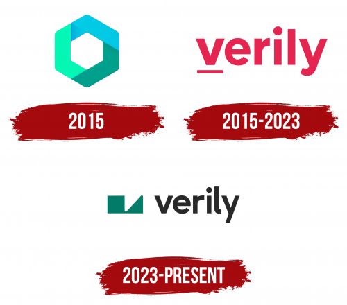
October-December 2015
2015 – 2023
2023 – today
The logo of the Verily organization is both simple and complex. The simplicity is due to the two-dimensional lettering in bold lowercase letters and colored black. The complexity is given by the icon that encrypts the brand’s identity. Two geometric figures (a square and a triangle) in dark body color unfold before the viewer and a portal to the encoded universe. They are stylized letters, almost superimposed on each other. Among them, the letter “v” stands out noticeably, presented in a double form: an inverted triangle and a recess.
This choice of logo design implies a deeper layer of meaning or complexity behind the seemingly simple image. A complex icon indicates that the organization deals with multifaceted and complex issues. Overlapping stylized letters indicate Verily’s integrated or overlapping areas of expertise. A clear “v” is a focal point directing attention to a specific aspect or value of the organization.
