


 Villanova Logo PNG
Although the Villanova logo has a modern design, it symbolizes the university’s ancient Catholic heritage. It represents different aspects of the institution, including its values: responsibility, collaboration, solidarity, and respect for truth. The emblem reflects the scientific, intellectual, and spiritual wisdom that students acquire as they cross the threshold of Villanova.
Villanova began in October 1841, when two Augustinian friars from Saint Augustine’s Church in Philadelphia bought the Belle Air estate in Radnor, Pennsylvania. The Augustinian College of Villanova accepted its first students in autumn 1842. It officially opened on 18 September 1843 under Father John Possidius O’Dwyer.
The college soon faced repeated closures. In May 1844, anti-Catholic mobs burned Saint Augustine’s Church, damaging the institution’s financial base. Villanova closed in February 1845, reopened in 1846, and received degree-granting powers from Pennsylvania in 1848. The first master’s degree followed in 1859, but the Panic of 1857 and the Civil War forced another closure until September 1865.
Villanova became a university in 1953. It admitted its first Black full-time student in 1962 and opened all faculties to women in 1968. Singer-songwriter Jim Croce graduated in 1965, worked at WXVU, and performed in campus vocal groups. Athletics grew alongside academics, with men’s basketball starting in 1920-1921 and reaching the NCAA Final Four in 1939.
In 1980, Villanova joined the new Big East Conference with Georgetown, St. John’s, and Syracuse. On 4 April 1985, Rollie Massimino’s team beat Patrick Ewing’s Georgetown 66-64, shooting 78.6% in the NCAA final; Ed Pinckney was named tournament MVP. Jay Wright became coach in 2001 and won national titles in 2016, after Kris Jenkins’ last-second shot against North Carolina, and in 2018, when Villanova beat Michigan 79-62. Wright entered the Naismith Hall of Fame in 2021 and retired in 2022.
Meaning and History
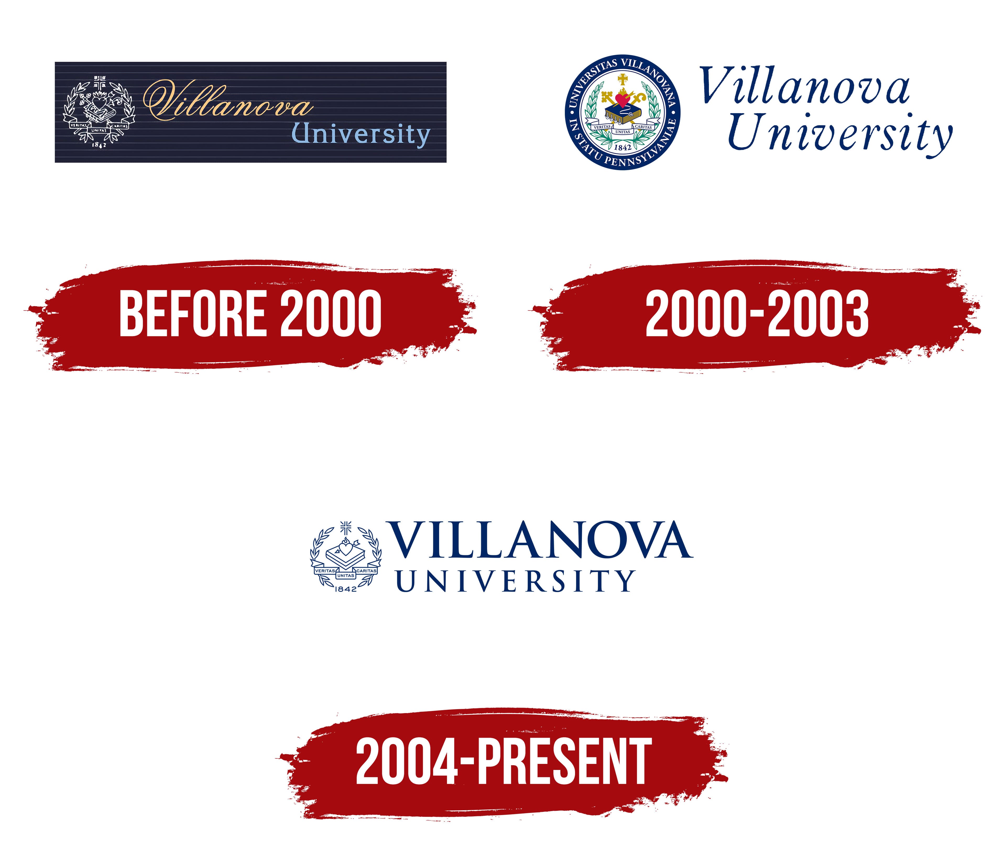
Like many other educational institutions, Villanova uses an emblem to identify its brand. The stylized seal of the Order of St. Augustine has become the institution’s main symbol. It helps create a recognizable image by reflecting Villanova’s values and mission, as well as its rich history and traditions. The design of the graphic sign has changed over the centuries to match the trends of different eras. The logo’s style has gradually shifted from refined and sophisticated to minimalist.
- A heart with an arrow represents St. Augustine. The arrow in the heart symbolizes love for God and the desire to give that love to others.
- The cross reflects the university’s Christian roots and its mission to teach students not only academic subjects but also ethics.
- The wreath is considered the embodiment of greatness, triumphs, and accomplishments.
- The slogan “VERITAS, UNITAS, CARITAS” on the ribbon stands for “Truth, Unity, Love.
What is Villanova?
Villanova University is the oldest educational institution in Pennsylvania and is privately owned by the Catholic Church. It is based on the parochial school that operated at St. Augustine Catholic Church. The university’s administration includes many clergymen, and most of the students are Catholic.
before 2000
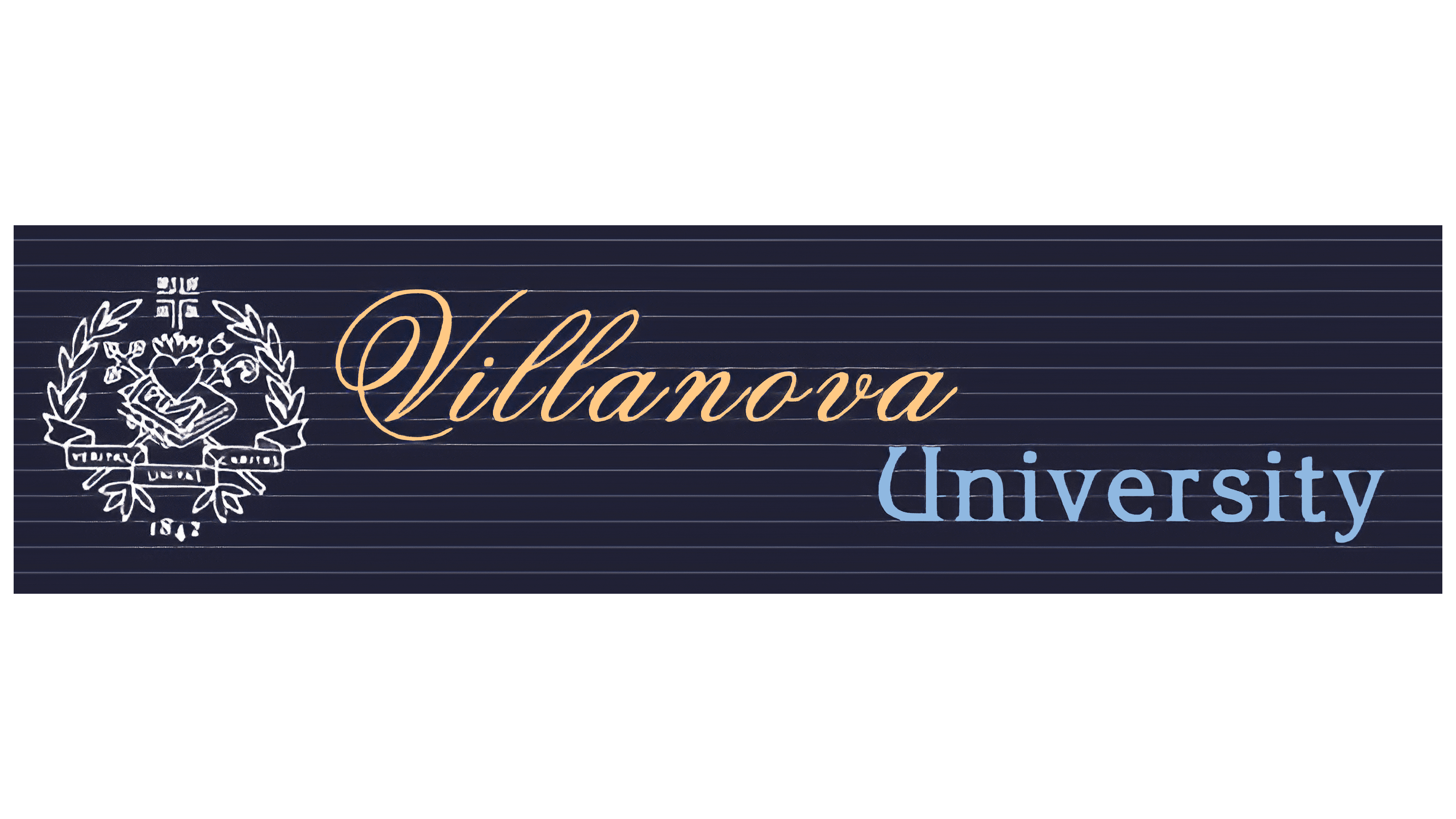
The old logo contains the “Villanova University” inscription divided into two lines. The first word is left-aligned, and the second is right-aligned. The fonts also differ: “Villanova” uses yellow calligraphic italics with swirls, while “University” uses a light blue font with sharp serifs. The most unusual initial letters are the “V” with a loop and an intricately curved “U.” The school’s name is against a dark blue rectangle with many light horizontal stripes. The ruled surface with the inscription resembles a notebook page. The main element of the emblem is the stylized seal of the Order of St. Augustine, shown on the left.
2000 – 2003

In this version of the logo, the round seal of Villanova University appears on the left, inspired by the Order of St. Augustine’s graphic symbol. It is placed in a blue ring with an inscription – the institution’s name in Latin. To the right is the blue word combination “Villanova University.” Even though the words are separated on two lines, they are designed in the same style. Their elegant font is reminiscent of Vulpa Italic from Schizotype Fonts, Libre Baskerville Italic from Impallari Type, or Lanston Bell Italic from FontSite Inc.
2004 – today
The logo of Villanova University consists of a wordmark and an image. The main inscription of the school’s name is on the right. It is two lines long, and the letters in the upper line are twice as big as those in the lower line. The designers set the text in a contrasting font with long, thin serifs.
The left side has the same elements as the seal: a book, a heart pierced by an arrow and caught in flames, a shining cross, a ribbon with the motto “VERITAS UNITAS CARITAS,” a laurel wreath, and the number “1842”. They are depicted in a simplified manner, consisting only of thin blue outlines with unpainted interiors.
The Seal
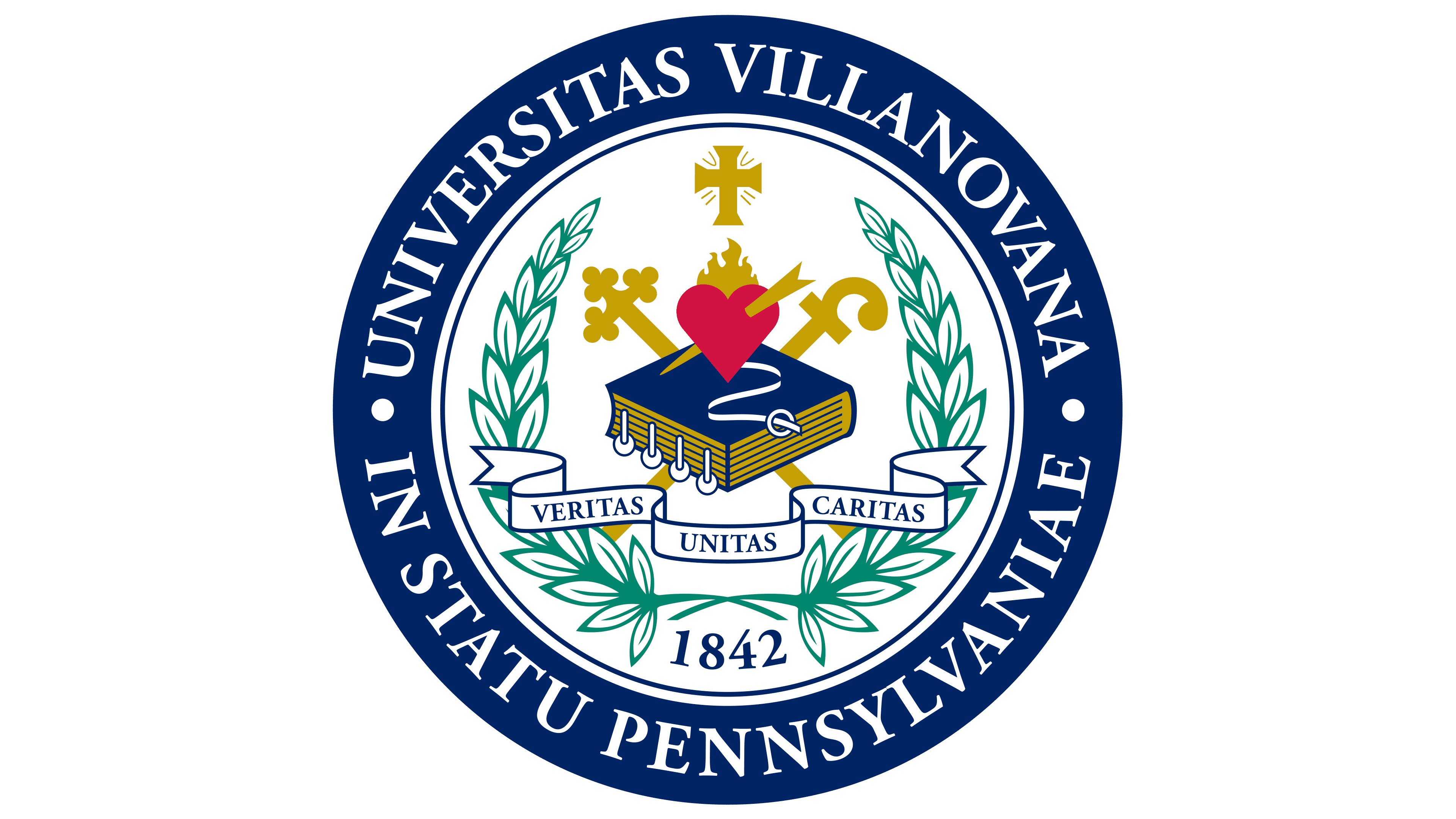
Villanova maintains its reputation as a Catholic university that follows ancient traditions. Its symbolism confirms this: the seal and logo represent the main elements of the Augustinian Order’s emblem. The book symbolizes the source of wisdom, and the burning heart symbolizes love, both earthly and towards God.
The seal of Villanova University is based on the St. Augustine emblem, which features the same combination of elements: a thick book, a large heart engulfed in flame, and an arrow piercing it. This is the most important part of the institution’s identity. At the bottom, the motto “VERITAS UNITAS CARITAS” is written on a long white ribbon, listing the values that are mandatory for all community members: truth, cooperation, and mercy.
The blue-covered book symbolizes the desire for intellectual activity, for learning something new. It is also a reminder that St. Augustine once embraced the Christian faith. It is believed that a voice from above told him to pick up the Bible and read it. The red heart is a symbol of a spiritual quest and love for people. Underneath it is a white, wriggling band. It is part of the traditional liturgical vestment of the Augustinians.

Above the heart is a cross with extended ends. This element indicates that Villanova University adheres to the Catholic faith and reflects St. Augustine’s devotion to Christianity. The same meaning is embedded in the other cross, which intersects with the staff behind the book. As for the staff, it symbolizes the leadership positions of the Roman Catholic Church and recalls the time when St. Augustine was a bishop. Augustine was a bishop.
The central composition is placed on a laurel wreath with white leaves and green outlines. It is a traditional sign of victory, in this case, victory over ignorance and uneducation, the triumph of the intellect, and success on the road to knowledge. At its base, the year of the institution’s foundation, 1842, is written.
The main graphic elements of the seal are within a large white circle, outlined by two thin blue lines. A frame, a wide dark blue ring, follows this. Inside it are written the words “UNIVERSITAS VILLANOVANA” (above) and “IN STATU PENNSYLVANIAE,” separated by two bold dots. All capitals are white with fine serifs.
Font and Colors

Villanova University uses two families of fonts in its identity: Goudy and Gotham. Judging by the shape of the glyphs, the wordmark is made by CastleType’s Goudy Trajan Pro Bold antique. Although the chosen typeface most closely resembles Trajan Pro 3 Semi Bold from Adobe. On the other hand, print lettering has a lot in common with Goudy. The text on the ribbon, part of the main logo, is set in sans-serif letters. This is one of the standard geometric grotesque options.
The palette follows a color scheme approved by the university. The logo is entirely dark blue (#002664) if you exclude the blank white spaces. On the other hand, the print has additional accents: green, red, and gold.