Vineyard Vines logo is a sign depicting a pink whale, which symbolizes the brand’s main idea – creating comfortable and stylish clothing for outdoor recreation and entertainment. The logo includes the brand name “Vineyard Vines” in fine print below the whale image. The Schaeffer brothers created the Vineyard Vines brand, who emphasized the nautical theme and brought a coastal feel to their clothing. The emblem has become an important part of the company’s branding. It is often used on products, stores, and promotional materials, attracting consumers’ attention and emphasizing the uniqueness and style of the brand.
Vineyard Vines: Brand overview
| Founded: | July 3, 1998 |
| Founder: | Shep & Ian Murray (Brothers) |
| Headquarters: | Stamford, Connecticut, United States |
| Website: | vineyardvines.com |
Meaning and History
After swapping business suits for bathing suits and moving from the big city to Martha’s Vineyard, the brothers Ian and Shep Murray decided never to return to the office again. And to have money for vacations and fishing, they went into debt and started sewing funny ties. The entrepreneurs named their companies after the place they loved most. They added the word “Vines” because of the uncomfortable associations: in their mind, a tie is as tight around the neck as a vine.
What is Vineyard Vines?
Vineyard Vines is a clothing manufacturer famous for its whimsical and colorful ties. Their story began in 1998 when siblings Ian and Shep Murray quit their day jobs to become entrepreneurs. They began sewing ties, even though they managed to hate them during their time in the office. They added polo shirts, shorts, hats, bags, and more to the range a little later.
1998 – 2005
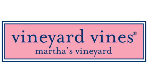
Vineyard Vines products used to be available only on the small island of Martha’s Vineyard in southeastern Massachusetts. Both names – the brand and the island – were featured on the logo that was used in the promotional materials. The designers divided the lettering into two lines and placed it inside a pink rectangle with a border of white and blue stripes of varying thicknesses. All of the letters were lowercase and dark blue. The font was completely consistent with Mrs. Eaves Lining by Emigre.
2005 – today
Not many people know, but the Murrays chose the logo for Vineyard Vines not in 1998 but in 2005. It was needed to decorate polo shirts because they usually have a brand name on them. The funny pink whale became the brand’s symbol and was supposed to inspire the customers to have a carefree time. After all, the aspiring entrepreneurs promoted the concept of the so-called good life – without offices and utilitarian style, with relaxation, outdoor recreation, and fishing.
And the whale was also a tribute to Martha’s Vineyard island, as the place has long been famous for its whaling. Also, one of Ian and Shep Murray’s ancestors was known to have masterfully carved whales from wood. One such figure still hangs above the brothers’ ancestral home entrance.
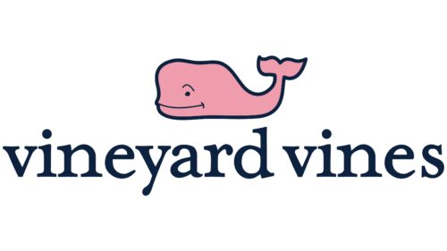
The whimsical logo is reminiscent of the style of the patterns that adorn the iconic Vineyard Vines ties. First, the whale is not a regular but a pink one with a dark blue outline. Second, it smiles affably, raising an eyebrow. The drawing looks childish, and the minimum of details reinforces this impression. There are no side fins, but there is a tail bent upwards and bifurcated at the end in the form of a heart or two tassels.
The brand name is written at the bottom, for which the designers used lowercase letters in navy blue. The elegant font with serifs and drop-shaped thickenings adds dynamics, contrasting with the rounded silhouette of a whale. The text is intentionally oversized and takes up one line, so the icon looks small against its background.
As Ian and Shep Murray admitted, they didn’t put anything specific into the image of the whale and didn’t try to create a recognizable character out of it. According to them, the whale has no gender or name. It is simply a traveler who is cheerfully sailing the ocean and meets someone along the way. Though he often appears on Vineyard Vines merchandise in different roles: as a teacher, lifeguard, doctor, soccer player, and even a pet. The main emblem with the pink whale symbolizes the island’s way of life, full of carefree relaxation.
Font and Colors
The company, which produces clothing for outdoor activities, wants to convey to its customers a sense of freedom and comfort. Therefore, the Vineyard Vines logo symbolizes relaxation, cheerfulness, and strength. It reflects the brand’s philosophy, stressing its connection with adventure and the seashore.
The American men’s and women’s clothing retailer has long used the logo with “vineyard vines” in lowercase. The geometric serif typeface, which was chosen as the main font, is called Mrs. Eaves Roman, after the wife of English typographer and wordsmith John Baskerville. It was created by Zuzana Licko in 1998 and published by Emigre Fonts.
The smiling whale looks as bright as the first Vineyard Vines ties because it’s blue and pink. The Murrays brothers made it that way on the advice of someone outside the family business. Shep Murray didn’t know what color to use for the brand identity, so he asked a friend for his opinion. He replied that he should choose a palette associated with Vineyard Vines. Many Islanders wore blue polo shirts or blazers and faded Nantucket Red-style pants or shorts at the time. That’s why the whale is painted a Pantone #197 shade of pink and complemented with navy blue elements.
Vineyard Vines color codes
| Space Cadet | Hex color: | #0c223f |
|---|---|---|
| RGB: | 12 34 63 | |
| CMYK: | 81 46 0 75 | |
| Pantone: | PMS 282 C |
| Mauvelous | Hex color: | #ef9bac |
|---|---|---|
| RGB: | 239 155 172 | |
| CMYK: | 0 35 28 6 | |
| Pantone: | PMS 708 C |


