


![]() Virginia Tech Logo PNG
Virginia Tech Logo PNG
The unification of disparate parts is read in the emblem’s elements. Separate university buildings form a single institution system. The Virginia Tech logo shows that the lack of territorial integrity does not prevent students from receiving the necessary knowledge.
Meaning and History
![]()
The university’s career began when the Virginia General Assembly, pursuant to the Morrill Act of 1862, purchased the Preston and Olin Institute building and the Methodist School for Boys premises in Montgomery County, Southwest Virginia. At the same time, several adjoining buildings on Solitude Farm were acquired. Thus, the foundation for the state-subsidized military institute and the Virginia Agricultural and Mechanical College was laid.
The first student enrolled in this institution was Addison Caldwell. He traveled more than 25 miles from his home in Craig County to register, leaving a permanent mark on the university’s history. A monument has been erected in his honor, and a forced march is named after him. First-year cadets traditionally hold it. They complete the first half of the nearly 26-mile journey in the fall and the second half in the spring.
The curricula were revised between 1891 and 1907, and a postgraduate department was established. This was the reason for raising the school’s status and renaming it Virginia Agricultural and Mechanical College (1896). The first part of the name was removed almost immediately. In 1944, the educational institution officially became the Virginia Polytechnic Institute (VPI), thereby outlining its priorities.
In 1921, the university admitted its first day department students who did not live in a hostel. In 1943, Radford State Teachers College, located in a neighboring town, became part of the VPI. The final merger was completed in 1964. This educational institution is Radford University, a research institution where students receive a joint education through 150 undergraduate and graduate programs.
Virginia Tech’s history includes expansions, transitions, wars, and sad incidents. But no matter what, it remains the flagship of Virginia’s educational system. Its identity is common to all structures. This is the official seal; three logos were adopted a little later.
Virginia Tech has several official emblems that are occasionally modified. Each new variation simplifies the design.
What is Virginia Tech?
This educational institution, located in the charming town of Blacksburg, Virginia, is an outstanding public university. It is renowned for its elite engineering program, athletic traditions, and a unique camaraderie among students who proudly call themselves Hokies. The Corps of Cadets, one of the oldest in the United States, holds significant importance here, bringing a unique discipline and tradition to university life. The campus impresses with its distinctive Hokie Stone-style architecture. Offering over 280 academic programs, the university lives by the motto “Ut Prosim” (“That I May Serve”), reflecting its core mission of preparing leaders who can effectively serve society through their knowledge and skills.
1991 – 2006
![]()
The logo features a shield from the university’s academic seal. It is a miniature icon located in the second line of the university’s name, before the word “Tech.” The top row is occupied by the inscription “Virginia.” The shield depicts a suite of columns and indicates the year of the VPI’s appearance: “1872”. Under them is the institution’s expanded name. The font is inconsistent, with serifs in monochrome black-and-white.
2006 – 2017
![]()
During the redesign, some elements were rearranged. For example, the university’s name occupies only one line, and in front of it is an icon in the form of a shield with an enfilade and a year of education. Under the phrase “Virginia Tech,” the developers placed the slogan “Invent the Future.” Everything related to the text remained black and white, while the icon received the signature burgundy-purple color.
2017 – today
![]()
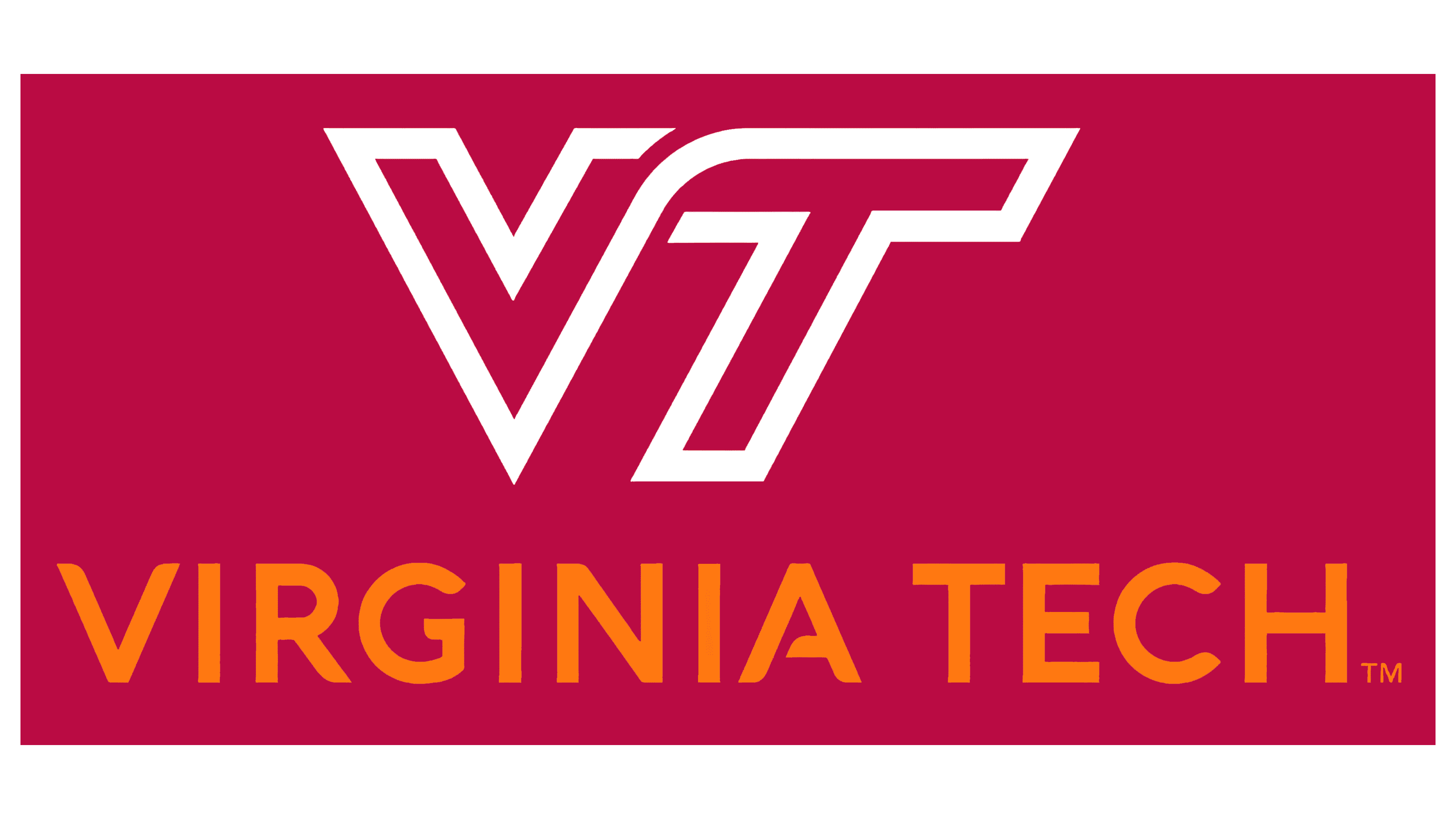
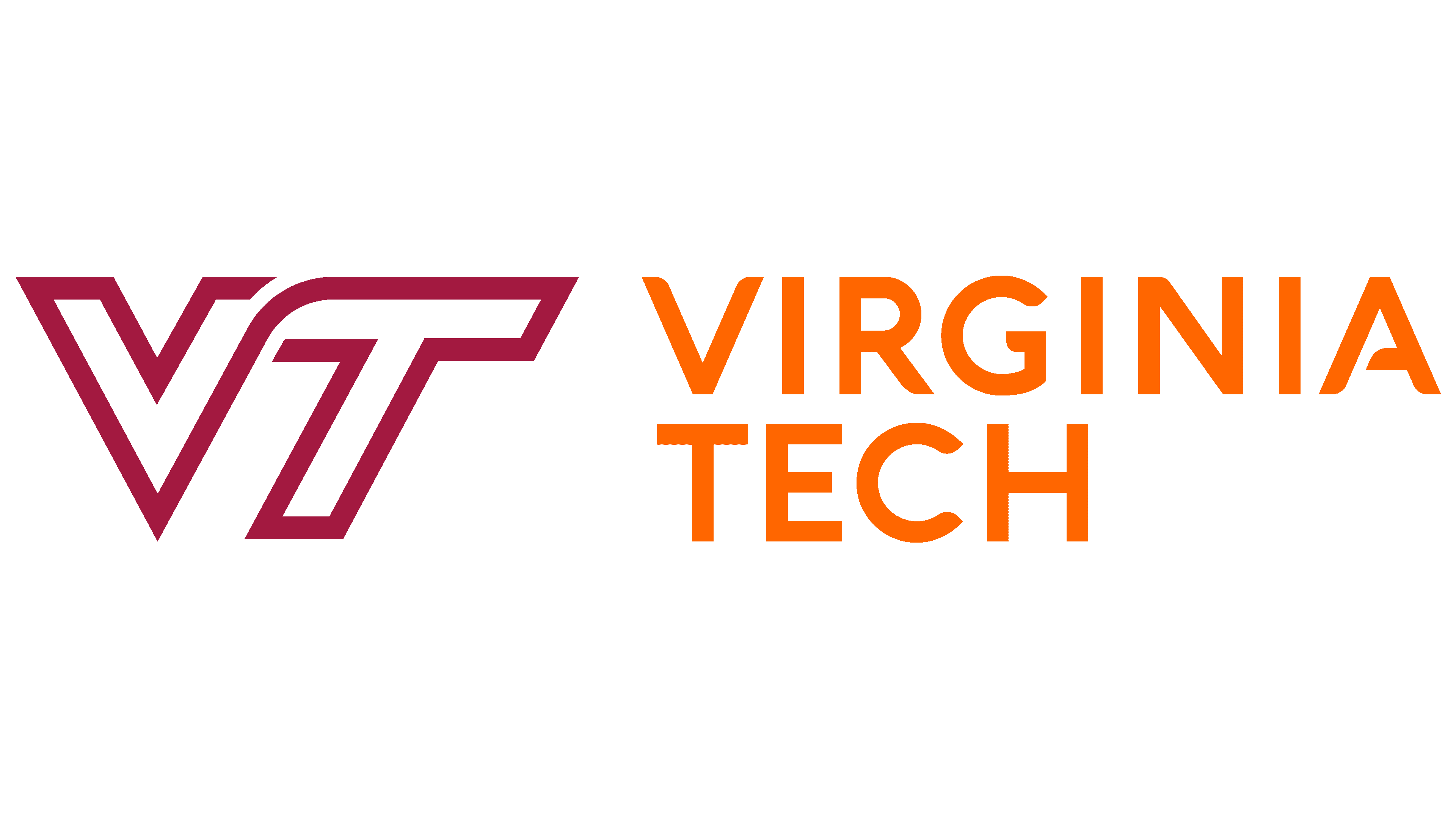
After a radical change in its image, the university approved an updated emblem. It shows the abbreviation “VT.” To add dynamism, the designers used inconsistent capital letters. They have a single line that starts at the top of the right leg, “V,” and ends at the bottom of the left leg, “T.” It is an outline font with a purple background. The word “Virginia Tech” in orange-gold is in the second half of the rectangle.
The Seal
![]()
The original seal was approved in 1896. In shape, it resembles a standard rondel: an accented middle and stripes that expand towards the edge. A shield occupies the central part with a narrow lower and a wide upper half. At the same time, it does not have curly protrusions or bends at the top – only a smooth edge. The shield is divided into four equal zones, each featuring images of corn cobs with leaves, a round flask on fire, a tripod with a scroll and a pointer, and a warrior enslaving the enemy. Two of them are painted golden-orange, and two are in burgundy-purple. There is also a burning lamp on the shield, an allegory of light, education, and knowledge. Below it is an inscription in Latin, “Ut prosim.” This is the university’s motto.
This is followed by several narrow lines, alternating between burgundy and white. Then, there is a wideband painted in gold. It shows the full names “Virginia Polytechnic Institute” and “and State University.” The arches are arranged in an arch pattern and separated by side points. Along the edge is a double edging of the university’s branded palette.
Font and Colors
The identities of the Virginia Polytechnic Institute and State University and the Virginia Tech Hokies share something in common. First, they are united by a color palette. Secondly, they have the same shape as the latest logos. The abbreviation of sharp and slightly slanted sans-serif letters has become predominant in both the university-wide and sports emblems.
The designers used a typeface from the Acherus Grotesque family for the inscriptions. The university palette consists of two base colors (Chicago Maroon and Burnt Orange) and two additional colors (Yardline White and Hokie Stone).