![]()
Weed.de, an information portal connecting medical cannabis patients, doctors, and pharmacies, has introduced a new logo and brand identity. Established in 2022, Weed.de provides comprehensive guidance on medical cannabis products, trained doctors, pharmacies, prices, and available preparations. The platform offers doctors tools for efficient patient management, like a prescription generator.
The new logo represents a significant change from the old design, which featured an exclamation point and an early 2000s.com style. The revised logo is more refined, presenting the name as Weed.de, emphasizing its German origin and creating a sophisticated image for a serious medical resource.
![]()
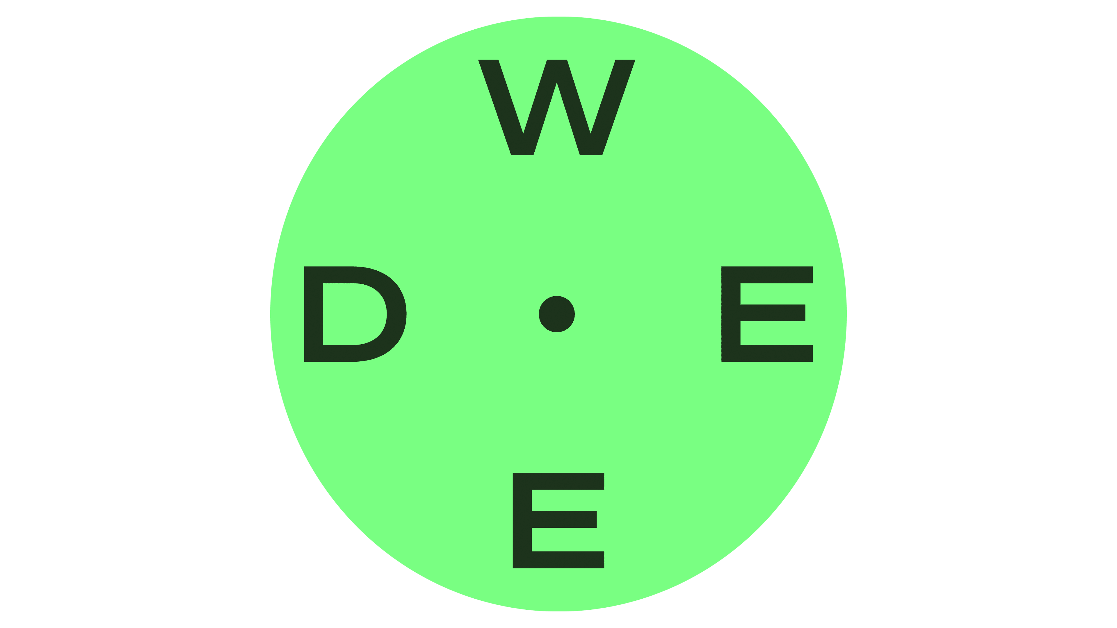
The logo cleverly spells out the name using four glyphs, integrating “W,” “E,” “E,” and “D” in a clockwise direction, with “DE” read across the design. This layout is not immediately obvious but becomes clear with consistent use, helping users recognize and remember the brand. The design incorporates a compass theme, aligning with Weed.de’s mission to guide users through the medical cannabis landscape, with the letters replacing traditional compass points (N, E, S, W).
The logo animation features subtle tilting in cardinal directions, adding a dynamic element. The logo includes a spherical bubble and pronounced dimensional effects in elaborate animations, enhancing the compass concept and modern appeal.
The brand identity extends beyond the logo, featuring various design elements. The typography includes an extended sans-serif font and a trendy monospace typeface, blending modernity and professionalism. The color palette features neon-esque hues, creating a vibrant and distinctive look. This choice of colors adds flair to the otherwise clinical and serious approach, setting Weed.de apart from traditional pharmaceutical companies.
![]()
Graphic elements in the brand identity include 3D renderings and diverse photography styles, adding depth and visual interest. The use of spheres in packaging design contributes to Weed.de’s innovative and forward-thinking image. These design choices collectively present a professional yet approachable identity suitable for a platform dedicated to medical cannabis education.
The new visual identity reflects Weed.de’s commitment to providing accurate and reliable information in a field surrounded by stigma and myths. By adopting a clear and professional visual language, Weed.de aims to position itself as a trusted guide and educator in the medical cannabis sector.
Weed.de’s branding is supported by a message highlighting its role in improving patients’ lives. The tagline “Navigating Medical Cannabis” underscores the platform’s mission to simplify and clarify medical cannabis therapy complexities. This message is consistently communicated across all marketing materials and user interactions, reinforcing the brand’s dedication to helping users make informed health decisions.
The brand identity includes a refined communication style emphasizing clarity and professionalism. The copywriting is straightforward and informative. It is designed to build trust and credibility with users, ensuring Weed.de is perceived as a reliable information source capable of guiding patients through their medical cannabis journey.
Internally, Weed.de fosters innovation and flexibility among its team members. The new identity reflects this internal culture, highlighting the company’s commitment to creativity and growth. By promoting a dynamic and supportive work environment, Weed.de aims to drive continuous improvement and excellence in its services.