


![]() Werder Bremen Logo PNG
Werder Bremen Logo PNG
Team players simply knock out opponents. The Werder Bremen logo shows the strength and superiority of football players. The club comes out victorious in any fight and has no equal on the green field. The emblem is a symbol of fortitude and skill.
On February 4, 1899, a group of 16-year-old students in Bremen founded a football club after winning a tug-of-war contest and receiving a ball as a prize. They named it Werder after a river island on the Weser. In 1900, the club became a founding member of the German Football Association. On January 19, 1920, it was renamed Sportverein Werder Bremen after expanding into multiple sports.
In 1909, the team settled at ATSB-Kampfbahn, later known as Weserstadion, and never left the site. The stadium was expanded in 1926 and officially named in 1930. Green and white colors defined the club’s identity from the start.
During the 1930s, Werder won four regional titles in the Gauliga Niedersachsen. Players often worked at Brinkmann’s tobacco factory, leading to the nickname “Texas 11.” After World War II, Werder and Hamburger SV became leading forces in northern Germany. In 1961, the club won the DFB-Pokal against Kaiserslautern.
As a founding member of the Bundesliga in 1963, Werder won its first league title in 1965, ahead of Borussia Dortmund. After fluctuating results and relegation in 1980, the club returned immediately and entered a new phase under Otto Rehhagel.
Under Rehhagel, Werder won the Bundesliga in 1988, reached the UEFA Cup final in 1989 against Napoli, and secured the Cup Winners’ Cup in 1992 against Monaco. The 1993 title and 1994 domestic double followed.
With Thomas Schaaf, the club won the DFB-Pokal in 1999 against Bayern Munich and achieved another double in 2004. In 2009, Werder lost the UEFA Cup final to Shakhtar Donetsk but won the DFB-Pokal. Relegation came in 2021, followed by a return in 2022.
Meaning and History
![]()
At first, the club was called Fußballverein Werder, which was reflected in its official coat of arms. In this status, it remained until the 1920s, when it was renamed Sportverein Werder Bremen and adopted the corresponding emblem. A little later, the sports organization was disbanded. In the post-war period, she regained the name SV Werder and, with it, her diamond-shaped logo featuring the letter “W” at its center. This symbol first appeared in 1929 and has been a talisman throughout the team’s history, inspiring players to win.
What is Werder Bremen?
Werder Bremen is a professional soccer club from Germany. It has existed since 1899 and is part of the Bundesliga, where it ranks third, only behind Bayern and Borussia Dortmund. The team has achieved several remarkable victories.
1900 – 1902
![]()
The club adopted its debut emblem in 1900, when it was known as FV Werder. It was a text sign in the form of a monogram, decorated with loops and spirals. It consisted of the letters “FVW,” which were practically unreadable.
1911 – 1924
![]()
In 1911, the old logo was replaced by a figured heraldic shield. It was completely black, except for the green strip labeled “F. V. W. ” The line divided the shield into two halves: on top was the year the club was founded, and on the bottom was the name of the city. All inscriptions were diagonal.
1924 – 1929
![]()
In the second half of the 1920s, the coat of arms became oval and green, with a light outline. Simultaneously, the designers created a large white letter “W,” which later became the cult symbol of SV Werder Bremen.
1929 – 1976
![]()
Small metamorphoses took place: the oval became a rhombus with rounded corners, and the thin, light line became a two-color edging with three stripes. The “W” in the center of the geometric shape has become thinner, so it doesn’t take up much space.
1976 – 1977
![]()
In the mid-1970s, the coat of arms of Bremen was used as a logo, which Napoleon Bonaparte had approved. The heraldic shield’s figured key is an attribute of one of the twelve apostles, Simon Petrus. To associate the state symbol with the football club, the designers placed the word “Werder” at the top of the shield.
1977 – 1981
![]()
The team reverted to the diamond-shaped emblem with the white “W” used from 1929 to 1976.
1981 – 1994
![]()
In 1981, the SV Werder Bremen logo was redesigned: the designers chose a different shade of green, widened the “W”, and removed one white line from the shield frame.
1994 – 2005
![]()
In 2005, there were several more changes. Now the club badge has the shape of a classic diamond with no cut corners. The letter “W” is slightly narrowed and stretched upwards, and its lateral lines are rounded.
2005 – today
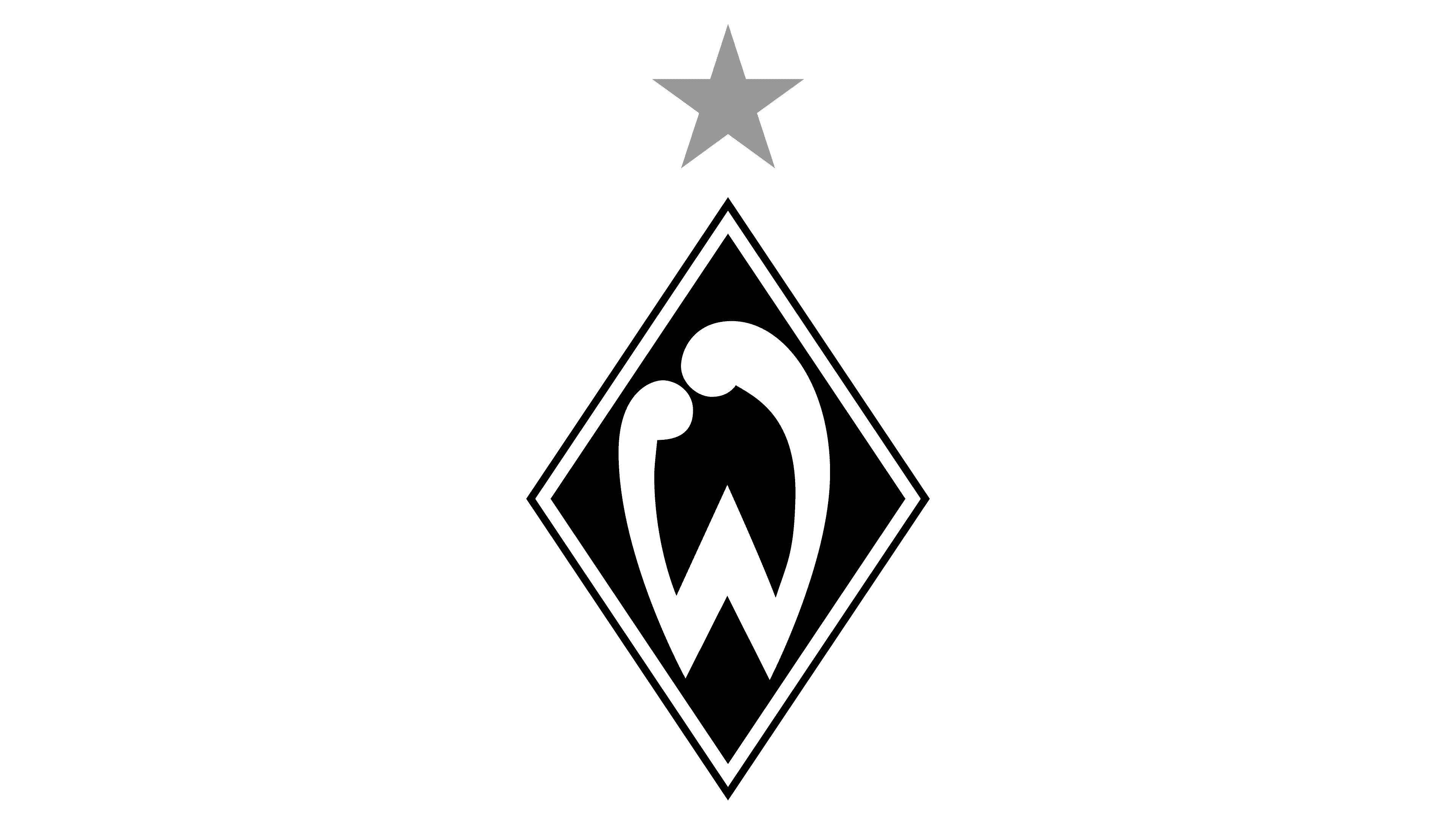
![]()
A yellow five-pointed star appeared above the coat of arms, denoting the Bundesliga titles won.
Font and Colors
SV Werder Bremen achieved what it wanted with many different emblems: it found the unique style that made it recognizable. In 1929, the designers developed a graphic sign with a green diamond and a white letter “W” representing the team’s nickname. It underwent a series of changes and briefly disappeared in the 1970s, only to be replaced by the city’s coat of arms. But then the diamond-shaped logo returned: the club’s leaders realized it was impossible to get rid of it so easily, as it holds a special place in Werder’s visual identity.
The only lettering on the emblem is the large white letter “W.” There is no question about the typeface: the designers created it from scratch and drew it by hand. It looks like a complex geometric shape with three corners in the middle and rounded ends.
Since 1981, the logo has been painted in two colors: white (#FFFFFF) and Sea Green (# 1D9053). Before this, other shades of green were used. Until 1924, the palette was based on black, combined with other colors – for example, with the same green or white.