The emblem expresses growth and development through special symbols, rushing up and in breadth. The Whataburger logo also hints at the layered nature of the burgers sold online. The dish is an excellent choice for friendly gatherings and communication.
Whataburger: Brand overview
Whataburger is one of the biggest burger joints in the U.S., although it is behind market giants such as Burger King or McDonald’s profitability. It is a family business founded in 1950. Harmon Dobson and Paul Burton. Now, its chain covers several counties in the U.S., including the Southwest and Southeast. It includes more than 800 fast-food outlets serving several types of burgers, sandwiches, fries, hotcakes, chicken strips, and desserts. To create Whataburger, Harmon Dobson had to give up the oil business. It wasn’t hard to do because his partner went on a binge and nearly caused the confiscation of several thousand dollars invested in drilling. The entrepreneur, who already had experience developing a family farm, building an oil refinery, reselling used cars, and mining diamonds, did not wait for his new business to become unprofitable. He immediately took the money out of there and set about financing Paul Burton, a keen hamburger fan. Together, they opened a restaurant called “Whataburger,” as if to voice the enthusiastic exclamation of customers, “What a burger!” and to foresee the successful fate of the future chain.
Whataburger’s story begins in 1950 in Corpus Christi, Texas when Harmon Dobson and Paul Burton opened their first burger joint with a dream: make a burger so big and tasty it would make anyone say, “What a burger!” Their dream quickly became a reality, capturing the love of many Texans with their large, delicious burgers.
In the 1960s, Whataburger started opening restaurants all over Texas. Its orange-and-white color theme and the unique A-frame buildings made it a well-known sight. The 1970s saw the menu grow to include breakfast, available any time, with the honey-butter chicken biscuit becoming a huge hit.
From the 1980s through the 2000s, Whataburger expanded even more, opening locations across the southern and southwestern U.S. Despite big competition, the company stuck to its high quality and customer care standards. Items like their beef burgers, Monterey Melt chicken sandwich, Whatachick’n Strips, and the restaurants’ 24/7 opening hours made Whataburger a community favorite.
In the 2000s and 2010s, Whataburger kept growing but stayed true to its roots. It updated its restaurants and packaging while keeping the classic design elements. It also started selling its popular sauces and condiments in stores, growing its brand and increasing revenue.
In 2019, the Dobson family sold most of Whataburger to BDT Capital Partners. Some fans were worried this might change the brand, but the new owners promised to keep up Whataburger’s high standards.
With over 850 spots in 10 states, Whataburger is expanding into new areas like Kansas City, Missouri, and Nashville, Tennessee, under BDT Capital’s direction. They aim to share their Texas-style hospitality and unique flavors with even more people without losing what’s made them successful for over 70 years.
Meaning and History
Dobson wanted his burger shop to be the best, so he tried in every way to make it stand out from the competition. He decorated the roof with a striped “W” in orange and white back in the early years. This combination and order of colors were chosen on purpose. The restaurant owner once built radio masts, mostly painted in white and orange stripes – making it easier for pilots to see obstacles. He hoped his “W” would be as visible to customers as radio towers are to airplane drivers.
Later, the logo received wings and became the main element of the logo, which has been used since 1972. Within ten years, Whataburger realized its logo was similar to the character Wonder Woman, created by DC Comics. The management of the restaurants decided not to raise the scandal. However, the Flying W burger was introduced earlier than a similar visual sign of the superheroine, so their diplomacy is enviable. The similarity of the two logos only bothered Whataburger in 2016, when DC Comics set out to sell Wonder Woman-branded food products.
What is Whataburger?
Whataburger is a popular Texas burger joint that started in 1950. It became famous for its unique burgers with triple meat, jalapeno, cheese, and other toppings. Her menu includes onion rings, french fries, meatballs, and chicken sandwiches. Breakfast offers light options, including pancakes, biscuits, and taquitos. In addition, the restaurant chain is known for its A-shaped building design and orange logo with a stylized ‘W.’
1950 – 1968
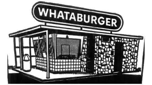
This logo is dedicated to the very first Whataburger outlet. It was opened in 1950 in Corpus Christi on the south coast of Texas. Harmon A. Dobson cooked hamburgers and fried fries in a small wooden building and poured soft drinks. Customers left their cars nearby and went to the window to buy fast food. Drivers passing by were attracted by a neon sign with the brand’s name shining brightly on the roof.
However, the Whataburger logo is one of many outlets preserved in archival photographs. The exterior of the building is more modern: it was no longer the portable kiosk from Corpus Christi in 1950. The picture shows a large structure with two windows (one closed), an entrance door, a terrace, an urn, a flat roof, and a huge black sign. The white word “WHATABURGER” is written in a strict bold sans-serif font.
1968 – 1972
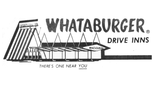
In 1961, Harmon A. Dobson improved the Whataburger architecture by building the first A-frame. To make the new restaurant visible from afar, he made the roof striped. First, two steel tubes were attached to the pediment at the top of the makeshift “A” to mimic the sides of the “W.” This building version is depicted in the presented logo.
As you can see in the picture, a long covered terrace with five triangular notches on the roof is attached to the A-shaped structure. The name of the restaurant is written on two signs. The first is at the highest point of the frame and is divided into squares so that each letter is placed in its separate quadrangle. The second sign adorns the entrance part of the terrace and has the shape of a rhombus.
In addition, the logo is complemented by another word, “WHATABURGER,” in the upper right corner. It is decorated with a handwritten font that imitates the inscription with a wide brush. A little lower is the italic phrase “DRIVE INNS,” indicating that the restaurant caters to drivers. Beneath the emblem is the phrase “THERE’S ONE NEAR YOU” with the word “YOU” underlined. The entire line is typed in capital but small letters, slanted to the right.
1972 – today
By 1972, the chain had expanded to 100 restaurants. By then, Whataburger had a corporate symbol called “Flying W.” It consists of five orange stripes curved into a “W” shape. Their lateral parts are expanded and aligned horizontally. All lines are located one under the other, but they are not the same. The name of the restaurant chain is written at the very bottom. All elements, including letters, are presented in the corporate orange color.
Whataburger: Interesting Facts
Whataburger stands out as a favorite fast-food chain, loved for its big burgers and unique orange-and-white restaurants.
- Founding Story: In 1950, Harmon Dobson and Paul Burton started Whataburger in Corpus Christi, Texas. Their goal was a big burger that needed two hands to hold and was so tasty that people would say, “What a burger!” That’s how the chain got its name.
- Unlike most fast-food chains, the Big Burger: Whataburger serves a large 5-inch burger. You can have it with tomatoes, lettuce, onions, pickles, and mustard, and change it up with other toppings.
- Iconic Design: The first Whataburger stores were easy to spot with their A-frame shape and orange-and-white colors. Although the design has evolved, the colors are still a hallmark.
- Always Open: Many Whataburgers are open daily, making it easy to get your favorite food anytime.
- Make It Your Own: Whataburger encourages you to customize your burger with various toppings and sauces, making each visit a new experience.
- Breakfast Favorites: Among its breakfast options, the Breakfast on a Bun and the Honey Butter Chicken Biscuit is particularly popular, drawing in crowds morning after morning.
- Ownership Change: Whataburger was family-owned until 2019. Then, the Dobson family sold a major share to BDT Capital Partners to help grow the brand.
- A Texas Icon: Whataburger is a fast food in Texas; it’s a cultural symbol with a range of branded merchandise.
- Signature Sauces: You can buy Whataburger’s own Fancy Ketchup, Spicy Ketchup, and Honey Butter in stores, adding a taste of the chain to meals at home.
- Giving Back: The chain is also known for its commitment to the community, offering scholarships through the Whataburger Family Foundation and supporting local causes.
Whataburger’s dedication to quality, flexibility, community, and distinct identity and history has made it a beloved name in the fast-food world.
Font and Colors
The big “W” was chosen for several reasons:
- It is the first letter of the restaurant chain’s name, making it easy to identify the brand.
- It became recognizable due to its multi-component structure: the Flying W contains five parallel lines with extensions at the ends.
- The burger chain has never experimented with an emblem, which automatically puts it in the iconic category.
Under the stylized letter with “wings” is the word “WHATABURGER.” Whataburger’s logo features bold and lively lettering in a modern sans-serif typeface. The letters shift slightly on the baseline, adding a playful touch. The bold, jagged lines make it look like it was drawn, as the strokes resemble brush strokes. The free Whatafont Regular typeface from Iconian Fonts was designed based on it. Also, this typeface draws inspiration from styles like Big Fish Casuals and Hold On Regular but includes custom tweaks to fit Whataburger’s unique brand. These adjustments make the logo look dynamic and modern, enhancing its appeal.
Because Harmon Dobson wanted his logo to be as prominent as the radio masts, he used two alternating colors for the W-shaped symbol: white and orange. The restaurant chain’s name is also orange and has a similar shade of #FF770F.
FAQ
What font does Whataburger use?
The Whataburger logo uses a font that looks a lot like “Whatafont Regular” by Iconian Fonts. This font matches the style of Whataburger, a popular fast-food chain in the United States. Iconian Fonts makes various fonts that fit specific themes or brands.
Picking the right font for a logo is important because it helps people recognize and feel good about the brand. The Whatafont Regular font makes Whataburger seem friendly and inviting, which is exactly how the chain wants to be seen. The font’s bold, round letters make customers feel welcomed and happy, matching what Whataburger wants to offer. This font helps Whataburger stand out from other fast-food places. Good branding draws in and keeps customers; Whatafont Regular makes the brand look unique. Iconian Fonts make it easier for designers and marketers to use the Whataburger style in their work. This is great for ads, merchandise, or online content that want to capture the Whataburger feel, keeping the brand’s look consistent everywhere.
What makes Whataburger so popular?
Whataburger stands out for a few reasons: it tastes great and offers fresh, high-quality ingredients. People enjoy their meals more because Whataburger focuses on freshness and lets customers tailor their orders. Here’s a simple breakdown of what makes Whataburger special:
- Fresh Ingredients
- Custom Burgers
- Careful Preparation
- A Strong Connection
Whataburger’s success comes from using top-notch, fresh ingredients, allowing meal customization, and always focusing on making customers happy. Their commitment to a great eating experience and the bond many feel with the brand make Whataburger a favorite among fast-food lovers.
What does the logo symbolize for Whataburger Logo?
With its big ‘W’ and bright orange color, the Whataburger logo means much more than it seems at first glance. The orange isn’t just picked by chance; it’s supposed to make people feel warm, welcome, and happy. This matches Whataburger’s goal of making every customer’s visit enjoyable. The bright orange also helps grab your attention, letting you know you’re in for a good meal and a friendly place.
The orange and white stripes on the logo have their own story, too. They come from the founder of Whataburger, Harmon Dobson, who used to paint radio towers in these colors so pilots could easily see them. This background wasn’t just practical but also a clever way to make his burger joints stand out. By using these colors for Whataburger, Dobson made sure his restaurants caught your eye, much like those towers did.
Bringing this color scheme to his restaurants was a smart move. It wasn’t just about looking different; it was about being easy to spot and remembering where you had a great meal. This ties back to Dobson’s experiences and shows how much thought made Whataburger stand out.
Why does Whataburger look like Wonder Woman?
The Whataburger and Wonder Woman logos look alike because they use a bold ‘W’ with diagonal lines. This design makes them stand out and symbolizes strength and identity in their worlds of fast food and superheroes.
Whataburger’s “Flying W” logo came out in 1972. Thanks to its sharp look and sense of motion, it was a smart way to make its brand easy to spot and remember. The ‘W’ wasn’t just a letter but a way to show what made Whataburger different and special.
The Wonder Woman logo got its sharp ‘W’ in 2016, aiming to update the superhero’s image to fit modern tastes and make a strong impact worldwide. This new look kept the spirit of Wonder Woman’s past but added a fresh, powerful vibe that matched her warrior image. These two logos seem similar because of their bold designs that catch your eye and tell you something about their identity and values. Even though Whataburger and Wonder Woman are very different, their logos share this approach to stand out and mean something important. Both logos ended up looking alike without planning to. Whataburger had its logo long before the Wonder Woman logo got its update.
What does the Whataburger logo mean?
At first, the “Flying W” logo of Whataburger simply looked like the letter ‘W’ in their name. However, the logo’s design and colors tell a bigger story about the company and what its founder, Harmon Dobson, wanted it to represent.
Dobson didn’t just want his restaurants to be seen; he wanted the Whataburger logo to be a symbol that stood out, similar to the orange and white radio towers he used to work with. These towers were painted in bright colors so pilots could easily spot them from the sky. Using the same design for Whataburger, Dobson made the restaurants noticeable and memorable.
The orange and white stripes on the logo do more than just grab attention. They link back to Dobson’s history and the practical reason behind the colors: making something easy to spot. Choosing orange was a deliberate move to make Whataburger feel warm, energetic, and friendly. These qualities are what the company wants to be known for in terms of how it serves customers and interacts with communities. The “Flying W” has come to mean more than just a burger spot; it’s a sign of quality, a bit of history, and a promise of a good experience.
Why is Whataburger called Whataburger?
Whataburger got its name from a simple but big idea its founders had. Harmon Dobson and Paul Burton, a businessman who loved hamburgers, wanted to make a burger so good that people would say, “What a burger!” when they ate it. This idea wasn’t just something they hoped for; it was at the heart of their plan. They wanted their burgers to be bigger and tastier than what other places offered.
They ensured every burger they served was bigger and tastier than typical burgers. This effort was to make Whataburger stand out and give people a reason to remember their meals.
The name “Whataburger” has stayed the same over time, and now it means top-quality, delicious burgers. This name is a big part of the restaurant’s identity; you can see it on every sign and logo. It reminds everyone of the founders’ original dream and promises always to offer the best.
What is the Whataburger slogan?
Whataburger is famous for its eye-catching orange-and-white striped restaurants and deliciously large burgers. But it’s also known for its catchy slogans that perfectly capture what the brand stands for. In 1979, Joe Andrews, Sr., coined the slogan “We build a bigger, better burger.” This simple yet powerful phrase highlighted Whataburger’s focus on making quality and sizable burgers, setting the brand apart from others, especially during its expansion phase.
In 2001, Whataburger introduced a new slogan: “Just Like You Like It.” Although this slogan wasn’t added to the logo, it became crucial to the brand’s message. It highlighted How Whataburger caters to each customer’s preferences, allowing them to customize their burgers.
These slogans are more than catchy phrases; they reflect Whataburger’s core commitments to quality, size, taste, and personalized customer service. They’ve played a significant role in defining the brand’s identity and ensuring its continued customer popularity.
