


![]() Wingstop Logo PNG
Wingstop Logo PNG
The Wingstop logo can be viewed from several perspectives. The first is romantic, representing a dream of reaching the highest level of service. The second is practical, related to the menu served in this chain of restaurants. The designers proposed an ideal option that combines both ideas. The successful emblem contributes to the franchise’s enduring popularity.
Wingstop is a restaurant chain from the United States that, in a short period, has grown into a franchise with over 1,400 establishments (data for 2022). It was established in 1994, starting in the city of Garland, Texas, and just three years later, it became a large-scale operation, selling franchises across the country. In 2003, it was acquired by Gemini Investors. In 2010, the brand was transferred to Roark Capital Group. Starting in 2015, it became a public company headquartered in Addison, Texas.
In 1994, in Garland, Texas, a restaurant called Wingstop began its journey, founded by Antonio Swad and Wes Jabson. They had a vision: make chicken wings the main attraction, with a variety of irresistible flavors. Their philosophy was simple: excel in one area, and people will flock to you.
By 1997, Wingstop expanded beyond Garland, particularly gaining popularity in Dallas. This success led them to offer franchises, facilitating rapid growth across the United States. The restaurant’s focus on a niche menu, quality ingredients, and efficient operations attracted many investors and operators, fueling expansion through the 2000s.
Unique flavors like Original Hot, Lemon Pepper, and Garlic Parmesan became Wingstop’s signature, creating a dedicated fan base. These flavors weren’t just tasty; they defined the brand and fostered a sense of community among customers.
Entering the 2010s, Wingstop’s momentum didn’t slow down. In 2011, the brand celebrated the opening of its 500th store, demonstrating its growing influence in the fast-food world. 2015 marked another milestone, with Wingstop going public through an IPO on NASDAQ. This move wasn’t just about raising capital but a statement of the brand’s ambition for further growth.
The 2020 COVID-19 pandemic presented challenges across the restaurant industry. Still, Wingstop’s focus on delivery and takeout, along with its digital initiatives, including a new mobile app and delivery partnerships, helped sustain and even grow its business. By 2021, digital sales made up over 60% of Wingstop’s revenue, a testament to its adaptability and forward-thinking approach. With plans to surpass 6000 locations worldwide, Wingstop aims for global dominance in the fast-food sector.
Meaning and History
![]()
The roots of the Wingstop brand do not go far back in history; they stretch from 1994, making the franchise one of the youngest in the food service industry. The company’s founder is entrepreneur Antonio Swad, who opened it in Garland, Texas. Since then, it has overcome many obstacles to achieve widespread popularity and high recognition worldwide. Today, its thematic logo is known in all corners of the globe. It is done in a rocker-and-aviation style, combining powerful energy, a drive for peak emotions, and a love of freedom.
Why did the culinary business choose such a design for its emblem and establishments? The answer is logical: simply because the spirit of Wingstop facilitates it. The design is done in the style of pre-jet aviation of the 30s/40s of the 20th century. All branding follows this trend, including visuals. The emblems predominantly feature restrained, masculine, strict, and austere decor. But most importantly, it has marketing practicality, allowing the combination of two opposing directions: aviation and culinary.
What is Wingstop?
It is a multinational chain of restaurants from the United States that specializes in aviation-themed establishments. In particular, it serves chicken wings, recreating the ambiance of 30s/40s aviation in its restaurants, facilitated by its location. The brand owners have excellently combined images of airplane wings and domestic poultry, surprising visitors with their signature recipes.
1994 – 2014
![]()
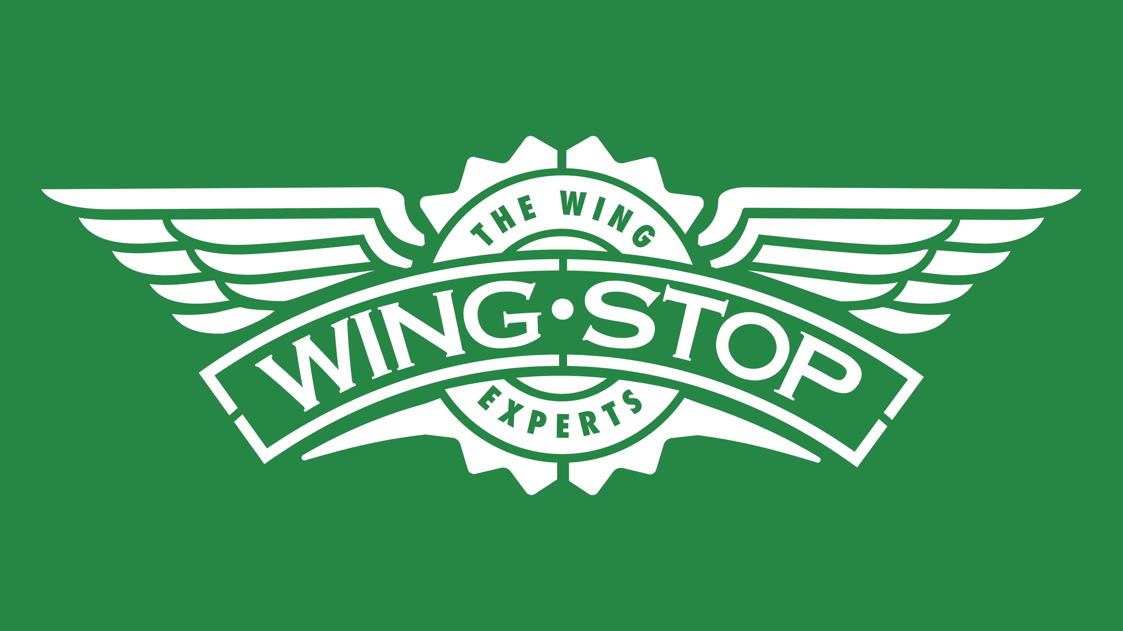
The logo’s basis is widespread wings. They have a classic shape and are made from improvised feathers, which support the restaurant chain concept. After all, from the very beginning, they have served chicken wings in various forms: on the bone, boneless, in sandwiches, in patties, with sides and sauces. These are simple tastes familiar to Americans.
The center of the emblem is a classic seal, surrounded by serrations on the edges, suggesting the spiciness of some dishes. The circle consists of several zones. The restaurant chain’s motto, “The Wing Experts,” is written on a wide stripe bordered by a thin line. Continuous triangular spikes go along the edge. A band with the brand name overlaps all the listed elements. It is positioned horizontally and arched. The logo is monochrome and colored dark green.
2014 – today
![]()
The new owners decided to support the militaristic theme of Wingstop’s visual identity, so they added some ruggedness. At the same time, designers lightened the image of spread wings, making them airy due to wide white gaps. They segmented large details and slightly spread them apart, positioning them farther than usual. As a result, the logo took a breath, filled with lightness and freshness. To simplify it further, the developers removed serifs from the slogan and thin strokes from the name’s glyphs. The tape took on a clear arched shape, with its bottom part serving as the background.
Font and Colors
The design studio Barkley created a font for the Wingstop brand named Sauce, which is wide but elegant. As the developers said, it’s a useful typeface with a sharp-edged imitation to accentuate the menu’s distinctive flavor. To emphasize the quality of their handmade dishes, they created a special font by hand, putting food at the center of attention. It sparks appetite and thirst from its spiciness. Designers also adapted it for different styles and occasions, as the products have many flavors that appeal to different people. Such is the concept of typographers.
As for the logo’s color, it’s standard: green. Only its spectrum changes from dark to light. This evolution of shades is due to the style: it was serious and rugged before, and later became soft and light. This emphasizes the accessibility and simplicity of the restaurant chain’s food.

FAQ
Why is Wingstop so famous?
Wingstop has made a big name for itself in the fast-food world because of its good, varied chicken wings. Key things that match exactly what people want make Wingstop stand out.
First, Wingstop ensures its wings are crispy and fresh because they cook them as soon as you order. This method guarantees that each wing is fresh and has that perfect crunch that wing fans look for. This crunchiness makes eating their wings a great experience. Also, Wingstop offers many flavors, so there’s something for everyone. From milder tastes to spicy ones, they’ve got it all. This wide range means you will likely find a wing that hits the spot no matter what flavor you like. You could go for something tangy like Lemon Pepper or something that packs much more heat.
The mix of these freshly made, crispy wings and a range of flavors you can choose from is a big reason Wingstop is so popular. They can keep delivering tasty, high-quality wings that suit exactly what you’re craving and bring people back again and again. This is what has helped Wingstop make its mark in the fast-food industry.
What is the original Wingstop?
When Wingstop first started, it had a simpler menu with just eight flavors of wings, unlike the wider variety we see today. These first flavors laid the groundwork for the diverse menu Wingstop is known for now. The original flavors were Lemon Pepper, known for its zesty taste; Original Hot, the first flavor to be sauced and tossed for a classic spicy flavor; Cajun, with its bold, Louisiana-inspired seasoning; Atomic, for those who like their wings very hot; Mild, a softer option for those who enjoy less heat; Hawaiian BBQ, which introduced a sweet and smoky taste; Teriyaki, offering a sweet and tangy flavor; and Garlic Parmesan, blending garlic’s sharpness with the rich taste of Parmesan cheese.
These first eight flavors were crucial to Wingstop’s identity, showcasing the brand’s focus on variety and quality from the start. Each flavor was designed to offer a unique way to enjoy wings, appealing to a broad spectrum of tastes. The menu grew to 11 flavors as Wingstop became more popular, thanks to the solid base these original eight created. This dedication to offering a range of flavors helped Wingstop carve out a special place in the fast-food world, continuing to draw in customers with its standout wings.
What is mild at Wingstop?
Wingstop’s “Mild” flavor is perfect for those who love wings but want to skip the intense heat. It has the same great taste as the Original Hot flavor, thanks to a special mix of spices that makes the wings delicious and satisfying. But with Mild, you get all that flavor without the strong spice. This option is ideal for anyone who likes the seasoning of hot wings but prefers a milder experience. It lets you enjoy Wingstop’s signature flavors without as much spice.
What is Wingstop brand value?
As of April 2024, Wingstop Restaurants is valued at $10.39 billion, marking its significance in the international market. By market capitalization, Wingstop ranks 1,595th globally. Market capitalization, the total value of a company’s shares, is essential for understanding a company’s size and worth. Wingstop’s market cap of $10.39 billion reflects its remarkable growth, customer popularity, and investor confidence in its ongoing and future success. This valuation demonstrates Wingstop’s financial health, brand strength, market position, and potential for further expansion in the competitive restaurant industry.