WP Engine, a leader in WordPress solutions, has launched a new brand identity to create a seamless user experience. Founded in 2010, WP Engine now includes over 20 brands, covering managed WordPress, headless WordPress, developer tools, plugins, and community events. This growth led to the need for a unified rebranding effort.
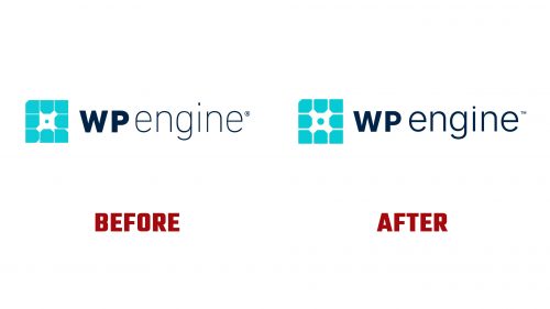
The new visual identity updates the original logo. The cog shape remains, symbolizing the “engine” aspect—the redesign balances honoring the brand’s legacy and modern design standards.
The new wordmark uses a clean, sans-serif font for readability and modernity. The angular characters convey precision and reliability. The chosen typeface aligns with digital interfaces, ensuring consistency across platforms.
The updated palette is vibrant yet professional, reflecting the innovative and trustworthy nature of the company. Blue and green primary colors symbolize trust, growth, and technology. These colors are used consistently across all branding materials.
The design system includes various graphic elements that enhance the brand identity. The modular cog logo can adapt to different offerings, ensuring versatility and relevance.
The rebrand includes a redefined user experience. The website and digital platforms are redesigned for intuitive navigation and accessibility. High-quality images and concise messaging create a professional and engaging user interface.
Customer feedback shaped the new identity, highlighting strengths in expertise, people-focused culture, innovation, and performance. This feedback informed the core messaging, ensuring the brand communicated its value proposition.
The rebrand updates all physical and digital touchpoints. Marketing materials, office spaces, and digital platforms reflect the new visual identity, creating a cohesive environment.
Employee engagement was key. Workshops and training sessions ensured all staff understood and embodied the new brand values, fostering enthusiasm and successful adoption.
Client and partner communication ensured a smooth transition. Personalized emails, press releases, and a launch event informed stakeholders about the rebranding. The response has been positive, with clients excited about the fresh and modern look.
WP Engine’s rebranding unifies and elevates the company’s visual identity. The updated logo, modern typography, vibrant colors, and strategic messaging create a cohesive brand presence. This rebrand enhances WP Engine’s market position and reinforces its commitment to innovation and leadership in the WordPress community.


