 Washington State University Logo PNG
The educational institution depicted on the emblem produces strong, confident, athletic, and educated people. The WSU logo focuses on the personality of the student. Education has one task – to help reveal the talents and abilities of the student.
WSU: Brand overview
| Founded: | March 28, 1890 |
| Headquarters: | Pullman, Washington, United States |
| Website: | wsu.edu |
Meaning and History
In the spring of 1890, the Washington legislature signed an executive order establishing the Agricultural College, Experiment Station, and School of Science of the State of Washington. It was then formally approved by the governor. A second law was then passed that greatly expanded the educational function of the institution. Two areas of general arts and science were added to the curriculum. But the final direction did not take shape until 1894 when the university’s first experimental agrarian station was opened. As a result, three courses of study emerged: agriculture, domestic science, and engineering.
For all the first decades of its existence, WSC competed with UW. The relationship between the two universities was extremely tense. They competed for state appropriations because they were actually in the same region. The situation escalated in 1909. But then came the Great Depression, which dramatically affected all of national education: students, faculty, and finances were in short supply. In the fall of 1959, the college finally received its well-deserved status as an institution of higher learning and a new name: Washington State University.
The university emblem is the universal pride of Washington State. Not only is it placed on business papers and academic documents, but it is also used as a mark, signature, and identifier of affiliation. It has even been in space, as the distinctive mark on astronaut John Fabian’s spacesuit. Its basic element is a puma head, invented in 1936 by a student Randall Johnson.
The modern interpretation of the icon has a very complex composition because it is, in fact, not a drawing but a text. The image of the predator with its mouth open encodes the university’s abbreviation. “W” is the scruff and stripes on the hide, “S” is the muzzle, smoothly transitioning to the neck and throat, and “U” in the lower jaw of the open mouth. The head is located on a pentagonal shield, which did not exist before. On the right side is the full name of the university, arranged in two lines. The first character in each word is highlighted: it is larger than the others, although all the letters are capitalized. There is a harmonious link between some of the characters. AS”, “UN,” “VE,” and “RS” have it.
Seal
WSU’s seal is circular, but it is still not a classic seal. The centerpiece is a portrait of George Washington, shown in profile and framed in gray tones. It is a tribute to the state’s great historical heritage and a connection to the area where the university is located. What sets this stamp apart from traditional seals is the lack of inner and outer rings and standard frames. They do not exist. Therefore, the expanded name of the university is located in the surrounding space, which is not outlined in any way and is itself a frame for the portrait of the first President of the United States. The letters are smooth and straight, without serifs. At the bottom is the year of the institution’s appearance: “1890”.
Washington State Cougars Logo
The athletic teams are named after a wild feline native to the area. The division represents nine women’s teams and six men’s teams in NCAA Division I and the Pac-12. The most successful disciplines are baseball, basketball, swimming, track and field, and boxing (now gone). The Cougars won a resounding victory in men’s basketball in 1917, boxing in 1937 (they won the NCAA championship), and track and field in 1977. The name of the department echoes the university’s mascot, the puma. This animal has been gracing WSU athletic paraphernalia from the very beginning.
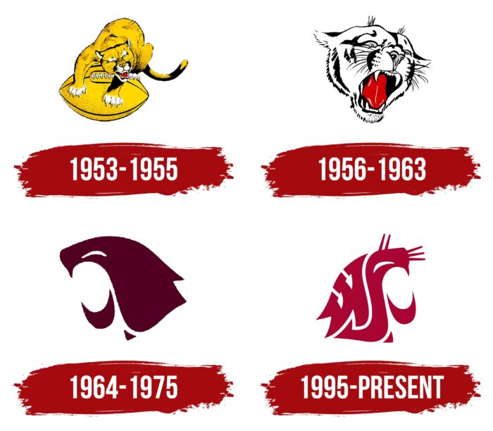
1953 – 1955
The logo is all yellow with a black outline, small dots of the same color, and a darkened tail. The cougar stands on four paws on American soccer and snaps viciously. Its muzzle shows the imprint of hatred for those it sees. The wild animal’s ears are pulled back, indicating its willingness to attack anyone who infringes on the ball. The tips of its paws, over-eye areas, and lacing are painted white. Sharp claws clawed into the sports paraphernalia. Fangs stick out of the open mouth, which is visible against the background of the red tongue. The cougar’s tail is bent, indicating a direct threat from its side.
1956 – 1963
The artists repainted the image of the wild cat, using only the head with its mouth open in a snarl. They depicted the mouth wider than in the previous logo to make the animal look more intimidating. They also removed the yellow color, added small touches to simulate fur, and made a long fluffy mustache. This version is characterized by a monochrome combination of white and black.
1964 – 1975
From 1964 the university teams used a graphic emblem. The designers left only the schematic resemblance to the cougar, while the detailing characteristic of this animal disappeared completely. The cat’s head is in profile and turned to the left. The wild grin with distinct fangs and the squinting eye have been preserved.
1995 – today
The athletic department received the logo from the university-wide badge. The head of the wildcat is composed of several fragments resembling “W” (scruff), “S” (muzzle), and “U” (lower jaw). They are so harmoniously matched that they completely correspond to the shape of the puma’s head. The first letter is completed with a wide serif, the second has an elongated curve, and the third looks like an inverted crescent. The color was changed from dark burgundy to crimson, corresponding to the official palette.
Font and Colors
Washington State University’s identity has common features:
- It is painted in the color scheme of the university.
- It consists of iconic symbols and images (George Washington, the puma mascot).
- It is succinct because it does not contain many elements.
The logo uses Proxima Nova (for sans serif lettering) and the classic small serif typeface. In both cases, the letters are thin and tall. The color scheme of the university emblems consists of dark gray, crimson, white, and black.
WSU color codes
| Vivid Burgundy | Hex color: | #981e32 |
|---|---|---|
| RGB: | 152 30 50 | |
| CMYK: | 0 80 67 40 | |
| Pantone: | PMS 187 C |
| Davy’s Gray | Hex color: | #53565a |
|---|---|---|
| RGB: | 83 86 90 | |
| CMYK: | 8 4 0 65 | |
| Pantone: | PMS Cool Gray 11 C |
