


![]() Zenith Logo PNG
Zenith Logo PNG
The Zenit logo says, “Club members are masters of the ball. ” The opponent can only watch how the team leads the game and makes passes, moving towards the goal. The players’ passes are accurate, and goals in the opponents’ goal are inevitable.
On May 25, 1925, football competitions began at the Leningrad Metal Plant, marking the origin of Zenit. The factory produced turbines, and its workers formed the first team. In the 1930s, it played as “Stalinets.” In 1936, another factory team, Bolshevik, joined the Zenit sports society, and by 1939, all structures were unified under the Zenit name.
In 1944, during World War II, Zenit won the USSR Cup, defeating CSKA Moscow in the final. After the war, the club stayed in the top division but remained mid-table, with a fourth-place finish in 1958 as the best result. In 1967, despite finishing last, the team avoided relegation due to political factors.
A breakthrough came in 1984 under Pavel Sadyrin. Zenit won the Soviet championship after a 4:1 victory over Metalist and reached the USSR Cup final, later adding the Super Cup in 1985. European debut came in 1981 against Dynamo Dresden.
After the collapse of the USSR, the club faced financial instability, was relegated in 1994, and returned to the top flight in 1996. In 1999, with Gazprom’s support, Zenit won the Russian Cup against Dynamo Moscow.
Under Dick Advocaat, Zenit won the Russian Premier League in 2007. In the 2007–08 UEFA Cup, the team defeated Bayer Leverkusen and Bayern Munich, then beat Rangers 2:0 in the final. In 2008, Zenit won the UEFA Super Cup, beating Manchester United.
Later titles were won under Luciano Spalletti and André Villas-Boas, with league wins in 2010, 2012, and 2015, and a run of six consecutive titles starting in 2018.
Meaning and History
![]()
All the club’s logos, except the first one, bear its modern name. It sits inside a makeshift triangle popularly known as the Zenit Arrow. In 2015, the “arrow” was involved in a minor scandal: the Daily Mail included it among the 10 ugliest football emblems. Zenit did not stand in debt and said that the Daily Mail has the ugliest logo of any newspaper.
What is Zenit?
Zenit is a Russian soccer club, founded in 1925 or, according to Russian sources, in 1914. It holds a leading position in its country and is part of the Premier League. In 2022, it was expelled from FIFA and UEFA and had its membership in the European Clubs Association suspended.
1925 – 1936
![]()
The first logo features a banner with the Russian-language inscription “Stalinets,” a reference to the club’s steelmaking past. Even though the flag is folded in two places, the letters do not get lost in the folds. Because of this, the word seems written on a perfectly flat canvas.
The banner is divided into three parts, painted in white (in the center) and blue (at the edges). As you know from archival materials, blue shades on the Zenit symbols could be any: an electrician often used sky blue.
1940 – 1977
![]()
During the Second World War, the famous Zenit Arrow appeared. This happened after the voluntary sports society Stalinets officially changed its name to Zenit. The text sign of that period looks unusual: two long lines go from the first letter to the right, connected at the end of the word. All other letters are inside the resulting non-standard quadrangle. The logo’s main color is blue, but two more versions were used on the T-shirts: red and white.
1978 – 1989
![]()
In 1978, the club redesigned the Zenit arrow by changing the font and arranging the long lines. The first letter also fits into an impromptu triangle, and the last one merges with the edge because its upper horizontal stroke coincides with the end of the upper strip. The second and third letters are connected according to the canons of calligraphy, although the inscription can hardly be called calligraphic.
1988 – 1991
![]()
As changes began to take shape in the Soviet Union, the club adopted a new logo featuring a yellow ship and a black-and-white soccer ball. The three-masted ship was taken from the building of the St. Petersburg Admiralty.
The Zenit Arrow remained centered, but the font changed slightly. The top line breaks before the last letter, then restarts. Around the emblem on an invisible ring is written the sports organization’s status (football club) and the city it represents (Leningrad).
1992 – 1995
![]()
In 1992, all elements of the logo disappeared except for the famous “arrow.”
1996 – 1997
![]()
When the club secured promotion to the major leagues in 1996, the ball-and-ship emblem returned. However, the emblem does not mention Leningrad; it only mentions Saint Petersburg because the city had already been renamed.
1998 – 2013
![]()
At the end of the 20th century, the designers made the graphic sign dark blue, shaved the boat, and placed a long inscription in a broken ring, which was divided into three fragments.
2013 – 2014
![]()
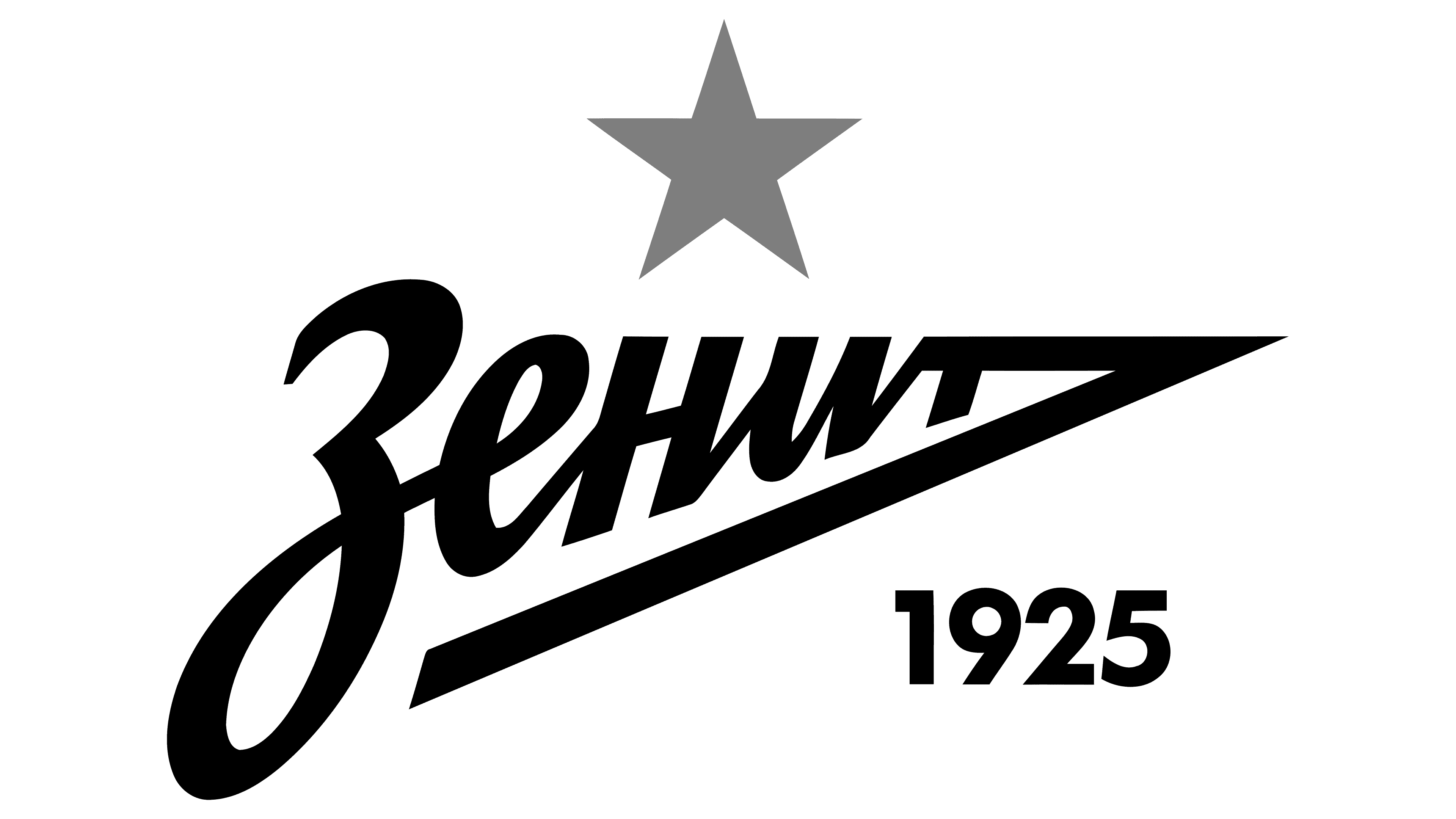
The new Zenit logo was presented in one of the LMZ workshops on July 11, 2013. Specialists from London-based branding agency Wolff Olins worked on the design with Russian typography expert Ilya Ruderman. They created their version of the “arrow”: the top line goes straight out of the last letter and down, forming an acute angle. To the club’s right, the name “1925” is written, the official year of the Zenit foundation.
2015 – today
![]()
On May 17, 2015, a version of the logo with a gold five-pointed star appeared. The team received this distinction for five national championship wins.
Font and Colors
A series of logo updates did not change the fact that the so-called “Zenit arrow” remains the centerpiece. It does have an arrowhead shape, although its design has changed a lot lately. If earlier the word was between two lines that began with the first letter and connected at a common point, there is only one strip: it goes from the last letter and sharply bends down.
Font designer Ilya Ruderman left the club’s name handwritten because this is its main distinguishing feature. The main shade in the palette is FC Zenit blue (#26acf5), used for the inscription and complemented by two other colors: white (for the background) and gold (for the star).