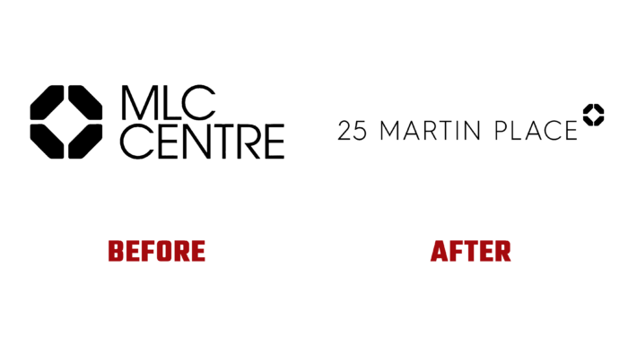
Over 40 years ago, architect Harry Seidler created an office building in the heart of Sydney that was architecturally unlike anything in Australia. Formerly named MLC Center in honor of MLC Limited in 2021 by new owner Dexus, it has been renamed the building at its location. The skyscraper with 67 floors has become one of the country’s main attractions, representing an original architectural structure. The object is one of the highest in the world among reinforced concrete structures. This is a snow-white octagonal column in Art Nouveau style, based on eight load-bearing columns, tapering towards the tops. It houses the Consulate of the United States of America, Cognizant, Servcorp, and the office of Prime Minister of Australia, John Howard. There is a shopping center and Theater Royal in the lower part with 1186 seats. After the restoration work, the building acquired hybrid protection of the facade against corrosion while retaining its appearance. The changes that took place required changes to the external identity, which James Nielsen developed.
The changed name became the basis for creating a new logo. The thin black sans-serif font makes it easy to read in any size. His choice is ensured by simplicity and visual clarity, and closeness to the writing style of modern street address plates. The execution ensures compliance with the requirements of modern typographic and digital technologies. At the same time, the simplicity and conciseness of the text make it easily recognizable and memorable. The new visualization is characterized by maximum and accurate information content, indicating the location and linking it to the object.
At the same time, a direct connection with the history of the brand was ensured by preserving the previously developed sign in the new identity. The black octahedron is made in the form of a section of blocks, which symbolizes the architectural features of the structure – its columns. The sign refers to a stylized demonstration of the classical foundations of the Bauhaus, which inspired the architect. The direct connection between form and function and a deep love for geometry is reflected here, building a corporate identity on the principles of Seidler design, which plays on the geometric shape of the White Beacon. The logo is distinguished by sophistication, simplicity, and clean execution without unnecessary elements that overload the visualization.


