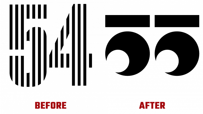
Before opening the 55th Karlovy Vary International Film Festival (KVIFF), the organizers presented their new original corporate identity. It was created by the Czech creative studio Studio Najbrt, located in Praga, which was based not only on the event’s main mission but also took into account the significance of the festival and its rich history. It was first held in 1946 in Marianske Lazne, then Czechoslovakia. Since 1948, it has been regularly held in the picturesque spa town of the Czech Republic Karlovy Vary at the Thermal Hotel, becoming one of the world’s oldest film festivals, the most important in Central and Eastern Europe. From 1952 to 1994, the period of its implementation was changed to 1 time in 2 years. Subsequently, it became annual again. KVIFF belongs to category A festivals, including public screenings of new films, competitions, and awards. Authors and performers are sure to come to such events.
Such a level requires especially an approach to forming corporate identity, which is created again before each of its holdings. But the 55th became special since it was supposed to pass back in 2020 but was postponed due to COVID. In this regard, the organizers decided to make the visualization original and unique, as it has always been. Stricter requirements were imposed on the new corporate identity of the 55th competition so that it could visually stand out against the background of all previous and similar international festivals.
The new visualization consists of a contrasting black and white palette, an original elaborated game typographic execution of numbers. It is made with high-quality clarity. Everything became a spectacular addition to the graphic style, which, according to the survey, attracted special attention from the majority of viewers. The style was built on creating an atmosphere characteristic of a cinema, its soft darkness, in which you can only see the glowing admiring eyes of the audience. At the same time, the black and white palette is becoming a symbol of evening dress – a tuxedo, which is worn at respected, social, and elite events. The emblem consists of two eyes that originally form the number “55”. It is very easily visually defined both as a number and as an eye due to its perfect and clear execution – you need to change your visual perception of the image, switching the priorities of values.
A certain playfulness in the performance of the composition reflects the general joy of the opportunity to get everyone together again, to spend a holiday, which was canceled due to a sad situation. The use of this original logo in digital and typographic performance has provided many pleasant moments when viewing all the material in an interactive space, on posters, images, and other printed materials. Applications have acquired the simplest visualization, provided by a laconic and interesting logo, and the use of an equal-sized sans serif font on all advertising surfaces and digital resources. The identity acquired the maximum attractiveness, which made the presentation of the beginning of the film festival especially in demand and popular.
