Forethought holds a leadership position among others involved in artificial intelligence. It is very important to maintain primacy through customer-centric service and a visual identity that attracts customers.
Breakout Studio’s design agency developed a unique new style for the company to emphasize its scale, perspective, and authority.
The bold color palette perfectly reflects Forethought’s positive outlook and ambition.
Interestingly, each product on the platform has its color scheme, distinctive features, icon, and animation. It turns out that each product is “imbued” with uniqueness and has a coherent image.
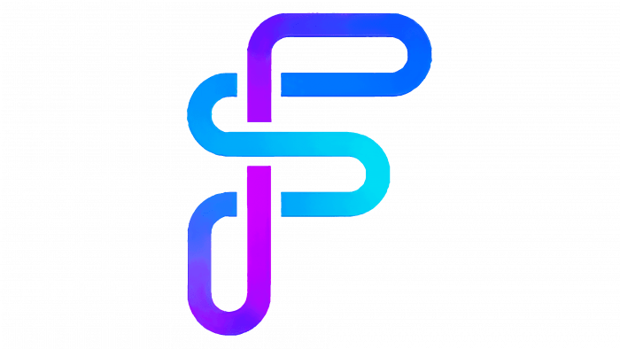
The capital letter F has always been an accent in the logo. Both the old and the new ones focused on their design style.
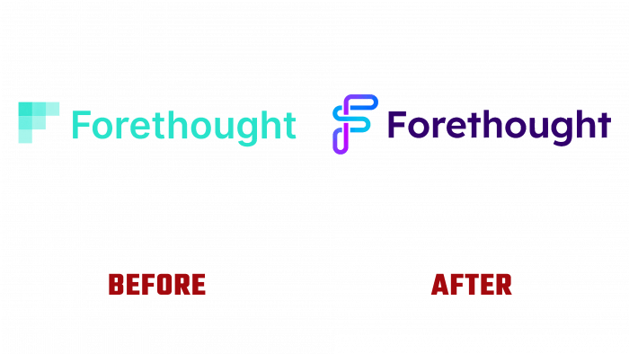
If before there were geometric cube symbols, usual plain font, and all that in greenish tones, now the new logo shows the continuity of processes and is a variation of a capital letter in the style of a gradient fill and dark blue font part. The font is sharper by compacting the color. Not taking into account that the font is different, the smoothness and lack of smooth curves are still evident.
Curved lines are plentiful in the company’s new badge, so both would be ridiculous and incorrect to aggravate visually.
Users are surprised by the new styling design, as many bright colors and chips have appeared on the platform.
Perhaps this is for the best because the public is always wary of innovations and then is drawn in and appreciates them positively.


