The oldest eminent German corporation GEA Group AG, founded in 1881 by Wilhelm Merton and Leo Ellinger, celebrates its next milestone in a new modern image. Initially created for the sale of rolled metal, the company gradually refocused on the production of food, beverages, and systems and components for the food and pharmaceutical industries. Today it is already an International Technology Group whose machines, plants, advanced technological processes, and other products are widely known worldwide. The 140-year-old brand is especially famous for its active participation in the program for the environmental protection of the planet. The process of its expansion and development has never stopped. Today there is a direct need for a global application of our design, which requires its complete renovation by modern trends.
The updated appearance was focused on such important points as the sustainability and technological leadership of the company. Known for many years for its outstanding technical expertise, the brand has successfully established itself as a premium enterprise in many markets. The current changes and dramatic changes that have taken place in society have caused the need to increase awareness of the company and brand among the end consumer. The new visualization reflects the main corporate goal – “any development – for a better world.” Based on this slogan, the company has made its identity even more attractive by focusing on the sustainability of its long-term development, using all the achievements of the modern digital world.
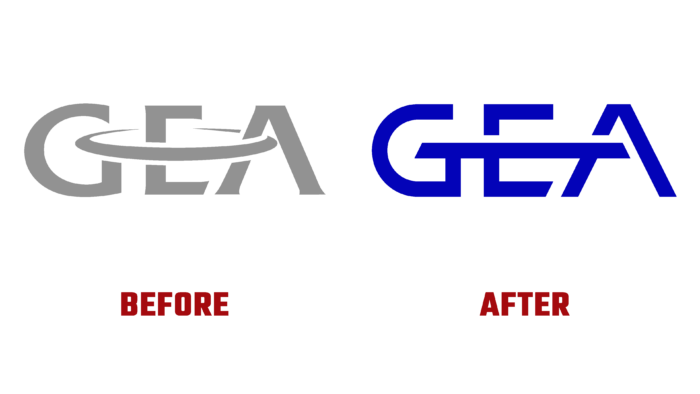
To increase the information presence, the company released its image video about itself, which appeared along with the launch of external and internal digital identification points. The constant desire to improve their technical solutions was reflected in every image element of the brand. The new logo has become the main representation of the company’s premium quality. Its redesign improved the display of graphics and other elements in a digital context. Adding dynamism and updating the design with a horizontal platform that ties the logo together was one of the achievements of this redesign.
The original icons needed to shape modern communications that play a key role in digital applications are integral to its new identity. The minimalist design and open outline make the GEA pictograms unique and expressive of his personality. The typography provided it with a bold technical appeal closely related to engineering.


