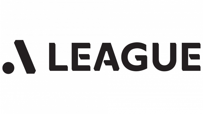
The Australian Football Premier League (A-League) recently announced the rebranding of its leagues – A, W, and Y. From now on, the three major leagues will be renamed under the new A-league banner. The men’s, women’s, and youth leagues are divided accordingly. Nothing unusual, think, who from sports teams and brands does not change their appearance now?
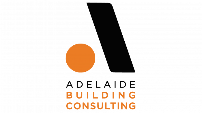
But here, the most interesting thing begins: stinging comments appeared on the network, and for a reason, a wave fell on the sports brand. As soon as the new logo emerged, the keen eye of observant fans pointed to the similarity to the Adelaide Building Consultancy logo, which does not favor the new visual image.
The most important thing in the logo of any brand is its unique message, which it shares with the target audience. Suppose there is a story, a legend of creation, a huge number of attracted specialists, but the result is bad. In that case, it is almost invisible, or maybe it seems to be a dubbing of an already existing graphic image and pulls into plagiarism, then this is generally sheer darkness.
According to the Sydney Morning Herald, the construction company has already responded to potential copyright infringement and is considering the possibility of defending the uniqueness of its trademark in court. Moreover, they also recently rebranded and claimed they have no desire to change their old logo.
The reluctance to share your graphic element with a representative, albeit from another sphere, but also business, is understandable. Adelaide Building Consultancy Managing Director Timothy Rogers gave a vague comment that they say, we do not know exactly what to do, because the situation is funny and would like to know the position of the A-League on this matter.
Of course, this is an unpleasant situation since some of the parties will be infringed because the logos, let’s face it, are identical. It can be assumed that one brand is trying to follow the successful path of another. But these are completely different areas; surprisingly, they found a common image for their brands coming from different directions.
According to News.com.au, Adelaide Business Consultancy hasn’t registered its trademark before; it’s a very bad sign for a construction company. And the smart guys from APL have already done it – they have registered a new logo for use in 11 grades.
The league’s confidence is justified: according to their answer, we can say that strategic sessions were held with the involvement of experts to develop the brand, and all the necessary formal procedures for registering the logo were followed at the highest level.
Most likely, the A-League will deny the obvious.
Well, judge for yourself what’s wrong: there is a circle, there is a rectangle with additional corners. They stand side by side, forming the letter A. so what?
And the fact of the matter is that it very much resembles a construction brand. The only difference is that their rectangle with slightly curled edges is softer; the color is different.
The league has a strange reddish-pink hue, like an unripe berry, and the dash and dot itself are dark blues.
The construction company has an orange circle as a large dot, and the line is black. There is also a postscript of the name, executed entirely under the graphic elements and in the same tone.
Of course, logos are not two identical dresses in which two guests could come to a party and pout one on the other. This is business, nothing personal.


