Papier changed his “appearance” to make others look at his proposals in a different way. Taymoor Atighetchi created the British online store in 2015 as an alternative to mainstream stationery. Its task was to provide an opportunity to purchase products that become the basis for creating an imaging office directly by the customers themselves. At the same time, all the sequels were distinguished by an eclectic design, which could be selected individually, creating a starting point for the formation of your style with your own hands. Today, Papier is a 60-employee company with high sales volumes in its home country, Australia, and the United States.
Growth prospects, the need for expansion required changes in the visual presentation of the company. Ragged Edge, a London-based global rebranding agency, was tasked with solving this important task. To enhance the attractiveness of the company’s offer informing the corporate identity, the emphasis was placed not on the product group itself but its aesthetic component. Unlike ordinary products in this category, Papier’s offers are distinguished not only by their originality but by their unique design. They carry the promise of the possibility of self-expression, the reflection of their individuality, inherent only in the one who uses this product. The styling created emphasizes the power of transformation that Papier’s offerings bring to their consumers.
The power of the magical effect of office supplies on a person should not be underestimated. Their feature is the ability to form a unique identity from scratch; thanks to its attractive aesthetics, it allows you to create a visual appeal that invites attention. The company’s office is intriguing and provoking, striking in its ability to transform and influence any sensory receptors. All this was reflected in the graphic and color design of the logo, packaging material, which create a unique atmosphere of some miracle, and not just aesthetics and product capabilities.
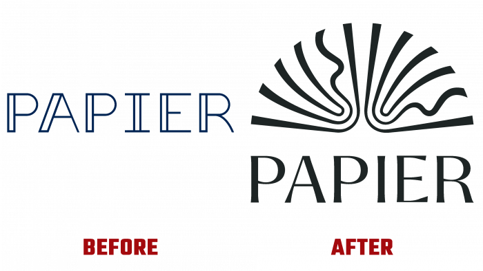
The new identity made it possible to raise the brand’s products from the level of a necessary and even an image product to luxury goods. The original sign of an open notebook or diary resembles a sophisticated bookplate on an expensive book. The carefully selected font for the brand name becomes a harmonious addition to the sign. He is distinguished by the beauty of the execution of each sans serif letter, with a classic elegance that meets both modern trends and the presence of a historical spirit. The Self-Modern type font from Bretagne Type Foundry and the auxiliary Rene Bieder’s Quarion perfectly reflect the essence of Papier’s activities, goals, and objectives.


