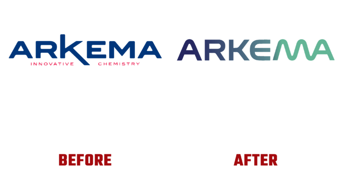
Sustainability and stability are important parameters that are ensured by modern innovative solutions. This is especially true in the field of materials science, where the demand for high-performance products is constantly growing. The products and activities of Arkema fully meet these requirements. Her valuable technological experience in materials science, commitment to high quality, and the responsibility of each member of the professional team allow her to claim a leading role in the development of new technological solutions. To achieve this goal by 2004, the brand embarked on a new strategy based on a unique positioning that relies on three main areas of high potential – adhesive technology, the latest materials, and advanced coatings.
Last year, the brand focused on accelerating its transformation. This has led to several important advances in key areas – the green technology development area has covered batteries and electric vehicles, biomaterials and non-waste materials, and adhesives. The transition from a key player in the chemical industry to a leading spokesman for specialty materials has required a significant realignment and redesign of our identity. There was an urgent need to create a new communication territory.
Starting with the logo and corporate colors, the brand upgraded the components that form recognition and visual information. The logo became the owner of a text element made of rounded and curved letters, which symbolized the double transition. The use of a gradient transition in the full-color version of the logo from blue to green and the smooth evolution of the letter K into MA effectively emphasized the change in direction in the brand’s activities and its commitment to the use of innovative solutions.
At the same time, the changes taking place in the appearance of Arkema have also led to some rethinking of the identity of its subsidiary, Bostik, which will retain its historical recognition and strengths of visualization unchanged. But at the same time, adjustments have been made to ensure the formation of a common identity, providing an understanding of the deep integration of all elements of the production Group into each other, which rely on the confidence and strong support of the entire brand.


