The Outfit brand emerged in 2015 as a response to a massive demand from marketing. Increasingly, there was a need to automate digital and print production with flexible templates. In large organizations, this need was growing by the day, so many resources and energy were devoted to controlling production.
The Outfit has become the kind of brand that solves several marketing production problems at once. For example, instead of corporations overseeing the production of their material marketing products, teams can better focus on the process of creating the product itself rather than on the technicalities of verifying it.
Its customer base includes global software companies, national real estate agencies, leading universities, national franchises, and other large organizations. Automated manufacturing under a specific brand name is Outfit’s short positioning.
Bigfish (Brisbane, Queensland) was entrusted with the rebranding, and it should be noted that it was the right decision.
The fact is that the Outfit brand is quite well established in the market, so there’s no need for drastic changes. We need to revitalize its image a little bit, leaving the features of its recognizability.
The idea of the redesign was to change the width of the font logo, which is the company’s face. Everyone got used to it, and why overload the visual with new details if the new creation, in this case, is inappropriate?
Focused on the alignment of the letters’ height, width, and shape.
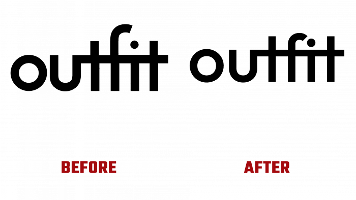
A particular distinguishing feature of the new logo from the old was the increased distance between the letters O and U. As before, the letters T, F, I, T are connected by a longitudinal line, which creates the impression of merged writing and conveys the idea of joining forces for a result.
The old logo is good, but some of the elongated lines seem to go beyond the space of the logo itself. In the updated font, everything is perfect – the spacing, the width of the letters, the gaps, and the height of the upper outlines, which are pleasing to the eye.
You could say that, on the one hand, nothing has changed. Like, who’s going to see the changes, just the designers themselves? No, there are changes. This is one case were to make it better means to tweak a little bit of what is already there.
I would like to emphasize the innovation and timeliness of the logo selection in 2015 when the fashion for minimalist and monochrome logos was nascent. And the brand was ahead of that fashion, creating a successful and well-selling logo. It probably didn’t seem as creative and successful five years ago as it does now. But that’s the thing; it was made before, updated today, and still relevant today.
They say that the best is the enemy of the good. By the example of Outfit, we can see how minimal visual transformations can be and how harmonious the final image of the brand becomes. The initiators of rebranding did not make a “big breakthrough” in developing their identity, but they improved something that is still in demand and inspires respect among customers. Attention to detail, respect for tradition, conservatism are the best features of the brand, which help it be a leader in the niche.


