Creative studio Pearlfisher has undertaken a redesign of the Loop brand. The company is in the auto insurance business and is making a revolutionary contribution to the industry by technically providing more transparent insurance processes at fairer prices. The brand’s alternative approach is to avoid outdated auto insurance metrics such as marital status, credit rating, income characteristics, etc. Two metrics — road conditions and driver behavior — are what Loop focuses on.
The founders, John Henry and Carey Anne Nadeau, state that the key idea behind their business was born out of a desire for inclusivity and individuality on the way to fair pricing.
The design brand is based on a combination of friendliness—fairness, inspiration, and trust. Nile Hope, creative director at Pearlfisher Agency, says the brand design should be friendly and inclusive, showcasing the modern flow of life and representing the interests of drivers.
The style of the identity is close to simple flat illustrations with the use of gradients, pleasing to the eye color shades. Because the naming itself has a “speaking” nature, the focus on the logo should be in the aspect of twisting, tightening, elongation of the elements.
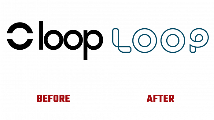
The brand logo consisted of a minimalistic combination of graphic elements and a simple rounded font. It is rounded because the name itself has three letters in a circle. The trademark was a circle trimmed with an invisible longitudinal line and made with a black border. It is essentially a circle made with a black border, with a gap inside that divides the pieces in half—nothing fancy, an unpretentious element that is easy to remember.
Can we say that this is a successful combination? More likely not, because the letters and the sign were very close together, and the symbolic circle looked like a strange letter at the beginning of the word. The color of the logo is only black. There is no association with the name, no knotty, confusing, and other ideas.
But the concept of the new logo is to show the ornamentation of the road. Visually, the logo is reminiscent of a road or braking path, bordered in either dark green or dark blue hues. The result is a pretty symbolic lettered logo, the font of which is impossible to determine. Most likely, it was the author’s development, which has no analogs among the existing fonts.
Such a logo is very handy because it is elegant, concise, and integral. It has no primitive details, which insurance companies often use in their identity – wheels, car track, wings, etc.
The advantage of this type of logo is that this style of graphic execution is rare in the market. The trend of black monolithic laconic minimalism without ornate lines and mysterious twists dominates more and more often. In this case, we can see how the logo fits in perfectly with the basic design of the identity, how it reflects the essence of the brand and its innovative movement, eagerness to meet customers.


