In 2021 the company Last Crumb began producing its unique cookies, whose specialty is working with consumers without intermediaries. The company’s production and headquarters are located in Los Angeles, CA. To attract attention to its products, the brand uses an original technology of product sales, which is a significant weekly reduction of prices for certain types of its products. Detailed information about these promotions is received only by subscribers through a system of newsletters.
The whole visualization of the brand was built on its rebellious spirit, reflecting the idea of irreconcilability with ordinariness in all aspects of life. At the same time, the product proves that it is possible to enjoy unsurpassedly delicious and inexpressibly beautiful cookies as a status symbol, as a demonstration of luxury that demands its recognition on the level of fine wines or fashionable luxury items. This was the focus of the visualization, which created high-quality interaction points at every stage of the user’s journey – from the photo to the packaging. These features are reflected in the messaging area, and on every printed piece, in the content itself, in the entire visual identity.
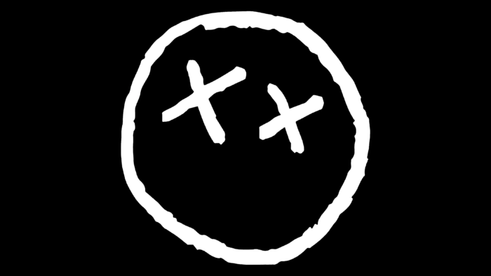
When building the visuals, the designers relied on the concept of luxury, boldness, rebelliousness, and modern minimalism. As a key element, the original cookie symbol was designed, possessing eyes in the shape of XX. These cross-shaped elements became a trademark, placed on various visual elements and identity images.
The brand typography is also original with its whimsical details like the flared serifs of the letters C and S and the eye-catching design of the letter R. By mixing contrasting sans serif fonts; the brand creates a fashionable atmosphere with various convincing combinations.
The red icon symbolizing the cookie adds to the appeal and supports the brand’s rebellious direction. The packaging used for each cookie also plays a special role. Frosted bags with the brand name and serial number look enticing and eye-catching. They are also printed on the backside, where the text information about each file, QR-code to join the mailing list is placed. The color design uses white for typography and a rich array of bright and attractive shades to create a fantastic background. Completing the identity formation is a box that ensures simplicity and ease of perception, making the visualization memorable and recognizable.


