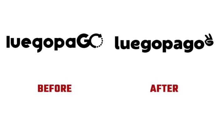
The first Colombian marketplace, LuegopaGO, became available to users in 2020. Its important feature is the possibility of making installment payments in 4 stages. In this case, the payer is not charged any hidden costs or interest. The service is active for all products exhibited only on this site. This feature is reflected in the site’s very name, which translates as “I will pay later.” The growing popularity of the brand, which during the year of its activity managed to attract the attention of a significant number of sellers and buyers from the domestic market in modern conditions, led to a revision of its identity and the creation of a new identity, which site users were introduced to at the end of last year.
The new visualization was developed by the Colombian design studio Invade Design from Medellín. The company’s new strategy included an important direction – the revision of its focus on centennials and millennials living in the country. Their financial capabilities, knowledge in using digital resources, priority types of social networks used were taken into account. Based on the local situation analysis, the most attractive elements of the aesthetic design of the visualization and slogans were selected. Considering previous experience, have formed a corporate identity, which is enlivened by selected bold and bright shades of the color palette, animated graphics, interesting stickers, and original photographs. The added whistle sound effects as the main brand sound and app notifications provided the brand identity with originality and uniqueness, demonstrating its optimism in its quest to achieve its goals.
The brand logo consists of two elements – the name and an emoji with the sign of peace, a recognizable gesture of friendship, and mutual trust. The text of the brand name is in bold round sans-serif, lowercase letters, providing a visual display of friendliness and goodwill. A feature of the verbal sign is the presence of a vertical line in every second letter, which fills the voids of the negative space. Rebrand font was used for application texts.
The right atmosphere is also created with the help of a perfectly matched color palette, where original attractive combinations of pink and purple are applied on a black and white background using a blur technique. Artwork with color and contrast photos and videos adds to the overall visual tone of audacity and joviality. The whole composition looks modern and youthful.


