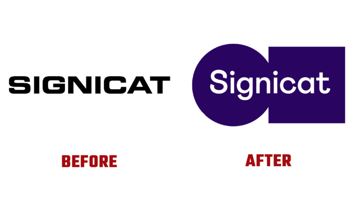
Digital identification is a characteristic of today. However, ensuring digital security has not yet been fully resolved. Signicat is the leading provider of digital identity solutions throughout Europe and is committed to providing effective assistance in this matter. The service becomes a single point of integration for all essential needs in the digital world. There is a need for identification – at all stages, from registration to passing secure authentication, applying an electronic signature. The brand gains integrity and visual confirmation of a rich customer experience in its new vision, making it fully equipped to conquer new customer markets. The update shows significant improvements.
As a result, the brand has taken on a more appropriate identity that makes it feel especially like the real thing. He gained more strength and external confidence, becoming bold and understandable, favorably reflecting the internal culture and a huge supply of energy, embracing with his capabilities not only the achievements of modern technologies but the person himself. The created strategy refocused the company on forming an organization that solves people’s problems, but with the help of technology. The applied graphics, built on modern digital technologies, ensured the creation of identification that will be effectively and efficiently implemented on analog, digital and post-print media.
The new visual appearance is permeated through the core concept built on the reliability of connections. The new brand has become more human, has acquired a large set of user tools, has become more integrated. Its graphics and text block are particularly attractive and recognizable. The white color of the company name contrasts favorably against the purple background of two geometric shapes – a circle and a square. The good choice of font type made it possible to reflect the overall personality only with its help. All the icons used in the visualization are very well executed in compliance with the general language principle used when creating a text composition.
The color palette is distinguished by the saturation and clarity of the shades of the selected colors. At the same time, the formation of illustrations was based on the use of geometric shapes of the logo. The main achievement of the new image was its versatility. Regardless of who will be the user – the developer or CEO of the brand’s voice will follow the same principles and rules. He demonstrates – readiness to provide the necessary assistance, friendliness, well-deserved trust, the presence of vigor and courage in his decisions.


