Abu Dhabi Festival (ADF), the United Arab Emirates’ largest cultural celebration, has introduced a new visual identity as it enters its 21st year of showcasing innovative Arab creativity globally. Founded in 2004 by philanthropist and arts patron Huda I. Alkhamis-Kanoo, the festival has established itself as a key platform for music and art experiences, supporting commissions, productions, and the preservation of arts throughout the year. With a mission that extends beyond national borders through co-commissions and international presentations, ADF continues to promote cultural exchange and understanding.
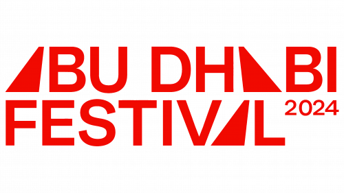
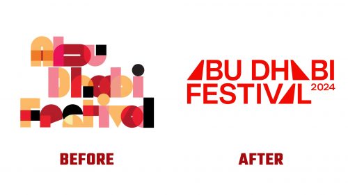
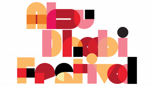
The festival’s rebranding, crafted by Dubai-based design firm No One, significantly departs from its previous visual representation. The old logo, characterized by its lively and somewhat complex design that mimicked Arabic script, presented challenges regarding versatility and readability. In contrast, the new Abu Dhabi Festival logo embraces simplicity and modernity with an all-uppercase sans serif font and innovative use of abstract spotlights to represent the “A”s in the festival’s name.
This minimalist approach not only nods to contemporary design trends but also reflects the festival’s forward-looking vision. Each spotlight “A” is angled differently, injecting dynamism into the wordmark and echoing the festival’s commitment to diversity and movement within the arts. The logo’s animation adds another interaction layer, with spotlights traversing the letters and creating engaging positive and negative space effects. This dynamic visual play extends to video overlays, where the logo interacts seamlessly with underlying imagery, offering a fresh and immersive experience.
A bold color palette accentuates The new identity system, including red, purple, aqua-blue, black, and white. While this combination may seem overwhelming initially, its application across various elements introduces a vibrant energy that captures the audience’s attention. The strategic use of duotones enriches the festival’s imagery, adding depth and intensity, while moments of monochrome offer a calming counterpoint to the otherwise assertive visual language.
One notable shift within the rebranding is the transition to Bauziet for typography in application materials, moving away from the sans serif used in the logo. Although similar, Bauziet’s distinctive ink traps present a subtle differentiation that ensures consistency and identity across all festival communications while not adding significantly to the concept.


