As one of the fintech applications, Toqio has achieved a high level of development in 2 years of its existence. This required adjustments to visual identity and brand strategy, opening up ample opportunities for further limitless growth. The platform is positioned not just as one of the recently developed fintech options. Its creators focus users’ attention on the fact that the application is smarter than the existing version. While developing the service, they laid the pragmatism characteristic of the brand itself and its team. Toqio represents the smartest option for innovating and advancing modern technology in its field. The platform demonstrates the implementation of a reasonable and comfortable solution in a simple implementation form.
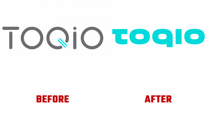
The creative study of the essence of the program, the study of the distinctive features, philosophy of the startup made it possible to accurately understand its goals for the current moment and the future, making it possible to create the most understandable and effective visualization. With this approach, a solution was found to create the cohesion and consistency lacking in the image. The result was the formation of a logo, which, with its fullness of information, turned out to be laconic, simple in visual perception, and memorable—opening a new creative path in brand development, which is based on the resource of the spheres. Studio Acute & Creative used a rounded and thicker font, which is reflected in the letters “o” and “q” – the latter “lost” its upper “ponytail.” To create a unity of spirit and style with the name of the brand itself, a graphic change in the structure of the letter “t” was applied in the font, which began to resemble a Japanese hieroglyph since the name of the brand itself is consonant with the name of the Japanese capital. This made the visual mark unique, distinguishing it from similar platforms, providing recognition.
Particular attention was paid to the color palette of the identity. His choice was inspired by the lights of the evening Tokyo. Not only the shades of the city were used in the color reflection. Every effort has been made to reflect the features and effects of the gradient transitions accurately. The turquoise of old Tokyo was adopted as the main color.
Intelligence, innovation was presented with the help of – a sphere, a geometric 3-D figure as a key element. Animation solutions have increased the visual impact on users, making all meanings smarter, faster, and more efficient.


