Leading its history since 1969, American Acxiom Corporation has completely rebranded itself, once again changing its name to LiveRamp. As a SaaS company, the brand provides a platform that provides data connectivity, including online data entry and transmission, for marketing use. The new name was chosen after the brand acquired the company of the same name, spinning off one of its divisions, Acxiom Marketing Services, into a global advertising network. The brand has a wide network of offices located in different cities of the United States, Europe, Australia, and Asia. The development and expansion process, still ongoing today, has stimulated a redefinition of its identity. The constant launch of new services such as Privacy Manager, the addition of management tools such as Safe Haven, and the acquisition of new platforms have all been reflected in the company’s new identity recently presented to users.
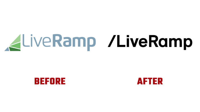
First of all, the identity presented is distinguished by a modern approach to the formation of graphic elements and building architecture. In addition, the identity aims to fully and accurately reflect what the brand is exactly today, emphasizing its reliability as a partner. The structure of the image reflection combines dynamic elements with vigor and simplicity. The designers have succeeded in reflecting everything the company does for its customers in a simple and minimalistic way. By leveraging the platform’s capabilities, the data used provides users with greater efficiency and effectiveness. Providing effective support for the formation of the required perception with graphics designers applied the addition of a simple slash in the logo, which creates a ramp effect symbolizing the exaltation of the company, its rapid growth.
Modern minimalist interpretation is built on the removal of unnecessary visual elements in the logo, the reflection in its only text block – the name of the brand, and adding only qualifying sloping lines. To form a simple perception of the text, consisting of two words not separated by a space, all letters are made in compliance with the unity of style and the same thickness. Rejection of multicolors in the logo, the preference for a strict monochrome of the classic black color also simplifies and accelerates the process of visual processing of the information obtained. This design provided:
- A simple, easy-to-remember logo
- Its recognizability
- Providing greater appeal of the new visualization.


