Adecco: Brand overview
In 1996, Switzerland saw a significant merger between two giants of the staffing sector, Adia SA and Ecco SA. As a result of this merger, the Adecco group of companies emerged.
Henri-Ferdinand Lavanchy founded Adia SA in 1957 in the picturesque city of Lausanne, Switzerland. Over the next two decades, the company grew rapidly domestically and internationally, mainly through a series of strategic acquisitions. On the other hand, Ecco SA, founded in Geneva in 1964, was the brainchild of Philippe Foriel-Destez. Like its counterpart Adia, Ecco also began its journey abroad, expanding its sphere of influence through numerous acquisitions.
In 1996, the merger of these two powerful companies resulted in the formation of Adecco SA. This merger took the newly formed company to the top, crowning it with the title of the largest staffing organization in the world. The city of Schezerex (Switzerland) was chosen as the location of the conglomerate’s headquarters.
At the turn of the millennium, in 2000, Adecco acquired the French firm, Adia, solidifying its position as a global leader in staffing solutions. Over the next twenty years, Adecco began aggressively acquiring new companies. In 2002, US-based Olsten Staffing joined the company’s portfolio, followed by Germany’s DIS Deutscher Industrie Service in 2005 and North America’s MPS Group in 2010.
The year 2017 marked a new round of development for Adecco: the company moved its global center to Zurich, Switzerland. Adecco Group now demonstrates its global presence, operating in more than 60 regions and employing more than 34,000 dedicated employees. As a member of the esteemed Fortune Global 500, Adecco maintains an enviable position as a leading staffing organization by revenue.
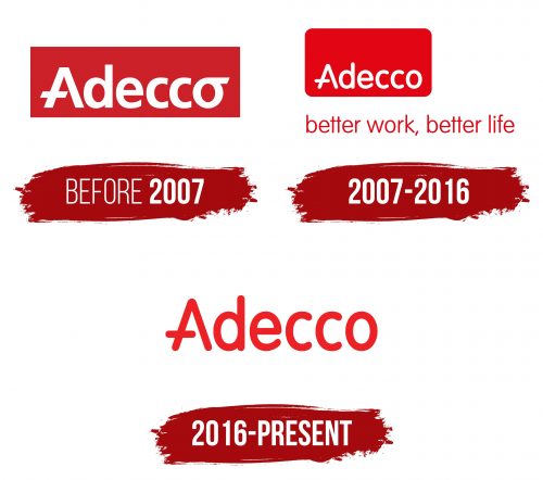
Meaning and History
before 2007
2007 – 2016
2016 – today
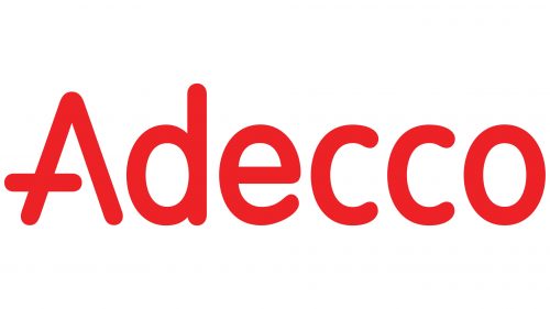
The Swiss-French recruitment agency opted for a minimalist yet professional logo, focusing on its name with a unique design that distinguishes it. Each letter in the logo has carefully rounded ends, creating a friendly look. Such a feature is vital for a company dedicated to building connections between people. The letter “A” stands out with its design of an open triangle pointing up and a short bar crossing the left leg, not extending to the right side. All other letters maintain a uniform oval shape, ensuring a cohesive appearance. The bold, mainly lowercase font enhances the logo’s inviting and professional tone.
The agency’s choice of logo design mirrors its recruitment philosophy: modern, accessible, and highly professional. The soft and approachable shape of the rounded letters is essential for a sector that relies on human relationships and trust. The minimalist approach underscores the agency’s commitment to efficiency and focusing on the essentials, appealing to companies and job seekers who value clear, effective solutions. The distinct “A” reflects the agency’s creative way of connecting talent with opportunities, underlining its key role in the job market. This logo adeptly represents the agency’s goals and principles, merging a friendly demeanor with professionalism in a stylish, contemporary design.
