The open consulting company ADL applied the main methods of promotion used in the development of optimal solutions for its clients. The primary model of the brand’s actions is the creation of interactions and close cooperation with each client, which is based on the creation of integration of their specialists and experts in client teams. As a result, the most exemplary results are obtained based on customized solutions shaped according to each company’s basic needs. The creation of optimal solutions is based on a modern, next-generation infrastructure based on the application of new technologies, digitalization, and convergence. Its sustainability creates the necessary stability, which is transferred directly into the client’s business world. It is imperative that all customer needs are taken into account, and a forward-looking program is created that considers the possible emergence of new ones in the future. Due to its multi-profile nature, the brand effectively applies both a creative and pragmatic approach in shaping the sequence of actions, emphasizing tomorrow’s possibilities.
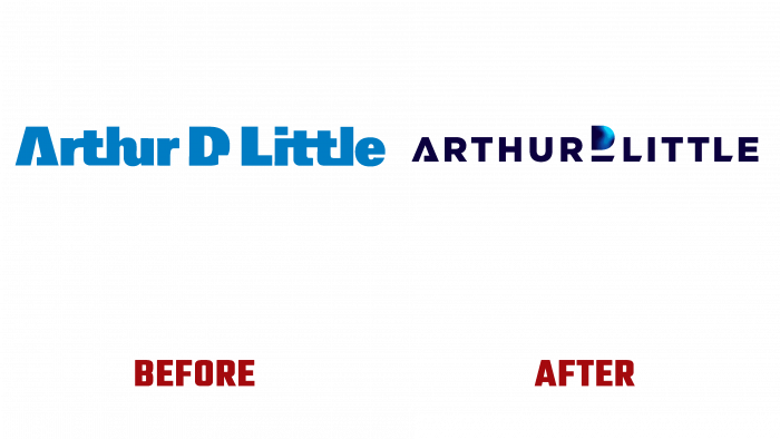
The brand updated its visual identity to reflect its uniqueness and demonstrate its existing strengths. The main emphasis was placed on the graphic execution of the logo, which used typographic text features. The brand emblem is represented by the original graphic execution of its name. Asserting its position of openness and emphasizing its professional purpose, the brand used graphics as the main element of impact on the viewer. To highlight its uniqueness, the platform applied an original move by emphasizing the letter “D.” Created in a completely different graphic style, using a color raster from blue to turquoise, making the letter the most active in this composition forming a visual emphasis on it. This provides a spectacular visual separation of the words that make up the name of the service. Thus, the effect of unity and simultaneous independence of each element of the composition and the formation of the required visual perception and understanding of the information presented by the logo is achieved.
Color palette plays a special role in the psychological impact on the viewer. The dark blue color of the main modern sans serif font creates an austere atmosphere, typical for financial structures. But this austerity is diluted by the gradient color variation of the letter “D,” demonstrating that the brand has limitless possibilities in shaping its strategy and policy.


