Aegon: Brand overview
In 1983, a new venture entered the insurance world: two Dutch insurance giants, AGO Holding N.V. and Ennia N.V., decided to merge. The newly formed organization was named “Aegon,” inspired by a Dutch phrase symbolizing eternal forward movement. In the 80s and 90s, Aegon expanded beyond the Netherlands, making strategic acquisitions in regions such as the United States, the United Kingdom, and Central and Eastern Europe. By 1994, the company’s significant growth was reflected in the financial arena when it went public on the Amsterdam Stock Exchange.
Over time, Aegon diversified and strengthened its global presence, specializing in life insurance, pensions, and asset management. However, in the late 2000s and early 2010s, Aegon made momentous decisions regarding its international businesses. These included the sale of the UK life insurance division to Atos Origin in 2008, the parting of ways with the Canadian division, which was acquired by Wilton Re in 2010, and the transfer of the Australian operations to AMP Limited in 2011.
In recent years, Aegon’s primary focus has been on markets in the US and the Netherlands, as well as emerging markets such as Brazil, Hungary, Poland, Spain, Turkey, and Romania. As of 2020, the company’s extensive operations are managed by approximately 26,000 professionals worldwide. By 2022, another significant shift will occur, with ASR Insurance announcing its intention to acquire Aegon’s Dutch operations, marking the transition of the Aegon brand under the ASR signage in the Netherlands.
Meaning and History
1983 – today
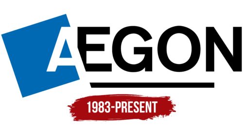
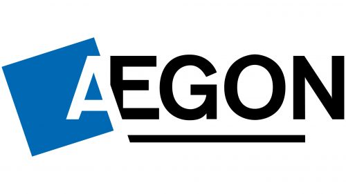
The Aegon logo is combined: the graphic element is successfully combined with the text to form a coherent design. Visually, the text is divided into two parts: the white letter “A” on a blue rhombus and the black word “EGON” emphasized by a short line. The way these two parts intersect is quite interesting from a design perspective: the first letter (which looks like negative space) cuts off the bottom of the letter “E,” making it incomplete. The rest of the letters are plain: bold, smooth, even. All of them are uppercase.
The unique trim at the bottom of the letter “E” makes you look at it twice. It adds a whimsical touch to an otherwise simple design. The blue diamond highlights the white letter “A” like a spotlight. The black text gives the logo a solid and casual feel. These elements make the logo easy to remember and full of character.
Aegon color codes
| Medium Persian Blue | Hex color: | #0069b4 |
|---|---|---|
| RGB: | 0 105 180 | |
| CMYK: | 100 42 0 29 | |
| Pantone: | PMS 285 C |
| Black | Hex color: | #000000 |
|---|---|---|
| RGB: | 0 0 0 | |
| CMYK: | 0 0 0 100 | |
| Pantone: | PMS Process Black C |

