


![]() Aflac Logo PNG
Aflac Logo PNG
The Aflac logo symbolizes family and the key to material and financial prosperity. It uniquely conveys this idea because the company represented by the emblem specializes in family insurance. The friendly, welcoming, and open sign instills trust and confidence for the future, as it features unique elements that bring hope.
Meaning and History
![]()
The beginning of this major American insurer was marked by the American Family Life Insurance Company of Columbus, as named by its founders. In 1964, the company was renamed the American Family Life Assurance Company of Columbus. The overly long name led to its abbreviation as Aflac, which was officially approved only in 1990. The emblem uses the shortened version.
The insurance company’s visual identity reflects only its primary line of business, as the graphic symbol cannot cover all directions. Therefore, at various times, designers proposed different logo versions, aligning them with the principles of simplicity, clarity, and good visibility. They changed at key stages of the insurer’s development to fully demonstrate to clients reliability and a commitment to progress in protecting the population.
What is Aflac?
Aflac is a major insurance organization from the US with numerous international agencies. Its full name is the American Family Life Assurance Company. It was founded by three Amos brothers (John, Paul, and Bill) in 1955 and has since been involved in issuing insurance policies in various directions.
1955 – 1964
As a budding insurer, the company focused on providing services, so the logo took a back seat. Moreover, during this period, the company successively adopted two different names, each of which was very long and, therefore, difficult to fit within the framework of visual identity.
1964 – 1990
![]()
The main element of the Aflac logo is people. They are depicted in the center of a vertical oval, similar to a medallion. The drawing is a black-and-white contour executed in a realistic style. It represents the key unit of any society, a strong and happy family. Their well-being is evident in their expensive clothing, contented smiles, confident poses, and kind-hearted gazes. Surrounding objects are made as background, so they are blurred and lack a clear structure. This reaffirms that the insurance company’s main focus is family values.
A wide dark band surrounds the central area with light lettering. On the right and left, it is divided by stars into two parts: the upper part contains the phrase “American Family Life,” while the lower part contains “Assurance Company.” Although the fonts differ, both are sans-serif. The first half of the name uses wide and rounded letters, while the second half uses classic print letters. The most original is the “A” and “E” with unusual crossbars.
1990 – 2005
![]()
After shortening the name to an abbreviation, a logo with a two-line inscription appeared: one line reads “Aflac,” and the other “Incorporated.” The word in the upper row is set in large, uppercase glyphs. They are semi-bold, decorative, italic, and have sharp serifs. The second inscription, on the other hand, is thin. However, it matches the style of the one below and is separated from it by two lines.
The family image is now improvised: it looks like four blue figures without any specifics. The people in the center are taller than those on the right and left, suggesting they are parents with children. Designers moved them from the center to the left part of the emblem, placing them directly on the capital letter “A.” For better contrast, they colored the inscription black.
2005 – today
![]()
The duck is the iconic mascot of Aflac. It appeared in 1999 when Kaplan Thaler Group designed it for marketing purposes. However, it didn’t become part of the logo until much later, taking a prominent place in the foreground. In advertising, the duck looks friendly, attracting potential customers’ attention, so it perfectly replaced the barely noticeable figures of the four people symbolizing a family. It smiles, too, sharing confidence in tomorrow, radiating happiness and joy. Moreover, this domestic bird embodies flexibility, success, and resourcefulness. It is located in the center, partially covering the lowercase “l.”
Fonts and Colors
For its logos, the insurer chose typefaces with clear and easily readable letters. For better visual contact, they are either colored in contrasting shades, have thin forms, or are highlighted in italics. In the version with the duck, the font includes an unusual “A” with a shortened and diagonally cut crossbar. The primary fonts resemble Garamond Amst SB Italic and one of the Today family variations. Glyphs are sharp, smooth, and sometimes rounded.
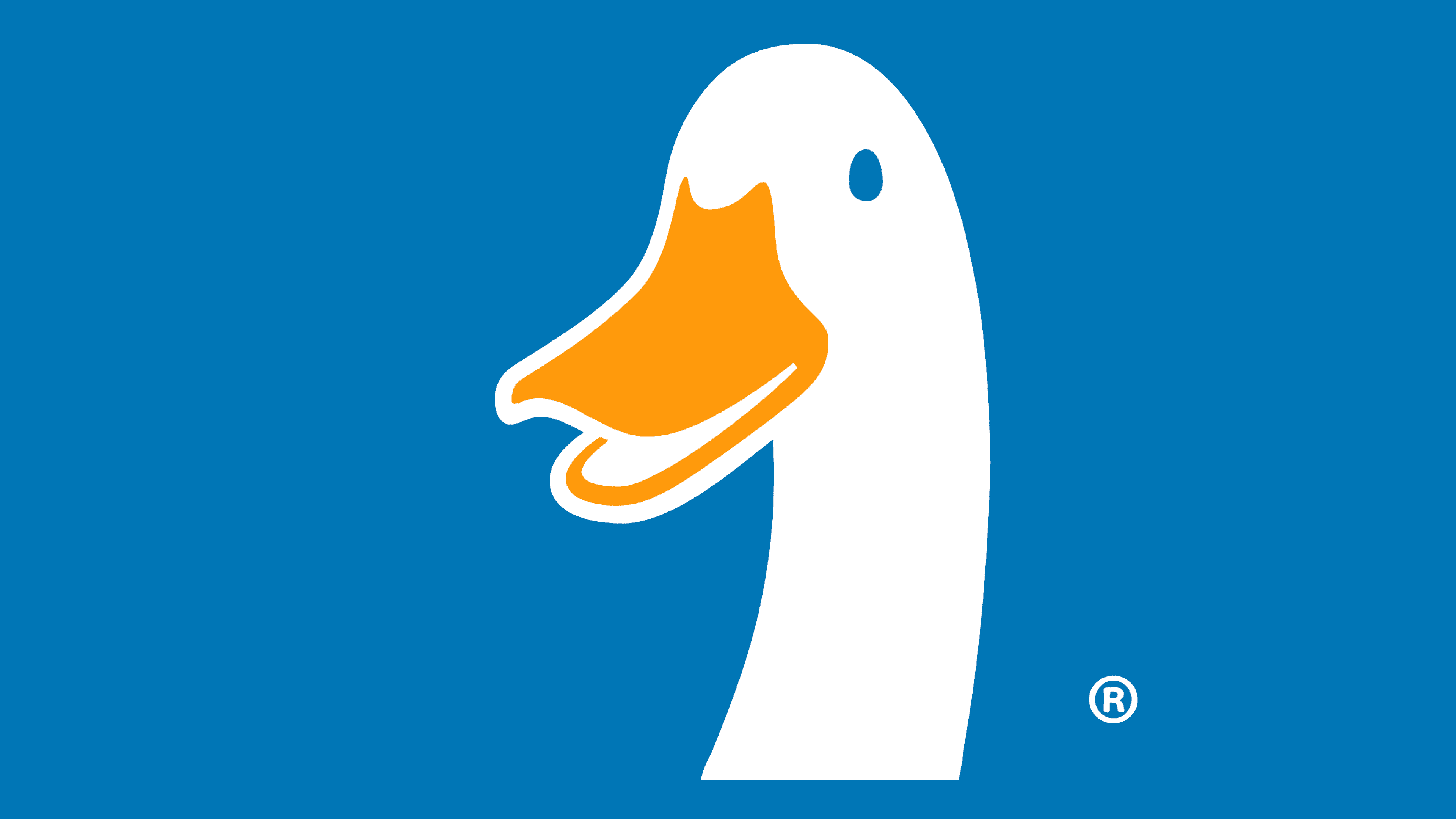
The color palette of Aflac’s emblem is business-like and practical, aimed at enhancing the perception of its visual identity. Designers chose contrasting colors, classically combined: black letters are visible on a white background, and vice versa. Subsequently, blue (inscription), white (duck and background), and yellow-orange (beak) were added. This addition is intended to improve the insurance company’s perception, as it should convey happiness, well-being, reliability, carefree attitude, and joy for clients through its identity.