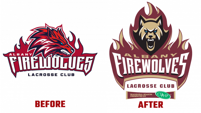
Albany FireWolves of the National League will be greeted with a new logo at the Times Union Center to start the new season Times Union Center. The need for such a change was driven not only by the team members’ desire but also by the sponsors, fans, and supporters of the club from Albany. On July 2, 2021, a new version was presented to the public, replacing the April version with a bared wolf’s head profile. A combination of several contrasting and aggressive color shades was applied to it – dark red, fiery red, dark purple, and gray. The logo’s structure strongly resembled the Seawolves Club emblem of Stony Brook University. This similarity was likely the main reason for such an urgent change in the image of “fire wolves.”
The new logo, created considering the problems with the first option, is radically different from the previous one. First, it affected the image itself and the entire color scheme of the logo. Its development was commissioned by Upside Collective, an Albany-based design agency specializing in professional rebranding, graphics, web design, video production, and visual effects development and production.
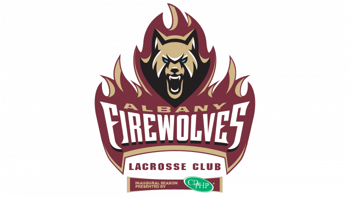
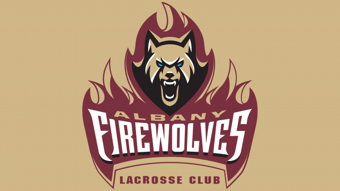
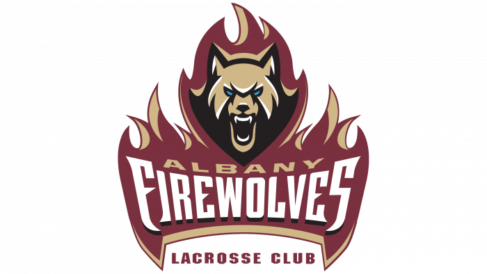
The new emblem is a grinning wolf head, depicted in full face, surrounded by flames. The designers conveyed the feeling of rage and strength with which the wolf appears ready to jump out of the flame. Below, in the fire’s expanding hearth, is the company’s name. The fire zone and flames are made using a dark red color, separating it from the general black background with a white and light brown border that exactly repeats the color of the wolf’s head in its shade. The original solution – highlighting the pupils in green, not used anywhere else in the image, significantly enhances the impact on the viewer. The LACROSSE CLUB text is positioned under the fire symbol, pushing its edges apart. This inscription is very well perceived on a black background, executed in a smaller font in the same color shade as the wolf.
Summing up the situation with the Albany FireWolves logo, we can say that the new version of the emblem is not just unique. Designers managed to convey not only the power, strength, and characteristics of the team. Their talent made it possible to create a feeling of movement, the willingness of the wolf to jump out of the flame and defeat the opponent. The logo turned out to be quite emotional and very consistent with the spirit and purposefulness of the team.
