The specificity of the Alfred Landecker Foundation activities is aimed at protecting and strengthening democratic rights and freedoms. He supports liberal institutions that resist the ideas of nationalism, populism, anti-Semitism, racism, and other similar negative manifestations in society. Generally speaking, these tendencies are destructive to society: they do not bind people but divide them, increasing hatred of certain people, and infringe on the rights of vulnerable social communities, ethnic groups, or categories of citizens. Any historical events that traumatize the memory of generations, such as, for example, the Holocaust, are reflected in society, raise to the surface the issue of respect, awareness, and eradicate painful memories by strengthening democratic rights and freedoms.
The Foundation participates in various events and works of friendly organizations, aiming to unite efforts for a common future. There is no place for discrimination, persecution, and violation of human rights. This organization unites with partners, expands the media space to spread information about cases of injustice and hatred. The Reimann family has headed the Foundation since 2109, the owners of the JAB Company, who are ready to support the Foundation for the next ten years with charitable contributions for 250 million euros.
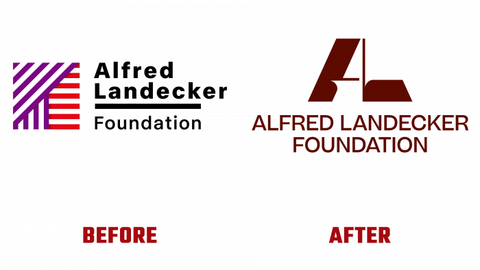
London-based creative agents designed the redesigned brand for Output. Designers talk about the power of the new logo, emphasizing that they wanted to indicate the authority and status of the organization. Decided to use a monogram of the name, as opposed to the previous logo.
The visual design of the old one consists of transforming stripes of purple and reddish shades in different directions and underlining the name of the Foundation and the word “foundation” itself with a black line. These lines form a visually acute-angled dynamic figure of a square, hidden two rectangles and a triangle directed upwards to the left. Nothing hints at democracy, resistance, or struggle.
In the new image, they wanted to present the idea of fragility, the strength of stereotypes, and structures under threat but which hold. It is like weak, thin lines that resist powerful external blows. The semantic emphasis is placed on two capital letters. There are no descriptors or annotations. The authors themselves consider the approach to design rather provocative and unconventional. The inherent hidden meaning, the deliberate hypertrophied form of the logo reinforces the motive for action, encourages resistance and struggle. In general, the new identity is designed so that the young generation will immediately join the movement for the rights and freedoms of democracy. Civil response, strong civic position, social activity, conscious resistance to stereotypical thinking are weapons against discrimination and hatred.
Looking intently at the new logo, one involuntarily creeps in the impression that one subject makes another move or rises. It is like a metaphor that means indifference and inaction present in a person’s life until the moment when external chaos and social upheavals begin to take root in the ordinary life of citizens.


