American Girl, established in 1986, is known for its iconic 18-inch dolls and educational books. The brand, founded by Pleasant T. Rowland and later acquired by Mattel, has expanded to include a variety of dolls, matching apparel, a magazine, and flagship retail stores. Recently, American Girl introduced a new brand identity designed by Pentagram partner Emily Oberman, marking the first major refresh in almost four decades.
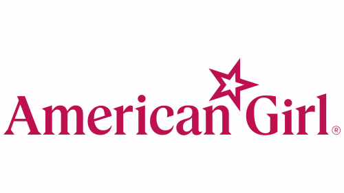
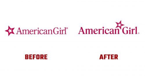
The rebranding aimed to rediscover American Girl’s essence and highlight its strengths. The new tagline, “Find your inner star,” supports a spirit of independence and self-reliance among young girls. The updated logo balances nostalgia and modernity with stronger, thicker typography, giving it a bolder presence. The star, a longstanding symbol, is now positioned between “American” and “Girl,” reflecting the new tagline and the idea that the star has always been within.
A notable detail in the logo is the 18-degree tilt of the star, nodding to the dolls’ 18-inch height. This angle is applied to the customized typography, seen in the angled shapes and points of the letters. The two lowercase “i “s are of different sizes, representing a girl and her doll, adding a clever narrative touch.
The new identity includes a proprietary typeface, Pleasant Serif, honoring the founder. The 18-degree angle is applied to crossbars and wedge serifs. Pentagram collaborated with Commercial Type to create this elegant serif. The supporting type is set in the sans-serif font Elza, chosen for its friendly and outgoing appearance.
Color plays a crucial role in the new identity. The signature color, Pleasant Berry, is richer and brighter, giving it an elevated and premium look. This primary color is supported by the “Berry Patch” palette, which includes shades from Cream to Blackberry and a secondary palette of core brights inspired by the 1990s branding.
The updated identity extends to American Girl’s sub-brands: Truly Me, Bitty Baby, WellieWishers, Girl of the Year, and Create Your Own. Each sub-brand retains elements from its past logos but now integrates the new star motif and updated typography, ensuring a cohesive look across the brand family.
The previous logo had inconsistencies in weight and placement between the star and the wordmark. The new logo addresses these issues, creating a more harmonious relationship between the elements. The sharp serifs of the new typography match the angles of the star, and the repositioning of the star creates a more balanced logo.
The monogram version of the logo is equally refined. The star fits neatly between the “A” and “G,” creating a pleasing and compact symbol suitable for various applications.


