Ameriprise Logo

Ameriprise LogoAmeriprise Logo PNG

The Ameriprise logo combines restraint and elegance. Its simplicity reflects the stability and trust the company aims to convey. The symbol’s meaning and design reveal the company’s ambition and drive to be a leader in its industry. The successful combination of different fonts and styles gives the logo individuality and expressiveness, making it memorable and striking.

Ameriprise: Brand overview

Founded:1894
Founder:John Tappan and J.R. Ridgway
Headquarters:
Minneapolis, Minnesota, U.S.
Website:ameriprise.com

Meaning and History

Ameriprise Logo History

What is Ameriprise?

This is one of the leading asset management and financial planning companies in the U.S. It provides various financial services, such as insurance options, asset management, retirement planning, and investment guidance. The company stands out with its personalized approach to financial planning, tailoring plans to each client’s goals and life stages. Financial advisors in the company’s network work directly with clients, offering advice on complex financial decisions and helping them navigate market fluctuations.

1967 – 1999

Ameriprise Logo 1967

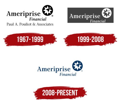
In 1967, a financial company specializing in asset management and financial planning introduced its first logo. It stood out with a clear structure that organized key informational blocks. The primary focus was on textual elements, complemented by another significant component that later became the company’s symbol.

Different fonts were used to emphasize the importance of various textual elements. The company’s name was bolded, and its size exceeded that of other text blocks, giving it a dominant role. Positioned to the left, parallel to the image, it created a sense of unity and completeness. In the logo, the text and image became two main visual elements that complemented each other.

The image consisted of three components. A circle provided a frame and background, providing a visual foundation for the other elements. Inside the circle was an eight-pointed star, and at its center was an arrow pointing toward the upper-right corner. The black arrow on a white background stood out vividly. It conveyed upward movement, symbolizing the company’s and its clients’ aspirations for growth and success.

The black-and-white color palette of the elements—the circle, star, and arrow—highlighted their contrast, creating a cohesive and minimalist image. These visual contrasts enhanced the sense of harmony and completeness in the composition.

The brand name was written in large black letters and combined with the image. Additional text blocks, arranged vertically, one beneath the other, provided reference information about Ameriprise’s activities. This arrangement reinforced the logo’s structure and emphasized its informational clarity.

1999 – 2008

Ameriprise Logo 1999

Over time, the company’s identity evolved, reflecting changes in the logo and overall perception. The color palette became more streamlined, distilling the design to its essential elements. The new design appears stricter and more elegant while maintaining its informational depth and layered meaning.

The emblem uses a simple and restrained color scheme limited to two colors: gray for the background and white to highlight the textual and graphical key elements. The exception to this combination is the geometric figures. The inner part of the star matches the background color, while the circle and arrow are accented in white.

The updated logo’s central feature is the company name on the left. It begins with a capital letter, with the remaining letters in a smaller size, giving the text a clean and visually balanced appearance. The spacing between the letters is precisely maintained, ensuring the inscription is legible and appealing. Rounded edges and slight serifs in the font enhance the style. On the second text line, “financial” is written in italics, emphasizing the company’s area of expertise.

A graphic element is placed in the upper-right corner. Its positioning and detailing balance the image and the text. Both elements are given equal prominence, forming a harmonious combination. Their parallel arrangement reinforces the overall sense of completeness and uniqueness in the company’s identity.

2008 – today

Ameriprise Logo

Since 2008, a financial company that expanded the range of services offered to clients has introduced a new identity. The logo acquired features that emphasize strength, simplicity, and clarity. One of the key changes was the updated color palette, which had a significant impact. The deep blue of the letters and symbols exudes energy, evoking associations with water. This shade is linked to the boundlessness and calm of the sky.

The company successfully combined two expressive colors that harmonize with each other. The white background highlights the richness of the blue, enhancing its aesthetic appeal. This combination gives the logo elegance, making it a key element of the composition.

The company name is positioned on the left, taking a central place within the logo’s overall layout. To the right, space is reserved for the graphic element. The text blocks are arranged in two lines, creating a clear and structured design. The arrangement of all elements ensures the graphic element becomes the focal point, while the name serves as informational support.

This arrangement and color combination make the emblem distinctive, highlighting its modern and professional character.