The Ameris Bank logo conveys the financial company’s boldness and strength. The emblem’s imagery reflects global reach, confidence, and nobility. Notes of patriotism complement the overall design. The symbol highlights qualities that enable the bank to grow and win the trust of new clients.
Ameris Bank: Brand overview
Eugene M. Verin Jr. established the American Banking Company on October 1, 1971, in Morven, Georgia, marking the foundation of what would later become Ameris Bank. Initially, the institution aimed to provide high-quality financial services tailored to the needs of southern Georgia’s residents and agricultural sector.
In its early years, the company focused on delivering essential financial services to farmers and rural communities. The bank quickly earned a reputation as a trusted financial partner by personalizing customer service and deepening its understanding of local needs.
Expansion beyond Morven began in the 1980s, as the bank opened branches in neighboring cities across Georgia. During this period, it also introduced mortgage products and business financing, broadening its range of services.
The 1990s saw the bank continue growing within Georgia, acquiring smaller regional banks and pursuing organic development. This decade was marked by the diversification of business offerings and a stronger presence in the regional market.
A pivotal moment came in 2001 when the American Banking Company rebranded as ABC Bancorp, reflecting its broader ambitions and plans for geographic expansion.
In 2005, the organization underwent another significant transformation: it adopted the name Ameris Bancorp and officially renamed its banking operations Ameris Bank. This rebranding symbolized the company’s readiness for a new growth phase beyond its traditional markets.
Between 2006 and 2010, Ameris Bank expanded its footprint significantly through strategic acquisitions across the southeastern United States. During this period, the bank established specialized business areas, such as commercial banking and business financing.
From 2010 to 2015, the bank continued its growth trajectory, integrating several financial institutions to increase its customer base and geographic reach. Significant investments were made to enhance digital banking capabilities, aligning the bank with evolving technological trends.
Several key acquisitions further bolstered the bank’s position between 2016 and 2019. Notable milestones included the 2018 merger with Atlantic Coast Financial Corporation and the 2019 acquisition of Fidelity Southern Corporation. These deals expanded the bank’s services and solidified its market presence.
From 2020 to 2023, the bank focused heavily on digital transformation and improving the customer experience. Investments were directed toward advancing online banking platforms and upgrading technological infrastructure to better meet client needs.
By 2024, Ameris Bank will continue to expand across the southeastern United States, introducing innovative financial products while maintaining its commitment to customer-focused service and community support. The institution is dedicated to blending modern technology with its core values of attentive customer care and local engagement.
Over its 50-year history, Ameris Bank has grown from a small local operation into a leading regional financial institution, remaining steadfast in its mission to serve communities and deliver exceptional customer service.
Meaning and History
What is Ameris Bank?
This regional bank in the U.S. provides various financial services for individuals and businesses. It primarily serves customers in the southeastern U.S., including Georgia, Florida, Alabama, and South Carolina. The bank offers products such as asset management, mortgage loans, and banking services for individuals and businesses. The bank stands out with a people-focused strategy that combines the personalized care of a local bank with the resources of larger financial institutions. Customer service is a strong point, especially when assisting small and medium-sized businesses. Its dedication to understanding and addressing regional economic challenges has helped build a loyal customer base across various areas.
2005 – 2010
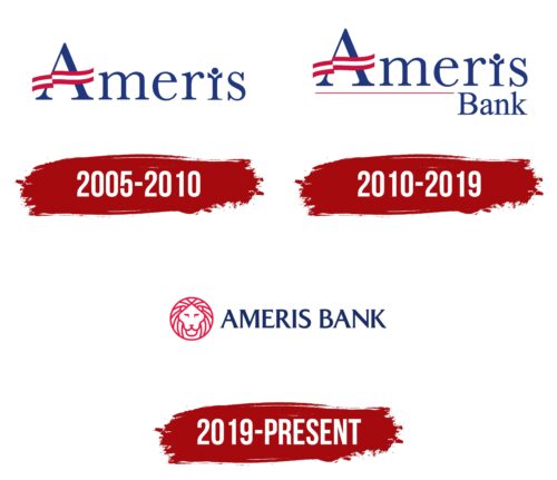
The emblem was created after ABC Bancorp, the former owner of the American Banking Company, was renamed Ameris Bancorp. At the same time, its subsidiary was given a new name: Ameris Bank. “Ameris is interpreted as a shortened “American” form, emphasizing the brand’s national identity.
The crossbar of the letter “A” features a ribbon in the colors of the American flag, visually reinforcing the name and enhancing the patriotic aspect. It highlights the company’s origins and its focus on operations within the United States. The bank started at a local level but gradually expanded its presence, serving clients across four states.
The thin lines of the font reflect the company’s initial scale, while the flowing ribbon on the letter “A” symbolizes pride in its achievements and aspirations for new heights. An additional design element is the letter “i,” transformed into the image of a person with raised arms. This symbol conveys the triumph and joy associated with growth and financial success.
The company’s mission is to contribute to the well-being of American citizens. This direction is reflected in the logo’s visual design and the organization’s activities, which aim to foster growth and support its clients.
2010 – 2019
In 2010, a new detail was added to the lower-right corner of the old logo—a small inscription reading “Bank.” This change made the logo more recognizable to potential clients in regions where the brand was not yet well-known. The company expanded, acquired competitors, and entered new markets in other states.
A thin red line was added beneath the name “Ameris,” extending to connect with the word “Bank.” The line resembles a timeline emphasizing the company’s growth dynamics and momentum. It symbolizes the brand’s steady development and confident progress toward new goals.
2019 – today
After the merger with Fidelity Bank, a new symbol appeared in the company’s logo—a stylized image of a lion borrowed from the competitor’s branding. This symbol emphasizes determination and courage, reflecting the company’s readiness for change and new challenges. The lion, symbolizing strength and grandeur, perfectly conveys the organization’s scale and character.
The company confidently demonstrates leadership in the financial industry, actively pursuing its goals and strengthening its market position. The updated design, created by the agency Matchstic, retained the national American color palette. This highlights the focus on the well-being of U.S. residents and reinforces the connection to their values.