Amil: Brand overview
In 1978, Amil, the brainchild of Edson Bueno, was born in the bustling city of Rio de Janeiro, Brazil. The Amil story began in 1972 when Bueno took over the modest Casa de Saúde São José clinic. This acquisition was only the beginning. In the following years, with his entrepreneurial spirit, he expanded his portfolio to include clinics such as Somicol and Santa Rita. These acquisitions led to the creation of a Hospital Services Company (Esho) to manage these facilities. In 1976, Esho made another significant acquisition, buying the San Sebastian Medical Center in Barreto, Niteroi.
With Esho’s financial backing, two years later, Bueno embarked on a more ambitious path, founding Amil Assistência Médica Internacional in his hometown. During the 1980s and 1990s, Amil gained a strong foothold in the health insurance sector. The company’s rapid growth culminated in 1998 when it debuted on the Brazilian stock exchanges.
A turning point in Amil’s history occurred in 2012 when it was acquired by global giant UnitedHealth Group for the impressive sum of $4.9 billion. This acquisition was significant for Amil and marked UnitedHealth’s strategic entry into the Brazilian healthcare market. Amil’s heritage and continued expansion make it the leading provider of health insurance in Brazil, serving approximately 7 million people. In addition to insurance, the company includes dental plans, clinical services, and a network of hospitals, strengthening its presence across Brazil’s vast territory.
Meaning and History
2001 – 2018
2018 – today
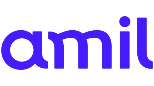
The Amil logo has a simple design with no graphic elements, but the text itself does well in this role as the font is very close to its own unique style. All the letters in the name are soft and flowing, even the “i” and “l,” which are not usually perceived as rounded. Thanks to the rounded corners and smooth edges, they have a smooth look, too. All the characters are in lowercase. The legs of the letters “m” and “a” are curved like a skateboard ramp and repeat the shape of the letter “l .”The emblem is made in a bright color – ultramarine, close to light cobalt blue.
The curve of the skate-ramp in the letters “m” and “a” gives the emblem a certain playfulness. The ultramarine color makes it more vibrant and eye-catching. There is a lot of personality in this logo. It is the little things like the rounded “i” and “l” that make it special and easy to remember.
Amil color codes
| Han Purple | Hex color: | #3fc2cc |
|---|---|---|
| RGB: | 69 27 255 | |
| CMYK: | 73 89 0 0 | |
| Pantone: | PMS Violet C |


