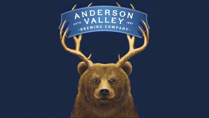
The new brand identity represents respect for the company and all those who have worked to improve it.
The packaging design came about as a result of collaboration with Stranger & Stranger. The team updated the cans with the Barkley the Beer mascot, adding vibrant colors and wide lettering. The branding was based on the history of the company itself and the efforts of the team, which is constantly working to improve the product on the market.
The history of beer, especially the Anderson Valley Brewing logo, is based on the famous adage “What happens when you cross a bear and a deer? Beer”. The banks depict a bear with horns as a symbol of the company. There are even legends that a mythical animal roams the local forests.
The designers worked out in detail not only the color combination but also the typography. You can notice a sufficiently large distance between the letters, making the inscription readable even from a distance. Harmoniously matched colors differentiate the types of products, creating a good impression of the product.
The company emphasized that all cardboard boxes and aluminum cans are recyclable, which positively impacts the environment and demonstrates the commitment of Anderson Valley Brewing. Anderson Valley Brewing brand entered the market in 1987 and specialized in producing ale and beer based on hand-made production. The company is represented in 39 states and, for more than 30 years of its existence, has managed to gain the trust of customers throughout America.


