There was once a food and beverage company called Contaynor Drink Delivery. And now the time had come when this company decided to change its life and turned to the famous creative agency Minale Design Strategy…
Thus, a new stage in the development of the brand began. Together with the identity, the creative team was engaged in naming, strategy, brand design, and promotion.
The Contaynor company has been known since 2019. She is 100% digital. Initially, the brand was developed independently, but they realized how important the opinion of experts in advertising and visual design is.
I wanted a less formal name, one that would be closer to the potential buyer. The basis of the creative concept “lay” on the surface – a playful zest, framed graphically – that’s what the brand needs.
And so the character Andy was born. This is your boyfriend, a friend from the next yard. True, this “dude” looks like a bottle delivering a box of bottles. But this is a funny hero that the public will immediately enjoy. He is kind, generous, ready to share pleasant impressions and deliver emotions right under the house. He is always helpful, very practical and elegant, ready to provide the services that the brand’s clients need.
In a sense, Andy is the new face of the milkman. The same stereotypical milk delivery man brought milk to the porch for families and always wished good health and a good day.
Just a new generation of people and, accordingly, new creative traditions, new demands, and challenges of society. Therefore, creatives had to look for new images and ideas to attract customers.
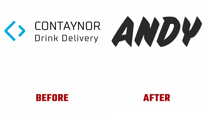
Peculiarity. The graphic design of the brand identity is that the logo looks like an inscription made with a marker. The font is handwritten, simple, and straightforward.
There used to be a box-like element to show the container as a symbol of Contaynor Drink Delivery. But such a simple logo, consisting only of contour lines and an even square font, is no longer interesting to the public.
And the new identity looks cool, non-trivial, youthful. It attracts attention as soon as you see the product.
Getting one hundred percent in the customer’s heart contributes to success in the market. Therefore, there is no need to doubt the promising development of the brand with a new name and identity – the company will have a positive future.


