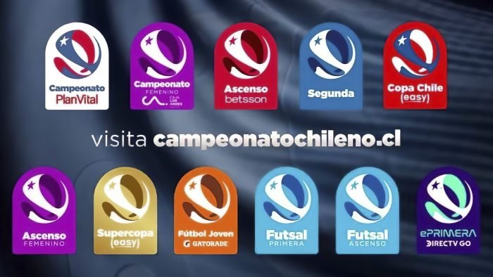
In addition to the primary subdivisions, the updates also affected all areas.
The first football matches of the season in Chile will start soon. In honor of the landmark event, the Chilean Asociación Nacional de Fútbol Profesional (ANFP) has announced a rebranding. In addition to its primary logo, the organization presented different images for all types of competitions.
The primary logo has become more modern and has not lost all the main elements. The color palette remained unchanged: blue, red, and white. They also did not forget about the star. All colors are combined to form a shape that looks like a football match.
All divisions received similar logos, only using a different color palette. Thus, it was possible to achieve the unity of all competitions: Chile Cup, the Super Cup, Women’s Soccer, Youth Soccer, Futsal, Silver Soccer, and others, and focus on the organization.
Pablo Milad, President of ANFP, says the rebranding is part of developing the championships in Chile. A modern logo will help you enjoy the event even more and attract the attention of fans. The organization also announced new sponsors for various competitions: Betsson and Caja Los Andes.
But all the news does not end there. ANFP also created a special website where fans can get information about teams, competitions, and additional improved content.


